- My Forums
- Tiger Rant
- LSU Recruiting
- SEC Rant
- Saints Talk
- Pelicans Talk
- More Sports Board
- Fantasy Sports
- Golf Board
- Soccer Board
- O-T Lounge
- Tech Board
- Home/Garden Board
- Outdoor Board
- Health/Fitness Board
- Movie/TV Board
- Book Board
- Music Board
- Political Talk
- Money Talk
- Fark Board
- Gaming Board
- Travel Board
- Food/Drink Board
- Ticket Exchange
- TD Help Board
Customize My Forums- View All Forums
- Show Left Links
- Topic Sort Options
- Trending Topics
- Recent Topics
- Active Topics
Started By
Message
re: The new USA away kits are awful.
Posted on 6/16/21 at 10:05 pm to ned nederlander
Posted on 6/16/21 at 10:05 pm to ned nederlander
We need a new crest and brand sponsor.


This post was edited on 6/16/21 at 10:13 pm
 1
1


Posted on 6/16/21 at 10:26 pm to Michael Stein
quote:
Did we even use that 2020 away kit?
vs Panama in 2020
vs El Salvador in 2020
vs Jamaica in 2021
vs Switzerland in 2021
vs Honduras in 2021
It's actually more than we wore the bomb pops in 2014/15.
Posted on 6/16/21 at 10:28 pm to ned nederlander
quote:
Just a big USA across the chest with a red white and blue color scheme.
This would be garbage and I'm glad it will never happen.

Posted on 6/16/21 at 10:50 pm to NamariTiger
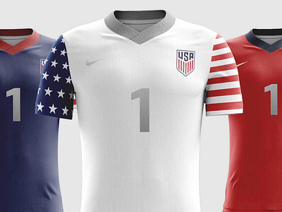
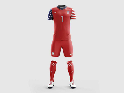
A couple of those concepts are ok, but this the GOAT concept kit.

Posted on 6/16/21 at 11:31 pm to Broski
Never is a long time for a nation with no loyalty to any one design. I’ll keep dreaming.

Posted on 6/17/21 at 9:48 am to Broski
quote:

Whoever was designing the kits from 2010-2013 - bring that guy back!!!

Posted on 6/17/21 at 12:18 pm to etm512
Waldos should be our flaghsip jersey.

This post was edited on 6/17/21 at 12:20 pm
Posted on 6/17/21 at 2:52 pm to Broski
The 2004-05 kits really take me back. That was prime Nike Total 90 days.
Posted on 6/17/21 at 2:57 pm to ned nederlander
quote:
Never is a long time for a nation with no loyalty to any one design. I’ll keep dreaming.
Has nothing to do with no loyalty to designs and everything to do with the fact that no kit designer worth a shite would think big block "USA" letters across the chest is a good idea.

Posted on 6/17/21 at 3:25 pm to Broski

Come on broski it’s been done before and it looks great!
Posted on 6/17/21 at 3:32 pm to cwil177
ned nederlander is a communist, confirmed.
Posted on 6/18/21 at 4:55 am to Broski
quote:
vs Panama in 2020
vs El Salvador in 2020
vs Jamaica in 2021
vs Switzerland in 2021
vs Honduras in 2021
It's actually more than we wore the bomb pops in 2014/15.
Wow, thanks. That shows how little my brain has retained.
I can normally remember obscure details of USMNT games even in the distant past, but the last three and a half years ever since the Couva disaster have blurred together in my mind. I forgot we drew France in that friendly before they won the World Cup, along with a bunch of other matches.
Maybe COVID is contributing to that. It feels like ten years ago when we played Cuba in the Cayman Islands on that high school field for the Nations League qualifier, but it wasn’t even two years ago.
I’ll have to go back and watch highlights of every USMNT game since Couva before the Gold Cup. Even the painful ones where we looked like garbage.
It’s a shame we never got to wear the nice 2018 kits in the World Cup. I feel bad for the designer at Nike who spent probably hundreds of hours on those kits, expecting their work to be seen on the world stage, only for us to faceplant and not qualify.
Posted on 6/21/21 at 7:09 am to Michael Stein
What i find to be interesting, is that the pattern on the new kits, is the same pattern of the new seats in the new Columbus Crew stadium. Coincidence? Columbus has always been the unofficial home of USA Soccer, makes you wonder if there is anything to this?

Posted on 6/21/21 at 7:51 am to Buckeye Backer
quote:
What i find to be interesting, is that the pattern on the new kits, is the same pattern of the new seats in the new Columbus Crew stadium. Coincidence? Columbus has always been the unofficial home of USA Soccer, makes you wonder if there is anything to this?
Holy shite you may be on to something! This is extremely believable and it does make you wonder!
Posted on 6/21/21 at 10:23 am to GeorgeTheGreek
quote:
Nope
The rocket ship soccer ball was terrible. Reminds me of the Microsoft Paint designed kits I had when I played U14 Rec ball in 2001.
Posted on 6/21/21 at 10:28 am to BleedPurpleGold
The new crest is definitely an upgrade. It's not great, but easily better.
Posted on 6/21/21 at 10:35 am to Buckeye Backer
quote:
makes you wonder if there is anything to this?
I highly doubt there's any connection. They didn't even install the first row of seats until February. These jerseys were probably in development long before then.
Posted on 6/21/21 at 11:06 am to pvilleguru
quote:
The new crest is definitely an upgrade. It's not great, but easily better.
Agreed. I think everyone can agree the retro crest with the stars instead of the "USA" was the best we've ever had.
Posted on 6/21/21 at 12:47 pm to BleedPurpleGold
Centennial jersey is my favorite of all time.
Posted on 6/21/21 at 6:06 pm to pvilleguru
The thing I hate about the new crest is that's it's too generic. It doesn't symbolize anything regarding US soccer. The bobsled team, table tennis, fencing, etc could all use it and you never know.
It reminds me of the off brand shirts youd see at old navy or target on Olympic years you could buy to show your "support".
It reminds me of the off brand shirts youd see at old navy or target on Olympic years you could buy to show your "support".

 Page 3 of 4

Popular
Back to top