- My Forums
- Tiger Rant
- LSU Recruiting
- SEC Rant
- Saints Talk
- Pelicans Talk
- More Sports Board
- Fantasy Sports
- Golf Board
- Soccer Board
- O-T Lounge
- Tech Board
- Home/Garden Board
- Outdoor Board
- Health/Fitness Board
- Movie/TV Board
- Book Board
- Music Board
- Political Talk
- Money Talk
- Fark Board
- Gaming Board
- Travel Board
- Food/Drink Board
- Ticket Exchange
- TD Help Board
Customize My Forums- View All Forums
- Show Left Links
- Topic Sort Options
- Trending Topics
- Recent Topics
- Active Topics
Started By
Message

 1
1

Posted on 6/16/21 at 12:59 pm to mizslu314
bring back the denim!

Posted on 6/16/21 at 1:46 pm to Tigerstark
Bring it back

Posted on 6/16/21 at 2:09 pm to BlackCoffeeKid
quote:
Would be a great warm-up top. Terrible uniform though
My thoughts as well. They’re fine for warm-ups.

Posted on 6/16/21 at 3:12 pm to jumbo
Yup. Keep the whites but give them blue shorts.
And for the love of all that is holy, bring back either the Waldos or Bomb Pops.
And for the love of all that is holy, bring back either the Waldos or Bomb Pops.

Posted on 6/16/21 at 3:28 pm to DByrd2
I just had a seizure looking at that. There should really be an epilepsy warning.

Posted on 6/16/21 at 3:29 pm to cwil177
quote:
There should really be an epilepsy warning.

Posted on 6/16/21 at 3:33 pm to Broski
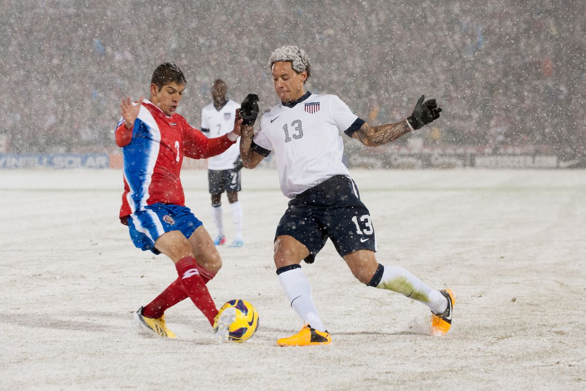
2006-2015, we never really had a bad kit.
Since adopting the new crest (which was an upgrade) in 2016, the only really good kit set we had was 2018-19, but that is obviously marred by us not being able to wear them in a World Cup.

Since adopting the new crest (which was an upgrade) in 2016, the only really good kit set we had was 2018-19, but that is obviously marred by us not being able to wear them in a World Cup.
Posted on 6/16/21 at 3:35 pm to Broski
I love our 2010 sash kit (away) and the 2006 Latvia friendly is a GOAT. We need to bring back the sash.

Posted on 6/16/21 at 3:39 pm to cwil177
The 2003 New Zealand was nice
Posted on 6/16/21 at 3:41 pm to Broski
I think the current home kit looks nice from far, but when you see the odd striping, it starts to look silly. We have had a lot of nice white jerseys. I would be completely fine if white jerseys at home became our thing. I just want something to be our identifier.
Speaking of that, it's not all Nike going off the rails. Mexico/Adidas has been lacking lately. As much as I hate Mexico, you at least recognized the green jersey, white pants, and red socks. It's a good look. They haven't really had that traditional look in a while. Right now, their home kit is black and pink. I'd lose it if we ventured that far off our usual look.
Speaking of that, it's not all Nike going off the rails. Mexico/Adidas has been lacking lately. As much as I hate Mexico, you at least recognized the green jersey, white pants, and red socks. It's a good look. They haven't really had that traditional look in a while. Right now, their home kit is black and pink. I'd lose it if we ventured that far off our usual look.
This post was edited on 6/16/21 at 3:44 pm
Posted on 6/16/21 at 3:41 pm to mizslu314
I like them. However they do look like the Union Jack.
Posted on 6/16/21 at 3:42 pm to cwil177
I would be down if we always incorporated one kit with hoops and one kit with a sash going forward.
Posted on 6/16/21 at 4:42 pm to Broski
Did we even use that 2020 away kit?
I agree our best time for kits was definitely 2009-14. It’s been very hit and miss since then. I loved the 2017 Gold Cup away kits, though.
I agree our best time for kits was definitely 2009-14. It’s been very hit and miss since then. I loved the 2017 Gold Cup away kits, though.
Posted on 6/16/21 at 5:09 pm to cwil177
The sash always did it for me. Regret never being able to snag the home and alternate. This new one? Sheesh no thank you

Posted on 6/16/21 at 5:22 pm to Broski
quote:
Since adopting the new crest (which was an upgrade)
Nope
Posted on 6/16/21 at 5:38 pm to Michael Stein
quote:
Did we even use that 2020 away kit?
The games we played in it were more forgettable than the splooge jerseys.
Posted on 6/16/21 at 6:40 pm to mizslu314
Loos like the Man U 3rd kit from this year, which was hideous.
Posted on 6/16/21 at 9:19 pm to Floyd Dawg
I wish we had a look with some consistency. Frankly I wish we could just slap the us Air Force emblem across the chest and call it a day. More realistically I’d like something more in line with US hockey. Just a big USA across the chest with a red white and blue color scheme.
Posted on 6/16/21 at 9:53 pm to Broski
Also - that 94 away Jersey just makes me happy in every way. So ugly. So overachieving.

 Page 2 of 4

Popular
Back to top