- My Forums
- Tiger Rant
- LSU Recruiting
- SEC Rant
- Saints Talk
- Pelicans Talk
- More Sports Board
- Fantasy Sports
- Golf Board
- Soccer Board
- O-T Lounge
- Tech Board
- Home/Garden Board
- Outdoor Board
- Health/Fitness Board
- Movie/TV Board
- Book Board
- Music Board
- Political Talk
- Money Talk
- Fark Board
- Gaming Board
- Travel Board
- Food/Drink Board
- Ticket Exchange
- TD Help Board
Customize My Forums- View All Forums
- Show Left Links
- Topic Sort Options
- Trending Topics
- Recent Topics
- Active Topics
Started By
Message

The LSU font needs to be enlarged in our endzones
Posted on 9/20/24 at 12:33 pm
Posted on 9/20/24 at 12:33 pm
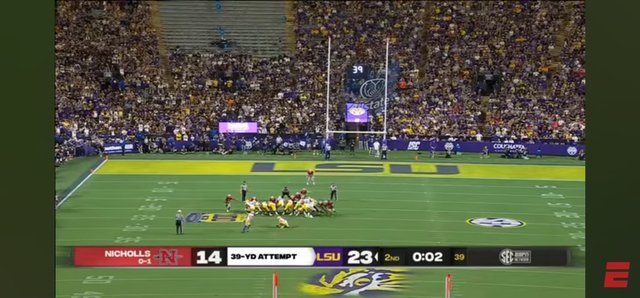
Mates, watching the Jets game last night, I was struck by how great it looked having their wordmark enlarged to fill up the entire endzones.
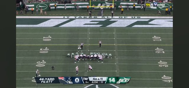
It's seaux much more visually appealing that the current (tired) geaux font design that has been unchanged since 2005. WAY too much blank space. By simply enlarging the font it would look much better.
And if enlarging the geaux font isn't an option, we should put the helmet tiger head in the corners of the endzones to eat up some of the space.
This post was edited on 9/20/24 at 12:40 pm
 18
18


Posted on 9/20/24 at 12:34 pm to SirWinston
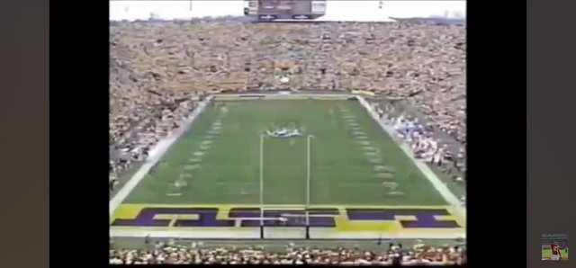
Early 2000s had the best endzones

Posted on 9/20/24 at 12:35 pm to SirWinston
Explain how you can enlarge the geaux font LSU while keeping the aspect ratio the same? It can't go much bigger unless you change the font to something else.
Posted on 9/20/24 at 12:37 pm to Lsuhoohoo
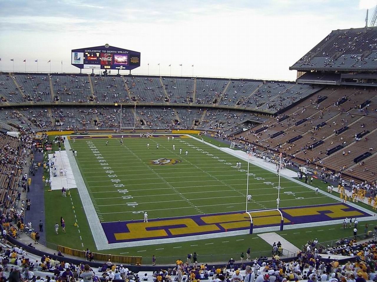
Easily the GEAUXT field design in the history of the sport, even if our own bbap didn't like it
Posted on 9/20/24 at 12:37 pm to SUB
quote:
Explain how you can enlarge the geaux font LSU while keeping the aspect ratio the same? It can't go much bigger unless you change the font to something else.
If they spaced the letters more it would work. Or put the tiger logos in the corners
This post was edited on 9/20/24 at 12:38 pm
Posted on 9/20/24 at 12:38 pm to SirWinston
Shrinkflation is a thing
Posted on 9/20/24 at 12:40 pm to SirWinston
The block letters get a lot of love here. Why?
Posted on 9/20/24 at 12:41 pm to SUB
Iconic. Lsu is art deco. I get why we "have to" use the geaux font bc its a billion dollar brand...I'm not even arguing for the block letters here bc it would never happen. But better utilizing the space could and should happen
This post was edited on 9/20/24 at 12:44 pm
Posted on 9/20/24 at 12:41 pm to SUB
that font style is never coming back
Posted on 9/20/24 at 12:41 pm to SUB
Because people are nostalgic for the past.

Posted on 9/20/24 at 12:41 pm to SUB
quote:
The block letters get a lot of love here. Why?
everything nostalgic does
Posted on 9/20/24 at 12:43 pm to Coastal Tiger
quote:
Because people are nostalgic for the past.
I was at LSU for both the block letters and the change to geaux font. I'm not in love with either.
Why not do a geaux font "TIGERS" in one of the endzones? That would stretch further across.
This post was edited on 9/20/24 at 12:44 pm
Posted on 9/20/24 at 12:46 pm to SUB
quote:
Why not do a geaux font "TIGERS" in one of the endzones? That would stretch further across.
Agree that would do the trick in one endzone at least. Alabama's endzones are perfect
Posted on 9/20/24 at 12:46 pm to SirWinston
I was thinking I might agree with you until you typed
Geez, just stop.
quote:.
It's seaux much more
quote:
the GEAUXT
Geez, just stop.
This post was edited on 9/20/24 at 12:49 pm

Posted on 9/20/24 at 12:47 pm to SirWinston
quote:
enlarge
quote:
our endzone
Posted on 9/20/24 at 12:50 pm to SirWinston
I think the geaux font is so generic and sterile. I’ve never been a huge fan, and as a defacto primary logo it looks weak on hats.
but the OP is right.
it could easily fill the endzone
but the OP is right.
it could easily fill the endzone
This post was edited on 9/20/24 at 12:52 pm
Posted on 9/20/24 at 1:08 pm to SUB
quote:I may be in the minority, but I honestly don't care for the geaux font except when it's used for "LSU"
Why not do a geaux font "TIGERS" in one of the endzones? That would stretch further across.
When Dinardo was here we did, however, have "TIGERS" written across the endzone in block letters

This post was edited on 9/20/24 at 1:09 pm
Posted on 9/20/24 at 1:11 pm to SUB
quote:
The block letters get a lot of love here. Why?
I really don’t know, they’re hideous
Posted on 9/20/24 at 1:14 pm to Lsuhoohoo
I get that nostalgia is a real thing but that letter style would have been horrifically dated by approximately 1972

 Page 1 of 2

Popular
Back to top