- My Forums
- Tiger Rant
- LSU Recruiting
- SEC Rant
- Saints Talk
- Pelicans Talk
- More Sports Board
- Fantasy Sports
- Golf Board
- Soccer Board
- O-T Lounge
- Tech Board
- Home/Garden Board
- Outdoor Board
- Health/Fitness Board
- Movie/TV Board
- Book Board
- Music Board
- Political Talk
- Money Talk
- Fark Board
- Gaming Board
- Travel Board
- Food/Drink Board
- Ticket Exchange
- TD Help Board
Customize My Forums- View All Forums
- Show Left Links
- Topic Sort Options
- Trending Topics
- Recent Topics
- Active Topics
Started By
Message

 1
1


Posted on 7/10/23 at 12:36 pm to Basura Blanco
Maybe not triggered but somewhere between concerned and displeased; far from outraged.
Posted on 7/10/23 at 1:10 pm to LolStarFishlol
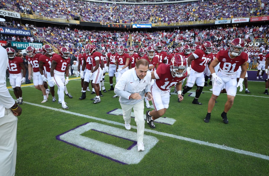
Wish we would use these end zones with the helmets worn vs Ole Miss in 2018 for all Ole Miss games.
/cdn.vox-cdn.com/uploads/chorus_image/image/61594407/usa_today_11349307.0.jpg)
Posted on 7/10/23 at 3:48 pm to Sir Fury
quote:
It's iconic, not cheesy at all.
Nah, it looks ghey. Kinda like toonces. Should be crazy Mike like the basketball court.
Posted on 7/10/23 at 3:59 pm to johnnydrama
quote:
Maybe not triggered but somewhere between concerned and displeased; far from outraged.
While not in a wad, my jimmies are at rustled.
Posted on 7/11/23 at 12:13 am to LolStarFishlol
I heckin love the block endzones and the more orangey gold hue as opposed to the current bright yellow
Posted on 7/11/23 at 12:30 am to TheRoarRestoredInBR
quote:
me guess..you like Tenn’s garish Orange Purina Dog Chow Checkerboard too?
Ours is pretty shitty. It’s not like our current has any tradition either.changing it should definitely be an option
This post was edited on 7/11/23 at 12:32 am

Posted on 7/11/23 at 1:24 am to GrizzlyAlloy
quote:
Need to get Saban's eye of the tiger off the field. Looks cheesey.
This is from 1983 (40 years ago if you're bad at math)

This was long before Saban ever even had his first HC job at any school. It is far from "Saban's Eye". Educate yourself on our history before you go acting like you know what's best for this program. It is one of the most iconic, elegant, and recognizable midfield logos in NCAAF. I have no idea how you can call that cheesy.
This post was edited on 7/11/23 at 1:35 am
Posted on 7/11/23 at 5:51 am to SirWinston
And maybe put 80 yards of giant gold block letters, stretching from the 10 to the other 10 yard line, and saying “ALIGNED”? 
Posted on 7/11/23 at 6:36 am to SirWinston
Turrible
You should be ashamed
Prob type guy that wants black uniforms as well
You should be ashamed
Prob type guy that wants black uniforms as well
Posted on 7/11/23 at 1:43 pm to WaterLink
Looks like that one hit you in your pussy.

Posted on 7/11/23 at 2:42 pm to SirWinston
It better not.
That is the practice uniform of football fields.
That is the practice uniform of football fields.
Posted on 7/11/23 at 5:17 pm to SirWinston
Lol the majority of 135 idiots. Yeah that’s a large sample size. Lmao
Posted on 7/11/23 at 5:20 pm to WaterLink
That’s not centered

 Page 2 of 2


Popular
Back to top