- My Forums
- Tiger Rant
- LSU Recruiting
- SEC Rant
- Saints Talk
- Pelicans Talk
- More Sports Board
- Fantasy Sports
- Golf Board
- Soccer Board
- O-T Lounge
- Tech Board
- Home/Garden Board
- Outdoor Board
- Health/Fitness Board
- Movie/TV Board
- Book Board
- Music Board
- Political Talk
- Money Talk
- Fark Board
- Gaming Board
- Travel Board
- Food/Drink Board
- Ticket Exchange
- TD Help Board
Customize My Forums- View All Forums
- Show Left Links
- Topic Sort Options
- Trending Topics
- Recent Topics
- Active Topics
Started By
Message
Logo Madness (BR edition)
Posted on 9/16/20 at 9:24 am
Posted on 9/16/20 at 9:24 am
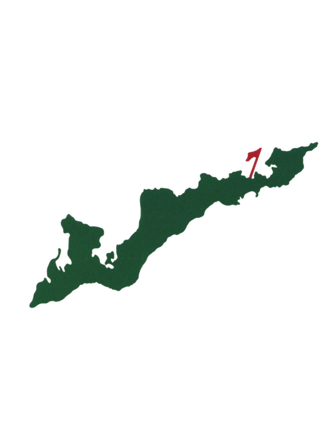
With Winged Foot logo getting some play this week, I started thinking about some of the great logos, like Pasatiempo, Olympic, etc. Then it got me thinking about local logos and how almost every Baton Rouge area course has a terrible logo. Below are the logos how I would rank them:


I wouldn't even call these two "logos"


But there isn't a decent logo in the bunch, except for maybe BRCC. Setting up a golf logo shouldn't be too difficult. Look at the great logos and mimic them to some extent. I can't be the only one who thinks Baton Rouge, pound for pound, may be the worst logo town in America.
I wouldn't even call these two "logos"
But there isn't a decent logo in the bunch, except for maybe BRCC. Setting up a golf logo shouldn't be too difficult. Look at the great logos and mimic them to some extent. I can't be the only one who thinks Baton Rouge, pound for pound, may be the worst logo town in America.
This post was edited on 9/16/20 at 9:25 am
 11
11


Posted on 9/16/20 at 9:46 am to The Johnny Lawrence
I can honestly say I have never given a golf course's logo a single thought.
Posted on 9/16/20 at 9:49 am to BMoney
When you like to occasionally buy hats From courses you start to notice it  Beaver Creek is one of my favorite courses but man that logo is bad. Looks like clip art
This post was edited on 9/16/20 at 3:08 pm

Posted on 9/16/20 at 9:53 am to The Johnny Lawrence
Posted on 9/16/20 at 10:10 am to BMoney
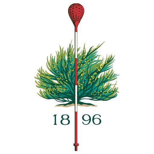
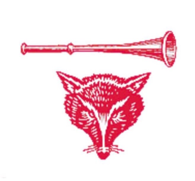
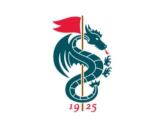
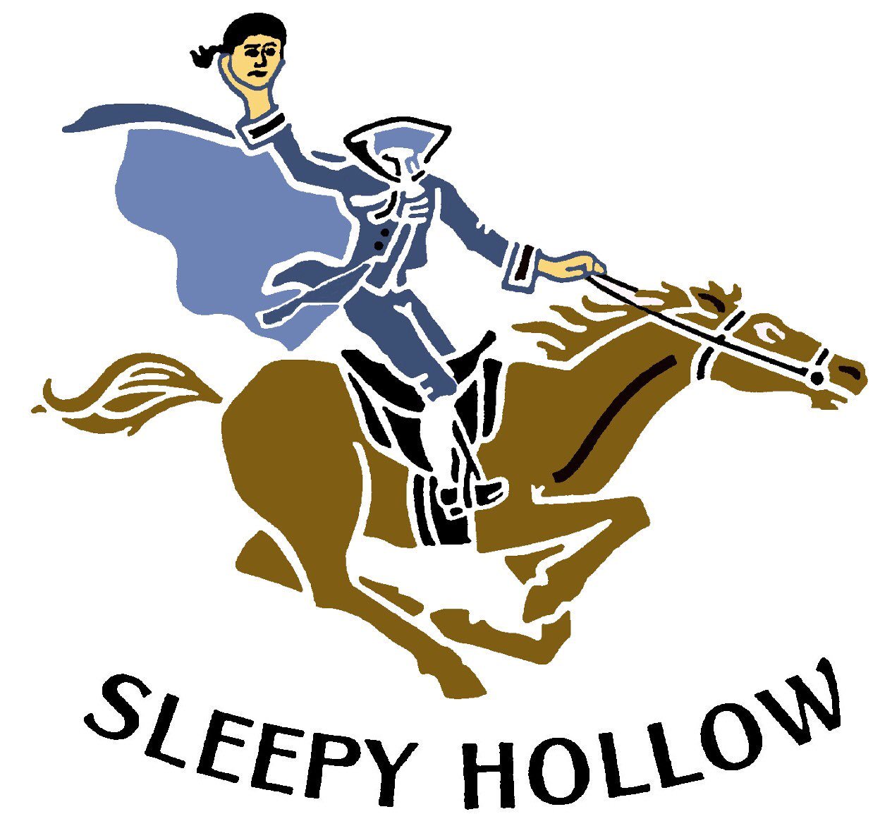
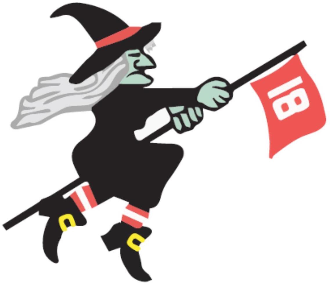
Just to compare- here are the top logos from Zac Blair's logo madness:


Posted on 9/16/20 at 10:18 am to The Johnny Lawrence


Posted on 9/16/20 at 10:21 am to WildcatMike
That’s awesome
Posted on 9/16/20 at 10:22 am to Swamp Goat
quote:
Looks like it clip art
It is
ETA:Best logo in golf
This post was edited on 9/16/20 at 10:27 am
Posted on 9/16/20 at 10:22 am to The Johnny Lawrence
Greystone's looks like its from a Golf Channel commercial from 1997.

Posted on 9/16/20 at 10:28 am to The Johnny Lawrence
Golf course logos are notoriously bad, especially the older / classic courses. Exceptions to the rule, but usually very bad. I'm a graphic designer, so I do notice and pay attention to all logos. Just Google "best golf course logos," really disappointing.
Pine Valley, one of the highest ranked and most exclusive course in the US has a crap logo. Looks like a scouting merit badge.

Pine Valley, one of the highest ranked and most exclusive course in the US has a crap logo. Looks like a scouting merit badge.
Posted on 9/16/20 at 10:37 am to mikedatyger
It isn't great, but I don't hate it.
I think a great logo is a picture of something related to your course that is so distinguishable from other logos that words aren't needed.
If the picture is really cool, it moves up the list.
I think a great logo is a picture of something related to your course that is so distinguishable from other logos that words aren't needed.
If the picture is really cool, it moves up the list.
Posted on 9/16/20 at 10:37 am to The Johnny Lawrence
I’ve never given this any thought but yeah those aren’t good.
Posted on 9/16/20 at 10:39 am to The Johnny Lawrence
UClub had the world at its fingertips and missed. Just the tiger head with university club underneath it would've been much better

Posted on 9/16/20 at 10:43 am to Zanzibaw
Oakbourne in Lafayette has a solid logo
Posted on 9/16/20 at 10:45 am to The Johnny Lawrence
The Island isn’t bad.
Metairie CC has the best one in South Louisiana IMO

Metairie CC has the best one in South Louisiana IMO
Posted on 9/16/20 at 10:52 am to dpd901
GOAT

Posted on 9/16/20 at 10:54 am to Front9Bandit
Posted on 9/16/20 at 10:55 am to mikedatyger
The BR area has some really shitty logos. Pine Valley is a classic. I like it. I think UClub messed up with that Tiger head being crooked, not sure why they thought that was a good idea
I like the Lafayette area logos for the private clubs...


I prefer Le triomphes when they just use the arc de triomphe and remove the words
I like the Lafayette area logos for the private clubs...
I prefer Le triomphes when they just use the arc de triomphe and remove the words
Posted on 9/16/20 at 11:00 am to icegator337
I saw on Google where the Bluffs used just the flower as the logo. That would be really good. But I've never seen it without the words.
Posted on 9/16/20 at 11:19 am to icegator337
If a golf courses logo has a golf ball replacing an O, it's automatically shite in my book

 Page 1 of 3

Popular
Back to top