- My Forums
- Tiger Rant
- LSU Recruiting
- SEC Rant
- Saints Talk
- Pelicans Talk
- More Sports Board
- Fantasy Sports
- Golf Board
- Soccer Board
- O-T Lounge
- Tech Board
- Home/Garden Board
- Outdoor Board
- Health/Fitness Board
- Movie/TV Board
- Book Board
- Music Board
- Political Talk
- Money Talk
- Fark Board
- Gaming Board
- Travel Board
- Food/Drink Board
- Ticket Exchange
- TD Help Board
Customize My Forums- View All Forums
- Show Left Links
- Topic Sort Options
- Trending Topics
- Recent Topics
- Active Topics
Started By
Message
Falcons will have solid coloured end zones tomorrow
Posted on 12/5/20 at 11:48 pm

Posted on 12/5/20 at 11:48 pm
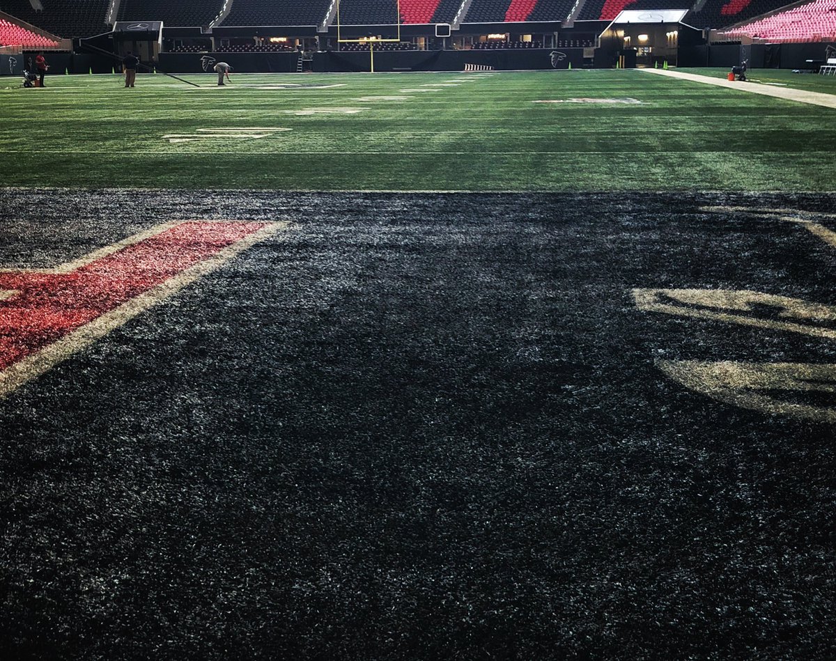
Mates we’ll have some excellent visual eye candy as the Falcons are breaking out their 1990’s black on silver “Dirty Birds” uniforms and look.
It’s unreal to me how some teams go all out on amazing homages to their history and then we are stuck with a team that hasn’t changed its field design one iota in over 15 years.
Atlanta has had 4 end zone variations just THIS SEASON... and each is superior and more inspired than the Saints. Going to pay homage to their Dirty Birds days with both pitch iconography as well as their kits.
Can you imagine if we did this with our 87 Dome Patrol uniforms and field design?
This post was edited on 12/6/20 at 11:36 am
 15
15

Posted on 12/6/20 at 12:32 am to SirWinston
This is a weird, dumb post.

Posted on 12/6/20 at 12:38 am to SirWinston
Keep fighting the solid endzone fight brother* 
*mate
*mate

Posted on 12/6/20 at 6:31 am to SirWinston
They have to do something to draw attention to their endzones. They rarely make it to them.
Posted on 12/6/20 at 6:49 am to SirWinston
Somthin, somthin, somthin, 28 somthin, somthin, 3
Posted on 12/6/20 at 6:53 am to SirWinston
STFU your endzone schtick is weird and beyond dumb
Posted on 12/6/20 at 7:13 am to SirWinston
frick solid color saints end zone
Posted on 12/6/20 at 7:14 am to SirWinston
That's an interesting query, Winston.
Well done.
The colour, I'm told, is "Black Harbour."
The paint, believe it or not, is made up of a cherry flavour.
I learned this whilst watching the show, "Neighbours."
Well done.
The colour, I'm told, is "Black Harbour."
The paint, believe it or not, is made up of a cherry flavour.
I learned this whilst watching the show, "Neighbours."
Posted on 12/6/20 at 7:47 am to SirWinston
Only Draconian Sanctions commitment to "Row The Boat" rivals your dedication to this cause
Posted on 12/6/20 at 7:54 am to SirWinston
quote:
Falcons are breaking out their 1990’s black on silver “Dirty Birds” uniforms and look.
White pants, it’s the fake “Dirty Birds” uni and looks.
Posted on 12/6/20 at 8:59 am to SirWinston
Honestly I hate the cluttered-up look that most fields have now. I'd be just fine with a white rectangle with white lines every 10 yards. The rest of it is just distracting folderol: Conference This, Awareness of That, Support Puerto Rico Week... whatever. I'm trying to watch a damn ball game.
Oh, and that yellow first down line they project somehow...
Oh, and that yellow first down line they project somehow...

Posted on 12/6/20 at 10:48 am to SirWinston
Never forget this dude was leading the anti-saint charge and said the Bucs would win the division.

Posted on 12/6/20 at 10:59 am to SirWinston
I’ve got nothing to say about End Zone designs but Natalies Portman or Wood (back in the day) would qualify for me to admit them into


Posted on 12/6/20 at 11:26 am to SirWinston
I've been seeing posts about it for years, but can someone explain to me the solid end zone obsession?
Posted on 12/6/20 at 11:42 am to SirWinston
I will get behind anyone on being the gold pants back.....endzone color....meh. I don't care.

Posted on 12/6/20 at 12:03 pm to SirWinston
quote:
SirWinston
I actively hate you, your posting, your political and social views, and your entire dumb schtick in general.
But the solid end zone argument is the one thing I’m 100% with you on. Our end zones and mid-field logo are high school-level bad. It’s embarrassing to have put so little effort into the field decorating of a professional football team.
Put the Saints shield logo at mid-field and make each end zone black, with one reading “NEW ORLEANS” and the other “SAINTS.”

 Page 1 of 1


Popular
Back to top