- My Forums
- Tiger Rant
- LSU Recruiting
- SEC Rant
- Saints Talk
- Pelicans Talk
- More Sports Board
- Fantasy Sports
- Golf Board
- Soccer Board
- O-T Lounge
- Tech Board
- Home/Garden Board
- Outdoor Board
- Health/Fitness Board
- Movie/TV Board
- Book Board
- Music Board
- Political Talk
- Money Talk
- Fark Board
- Gaming Board
- Travel Board
- Food/Drink Board
- Ticket Exchange
- TD Help Board
Customize My Forums- View All Forums
- Show Left Links
- Topic Sort Options
- Trending Topics
- Recent Topics
- Active Topics
Started By
Message

 0
0


Posted on 2/8/18 at 9:42 pm to SabiDojo
quote:
The only thing I don't like about Times New Roman is that it's a monospaced font. I prefer proportional fonts. But, I just assume Times New Roman would be best since I'm in an industry that's inundated with old farts.
Sabi, I was under the impression TNR and Arial were our only options for legal writings.
No one GAF about email font unless you pick something ridiculous.

Posted on 2/8/18 at 9:43 pm to Havoc
Anything that isn’t the default in the current version of office is trashy
That would be calibri
That would be calibri

Posted on 2/8/18 at 10:01 pm to Teddy Ruxpin
Which do you use?
Posted on 2/9/18 at 12:01 am to Havoc
Either Calibri or Arial (10-12 pt. depending on what I am working on)
This post was edited on 2/9/18 at 12:04 am

Posted on 2/9/18 at 4:36 am to Havoc
Verdana 12 pt.

Posted on 2/9/18 at 6:18 am to Havoc
LINK
Interesting read. I'll probably read the source material. I've always used Ariel of TNR 12 point. Maybe I'll switch
quote:
The creme de la creme of legal fonts, Century Schoolbook is used by no less an authority than the U.S. Supreme Court. It's highly readable, yet commands an air of authority with letters that take up more space than TNR. In addition to the Supreme Court, the U.S. Court of Appeals for the Federal Circuit uses Century Schoolbook. So does the Fifth Circuit, but with much smaller page margins that don't look as good, and I think we can agree that margins are half the battle.
Courier (and Courier New) Ugh. Courier. Unfortunately, many courts haven't yet received the memo stating that we don't use typewriters anymore. (And yet, according to Butterick, more than a few courts still require briefs to be submitted in a fixed width font like Courier.)
Interesting read. I'll probably read the source material. I've always used Ariel of TNR 12 point. Maybe I'll switch
This post was edited on 2/9/18 at 6:20 am
Posted on 2/9/18 at 6:30 am to lowhound
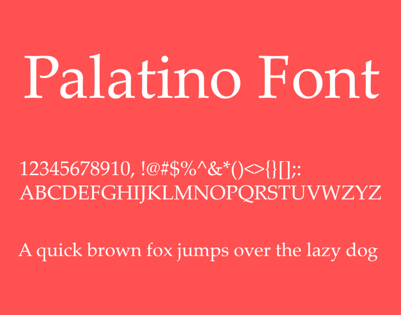
Scalia liked Palatino
Posted on 2/9/18 at 6:35 am to Havoc
Gil Sans MT…. Stands out well and very easy to read.
Posted on 2/9/18 at 6:36 am to Havoc
Arial, 10
Posted on 2/9/18 at 6:51 am to Havoc
Roboto Thin
Posted on 2/9/18 at 7:50 am to Retlaw
Rule 1 - if you want people to take you seriously, use a font with serifs. The serifs make reading easier. If you make reading harder, people won't read your document, won't understand it with the clarity you intend, and they are much more likely to get frustrated and put it down.
Rule 2 - font size matters, and should be at least 11pt when preparing research proposals because when converting to pdf the effective font size is reduced and the minimum for most sponsors is 10, though that depends on the font used. Either way, always go up a size when you know the document will be convertd to pdf. If you don't believe me, print a small paragraph in Word and then convert to pdf and do the same. You'll see and can measure the difference.
Other documents should be 12pt or larger. Anyone that gives me docs using less than 12pt without a really good reason - I just won't read it. If you think so little of your audience that you want them to strain while looking at your small font as you try to paint the entire document space black, then your reader will not think much of you in return. This is especially the case with so much presented digitally these days. No excuse for awful typography in a digital document. None.
Hint - this means you need to go into Outlook and change your defaults from the terrible settings that MS has placed in there. Side note - why hasn't MS made Outlook so that it imports to Excel seemlessly, for archiving? Absurd that utility is not available.
Rule 3 - line spacing must be at least 1.15 for readability, and less than 2 unless the specific purpose is to provide handwritten editing; and, much like the serifs, it matters. Margins should never be 1" unless required. Closer to 2" is much better for readability. A line of text should be between around 4.5" to 5".
Rule 4 - Bolding and Italics and Underlining should be for signposting and grammatical uses only. Otherwise it affects readability and you look like an idiot, much like when people speak and add emphasis to words in the middle of statements that then sound as though they are asking a question - you look incredibly stupid when you do that?
Rule 5 - there is no reason to think things change when preparing slides. Readability is readability. Use a serifed font. Send read-ahead copies of slides with white background, black font, in notes layout or convert to pdf and save as 4 slides per page. Present the slides with black background and white font - easier to see when the room is it, as is usually the case.
Rule 6 - in tables, left justify text, rather than centering, again readability. But if numbers are part of a table, usually better to right justify them so they can be tabulated by the reader if necessary.
Rule 7 - Century Schoolbook and Palatino should be your default fonts.
Posted on 2/9/18 at 8:17 am to SabiDojo
TNR
Posted on 2/9/18 at 8:23 am to Havoc
Arial.

Posted on 2/9/18 at 8:24 am to starsandstripes
Century Schoolbook looks a lot better than Palatino. Might switch to that over Garamond
Posted on 2/9/18 at 8:24 am to Havoc
We have to use "gil sans" for all documents that leave the office. 
Posted on 2/9/18 at 8:25 am to Teddy Ruxpin
Word. Thank you, e-bestfriend
Posted on 2/9/18 at 9:12 am to Havoc
Times New Roman

Posted on 2/9/18 at 9:57 am to Sigma
It's lazy and boring. And like other serif typeface it clutters the page and is difficult to follow if it's not double spaced. Type a document in calibri and then change the font to TNR and look at the difference. People who read emails, memos, resumes and reports all day notice the difference.
Posted on 2/9/18 at 11:34 am to WildManGoose
The thing is that when it is printed out on paper, TNR seems to imprint darker.

 Page 4 of 5

Popular
Back to top