- My Forums
- Tiger Rant
- LSU Recruiting
- SEC Rant
- Saints Talk
- Pelicans Talk
- More Sports Board
- Fantasy Sports
- Golf Board
- Soccer Board
- O-T Lounge
- Tech Board
- Home/Garden Board
- Outdoor Board
- Health/Fitness Board
- Movie/TV Board
- Book Board
- Music Board
- Political Talk
- Money Talk
- Fark Board
- Gaming Board
- Travel Board
- Food/Drink Board
- Ticket Exchange
- TD Help Board
Customize My Forums- View All Forums
- Show Left Links
- Topic Sort Options
- Trending Topics
- Recent Topics
- Active Topics
Started By
Message
re: Which teams have UPGRADED their uniforms over the past few years
Posted on 4/7/20 at 5:19 pm to David Ricky

Posted on 4/7/20 at 5:19 pm to David Ricky
quote:
Lakers new home (less yellow and more gold and they would be perfect imo)
I mean, the Lakers uniforms in the past have been yellower than people realize:

They were going back to the 80’s Magic Johnson era jerseys with small updates, and they nailed it I think.
 1
1


Posted on 4/7/20 at 5:23 pm to KD Burner Account
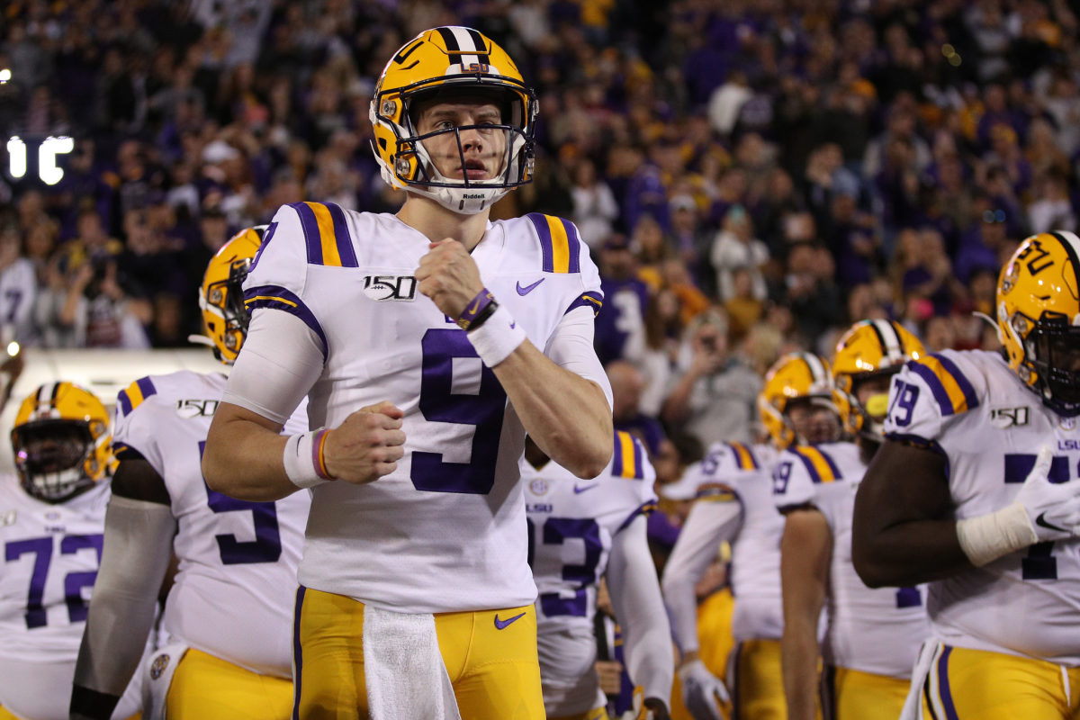
LSU proved that subtle differences can be the difference between an ok uniform and a great one. Did not like the small numbers and big stripes from the early 2010s

This post was edited on 4/7/20 at 5:24 pm
Posted on 4/7/20 at 6:12 pm to red sox fan 13
Adidas makes ugly football uniforms period. They only recently got better with State. Still looks like a hack job.

Posted on 4/7/20 at 6:23 pm to shagnasty 2
quote:
Adidas makes ugly football uniforms period.
They did OK with the Cajuns unis.


/cdn.vox-cdn.com/uploads/chorus_asset/file/15950087/1043028290.jpg.jpg)
Posted on 4/7/20 at 6:33 pm to 91TIGER
I think South Carolina’s throwbacks are pretty sharp. Better than their currents


Posted on 4/7/20 at 8:24 pm to reboss12
quote:
I think South Carolina’s throwbacks are pretty sharp. Better than their currents
Agree
Hope we adopt them fully and have them in a garnet and a white version
Posted on 4/7/20 at 8:52 pm to I Bleed Garnet
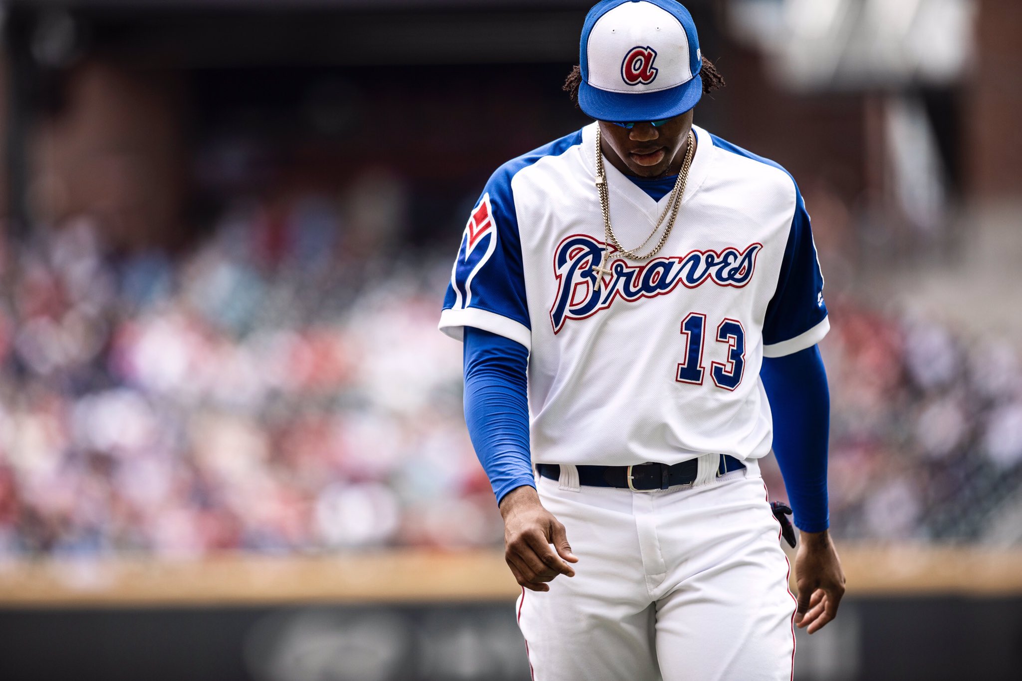
The Braves throwback unis are 

Posted on 4/8/20 at 1:21 pm to KD Burner Account
I like the Lions a lot more than what they had. Chargers need to go back to the badass powder blue with the old lightning bolt and numbers. The new ones aren't as good.
Posted on 4/8/20 at 1:28 pm to Paul Allen
The Suns jerseys when Barkley led them to the Finals were sweet. It was so idiotic to change to the hideous PHX jerseys with the ugly gray panels.

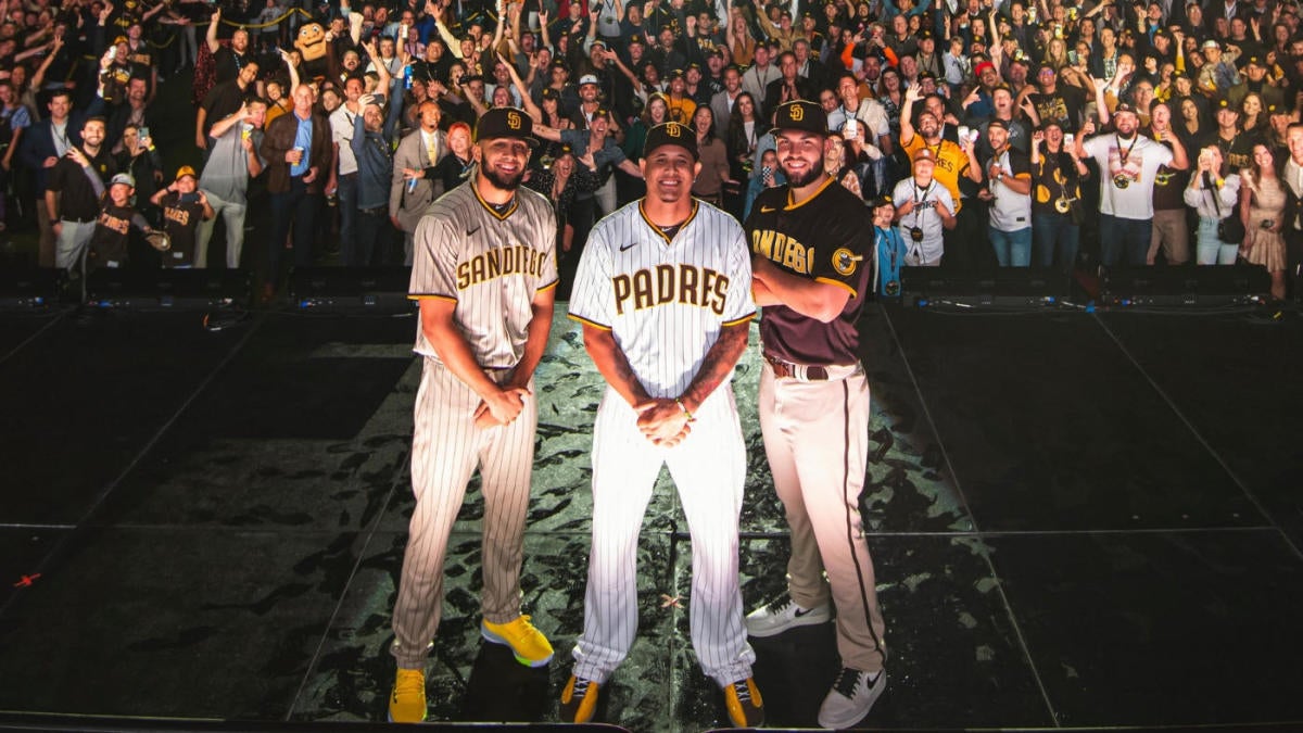
Posted on 4/8/20 at 1:30 pm to KD Burner Account
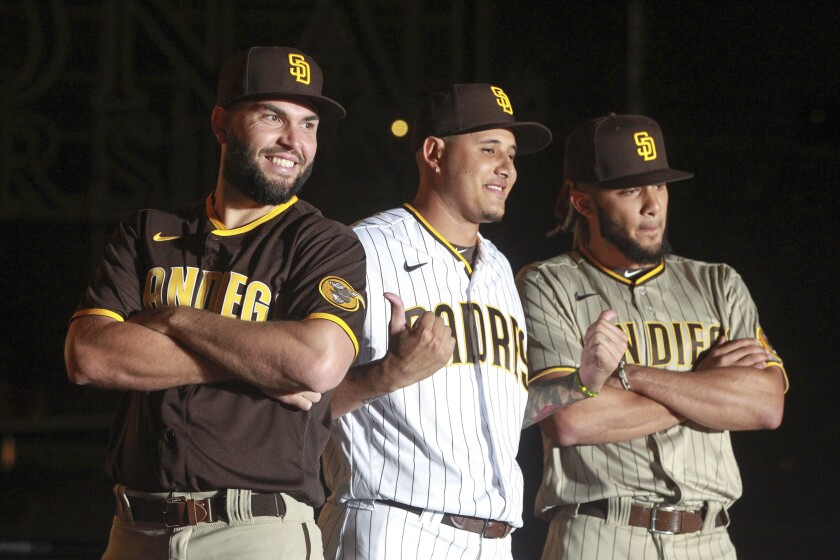
They haven’t played in them yet but the new padres are way better than the blue/grey
/cdn.vox-cdn.com/uploads/chorus_image/image/64085427/usa_today_12947300.0.jpg)
This post was edited on 4/8/20 at 1:32 pm
Posted on 4/8/20 at 1:41 pm to PrimeTime Money
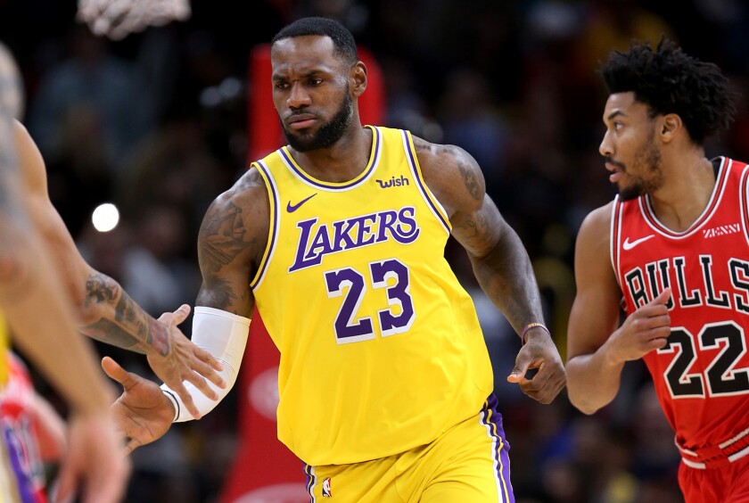
The number trim isn't as good as the old jerseys. But it is a step in the right direction. And the collar on the jersey looks so much better. The old weird V neck collar looked like shite. The only thing I still hate is the bizarre cut where the arm holes are on the back. The nice looking striping around the arm holes abruptly stops and looks terrible. Who the hell at Nike thought that would look good?
And yes, unless I am going color blind, those jerseys look yellow to me. Not gold. I hear people all the time confuse teams that really wear yellow with gold. Isn't gold supposed to be a much duller shade of yellow?
And yes, unless I am going color blind, those jerseys look yellow to me. Not gold. I hear people all the time confuse teams that really wear yellow with gold. Isn't gold supposed to be a much duller shade of yellow?
Posted on 4/9/20 at 9:32 am to Glorious
I liked the bigger stripes, tbh
Posted on 4/9/20 at 2:32 pm to kingbob
quote:
I liked the bigger stripes, tbh
They sucked, especially since it forced them to screw up the font to compensate.

 Page 2 of 2


Popular
Back to top