- My Forums
- Tiger Rant
- LSU Recruiting
- SEC Rant
- Saints Talk
- Pelicans Talk
- More Sports Board
- Fantasy Sports
- Golf Board
- Soccer Board
- O-T Lounge
- Tech Board
- Home/Garden Board
- Outdoor Board
- Health/Fitness Board
- Movie/TV Board
- Book Board
- Music Board
- Political Talk
- Money Talk
- Fark Board
- Gaming Board
- Travel Board
- Food/Drink Board
- Ticket Exchange
- TD Help Board
Customize My Forums- View All Forums
- Show Left Links
- Topic Sort Options
- Trending Topics
- Recent Topics
- Active Topics
Started By
Message

 0
0

Posted on 8/3/17 at 9:48 am to wizziko
That's not a Bulls specific decision. That's the cut of the template. None of the jerseys have striping on the back, unless I missed one. I'm not saying it's a good look or an excuse, but it's not a trendy thing decided to do just for the Bulls.

Posted on 8/3/17 at 10:03 am to DestrehanTiger
quote:
That's not a Bulls specific decision. That's the cut of the template. None of the jerseys have striping on the back, unless I missed one. I'm not saying it's a good look or an excuse, but it's not a trendy thing decided to do just for the Bulls.
I wasn't saying it was a Bulls thing, but Nike and their template having to screw things up. Adidas cut off the stripes too but it wasn't as blantant.

ETA: Forgot to post a pic of the shorts. The waistband thing Nike is doing does not look good with teams that have stripes on the waistband.

Posted on 8/4/17 at 2:50 am to wizziko
That striping does look fricked up on the back. I also liked the names in red on the white uniforms.

Posted on 8/8/17 at 11:30 am to David Ricky


Posted on 8/8/17 at 11:34 am to David Ricky


Posted on 8/8/17 at 11:35 am to David Ricky
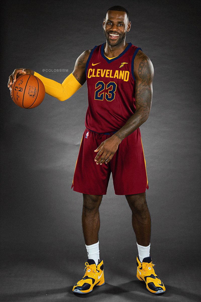
I approve of the wine colored number.
Wish they could keep the sleeved ones they won their title in, though.
Wish they could keep the sleeved ones they won their title in, though.
Posted on 8/8/17 at 12:01 pm to David Ricky
They’re a huge downgrade IMO. Their previous set was damn near perfect. I don’t like the “CAVS” on the home uniform or the blue number on the road uniform.
Posted on 8/8/17 at 1:32 pm to wizziko
I think the wine colored set needs white or gold numbers instead of navy blue. It's tough to make out what the numbers are.
Posted on 8/8/17 at 1:35 pm to David Ricky
The Goodyear logo just coincides with the uni

Posted on 8/8/17 at 1:36 pm to wizziko
quote:
They’re a huge downgrade IMO. Their previous set was damn near perfect. I don’t like the “CAVS” on the home uniform or the blue number on the road uniform.
Don't listen to this cry baby. He has a personal vendetta against Nike. Complains non-stop on the soccer board too about their jerseys.
Posted on 8/8/17 at 1:37 pm to McCaigBro69
Ooooooooh it makes sense now 

Posted on 8/8/17 at 3:06 pm to TbirdSpur2010
And mcaig is a nike Stan like no other. Dude has made some of the dumbest statements I've read on this site defending Nike over some irrelevant shite
This post was edited on 8/8/17 at 3:08 pm
Posted on 8/8/17 at 4:48 pm to David Ricky
OKC and Detroit's didnt change at all other than a swoosh right? Pistons ones are clean.
Posted on 8/8/17 at 4:50 pm to McCaigBro69
quote:
Don't listen to this cry baby. He has a personal vendetta against Nike. Complains non-stop on the soccer board too about their jerseys.
WTF?
The only complaint I've voiced about their basketball uniforms is the abrupt end of the shoulder stripe for no reason. I pointed out the same thing on the Adidas uniforms.
The other things I've pointed out are with the actual uniform designs.

Posted on 8/9/17 at 2:45 pm to David Ricky
New Denver Nuggets unis.


Posted on 8/9/17 at 3:00 pm to toj1111
Denver Pacers
The light blue looked good. Why change that?
The light blue looked good. Why change that?

Posted on 8/9/17 at 3:00 pm to toj1111
quote:
New Denver Nuggets unis.
How can they release those with that seriously fricked up spacing in the text on the front of the jerseys? That looks bush league.
D ENVER
NU GGETS
Posted on 8/9/17 at 3:04 pm to GeauxColonels
I never noticed that until you mentioned it. The D ENVER uni has too much going on with the highlighted letters. They should have thinned them out like the NU GGETS uni.
Utah's Twitter feed has a sneak peak at theirs....
Utah's Twitter feed has a sneak peak at theirs....
This post was edited on 8/9/17 at 3:06 pm
Posted on 8/9/17 at 3:15 pm to toj1111
Those are terrible. They look like MidMajor college uniform. At best.

 Page 7 of 12

Popular
Back to top