- My Forums
- Tiger Rant
- LSU Recruiting
- SEC Rant
- Saints Talk
- Pelicans Talk
- More Sports Board
- Fantasy Sports
- Golf Board
- Soccer Board
- O-T Lounge
- Tech Board
- Home/Garden Board
- Outdoor Board
- Health/Fitness Board
- Movie/TV Board
- Book Board
- Music Board
- Political Talk
- Money Talk
- Fark Board
- Gaming Board
- Travel Board
- Food/Drink Board
- Ticket Exchange
- TD Help Board
Customize My Forums- View All Forums
- Show Left Links
- Topic Sort Options
- Trending Topics
- Recent Topics
- Active Topics
Started By
Message

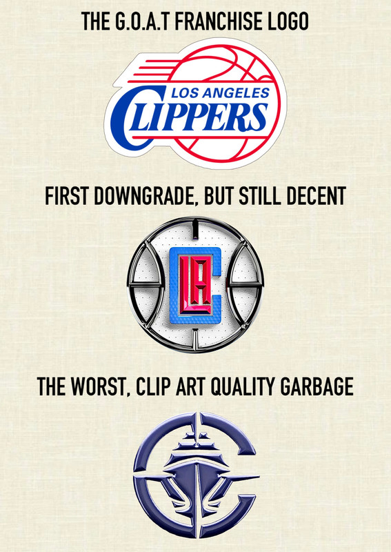
I’ve been a Clippers fan for thirty years….
Posted on 4/28/25 at 9:54 pm
Posted on 4/28/25 at 9:54 pm
and I’ve experienced many seasons of never being in the playoffs, to being in the playoffs consistently, to being a perennial second round exit franchise. I’m fully prepared for the Clippers to blow this golden opportunity against the Nuggets. Besides all that, what really irks me more than anything is this new image; quite possibly the worst downgrade in pro sports logo history. It’s been TEN years since the best logo I resonate with has been retired.
What are some other logo downgrades you all can think of? Can anything top the current Clippers logo?
What are some other logo downgrades you all can think of? Can anything top the current Clippers logo?
 30
30

Posted on 4/28/25 at 9:59 pm to Oklahomey
I don’t know but the new Clippers logo is absolute dog shite.
Posted on 4/28/25 at 10:05 pm to Oklahomey
It’s funny that the logo with an actual boat in it is the worst one.
Posted on 4/28/25 at 10:08 pm to Oklahomey
quote:
What are some other logo downgrades you all can think of? Can anything top the current Clippers logo?

Posted on 4/28/25 at 10:08 pm to Oklahomey
Goat franchise logo is quite strong

Posted on 4/28/25 at 10:12 pm to Oklahomey

Posted on 4/28/25 at 10:12 pm to Oklahomey
Whatever it takes to remove yourself from those mostly dark days I guess.

Posted on 4/28/25 at 10:19 pm to Oklahomey
quote:
I’ve been a Clippers fan for thirty years….

Posted on 4/28/25 at 10:26 pm to Oklahomey
It’s not even just the logo. They changed the colors and it’s boring and bland.
Posted on 4/28/25 at 10:32 pm to Oklahomey
It’s been all downhill since 1983. “Team America Soccer” was our peak.

Posted on 4/28/25 at 11:17 pm to Oklahomey
I salute you for being a loyal Clippers fan for 3 decades, and you are absolutely right about the logo downgrade. Refinement Culture.
Posted on 4/28/25 at 11:23 pm to Oklahomey

/cdn.vox-cdn.com/uploads/chorus_asset/file/22735962/dfdfdf.jpg)
Posted on 4/28/25 at 11:24 pm to SDVTiger
What’s so funny? I was 12 in 1995 and going through some basketball cards. I pulled a Pooh Richardson. At the time at that age, I thought Pooh was a cool first name when in reality I know it’s not his real name. But it was that point on, I became a Clippers fan.

Posted on 4/28/25 at 11:36 pm to Oklahomey
I used to be a logo designer, and the ideal logo should contain simplicity, be readily identifiable, hint at what the business is, preferably with no font/typography.
Example: if Apple Inc. was actually an apple orchid business, the Apple logo would meet all criteria listed above. As iconic & recognizable as the logo is for the company's name, it's only flaw is not conveying that it is a computer/technology company.
I get what the designer was going for as simple of a silhouette of a clipper with its gazillion sails as you can get, and a gesture outline of a basketball encircling the ship. They even further tried to make the basketball a "C" for Clippers.
It all looks like dog shite! A clipper is naturally too busy to be simplified into an identifiable silhouette. The basketball looks more like a rifle scope. The "C" is useless and would never make you think "Clippers". The color is hideously dull.
Posted on 4/28/25 at 11:44 pm to LSUFreek
The Bill Walton/World B. Free-era Clippers uniforms were great.

Posted on 4/28/25 at 11:50 pm to Oklahomey
Posted on 4/29/25 at 12:10 am to Oklahomey


I hate our current logo. Massive downgrade.

Posted on 4/29/25 at 12:20 am to Oklahomey

Posted on 4/29/25 at 12:21 am to tigerfan84
Posted on 4/29/25 at 12:23 am to tigerfan84


 Page 1 of 3

Popular
Back to top