- My Forums
- Tiger Rant
- LSU Recruiting
- SEC Rant
- Saints Talk
- Pelicans Talk
- More Sports Board
- Fantasy Sports
- Golf Board
- Soccer Board
- O-T Lounge
- Tech Board
- Home/Garden Board
- Outdoor Board
- Health/Fitness Board
- Movie/TV Board
- Book Board
- Music Board
- Political Talk
- Money Talk
- Fark Board
- Gaming Board
- Travel Board
- Food/Drink Board
- Ticket Exchange
- TD Help Board
Customize My Forums- View All Forums
- Show Left Links
- Topic Sort Options
- Trending Topics
- Recent Topics
- Active Topics
Started By
Message
Anyone else a fan of Brooklyn Nets court?
Posted on 11/20/19 at 9:41 pm
Posted on 11/20/19 at 9:41 pm
I’m a fan

 13
13

Posted on 11/20/19 at 9:44 pm to Large Farva
I like it. Very simple and clean look.
eta: now that i look at it, the "Barclay Center" should be black and white, not blue. Gonna dock some points there.
eta: now that i look at it, the "Barclay Center" should be black and white, not blue. Gonna dock some points there.
This post was edited on 11/20/19 at 9:46 pm

Posted on 11/20/19 at 9:44 pm to Large Farva
Uh...sure, why not.
Posted on 11/20/19 at 9:46 pm to DownSouthCrawfish
It’s different than every other nba run of the mill hardwood. It’s a good “different” as opposed to Oregon or Maryland’s court.

Posted on 11/20/19 at 9:52 pm to Large Farva
Yea it makes every color pop. It's a great visual


Posted on 11/20/19 at 9:56 pm to Large Farva
Yes
Last years “city edition” uniforms were also the best
ETA:

Last years “city edition” uniforms were also the best
ETA:
This post was edited on 11/20/19 at 10:20 pm

Posted on 11/20/19 at 9:57 pm to Large Farva
I hate to say it but I'm almost getting tired of the pelicans silhouette logo in the key
Posted on 11/20/19 at 10:03 pm to Large Farva
The herring bone pattern is a nice touch
Posted on 11/20/19 at 10:10 pm to DownSouthCrawfish
quote:
"Barclay Center" should be black and white, not blue
Meh, that's the company's official logo. I'm sure some marketing experts say they have to keep it blue. Brand recognition.
Posted on 11/20/19 at 10:12 pm to Large Farva
Subway font...I like it.
Posted on 11/20/19 at 10:16 pm to Large Farva
Auburn plays there Monday
Posted on 11/20/19 at 10:18 pm to DownSouthCrawfish
quote:
now that i look at it, the "Barclay Center" should be black and white, not blue. Gonna dock some points there.
No way Barclays is changing the color of their logos
Especially when advertising on the court

Posted on 11/21/19 at 5:54 am to Large Farva
Maybe the slickest court design in history. Just enough going on - love the font on the end lines. Even like the blue Barclay's center it just works
Posted on 11/21/19 at 5:56 am to thejuiceisloose
The entire pelicans rebrand sucks arse. So tired of the "overly aggressive/angry bird" sports logo, especially since the trend now is towards retro and goofy.
Should have done a Seymour D Fair type cartoon Pelican - a New Orleans aristocrat with spats and tophat spinning a basketball and grinning goofily. Love the Breakers looking "84" logo with the waves, etc. as well as the blue and grey colors that would have been unique to the NBA.
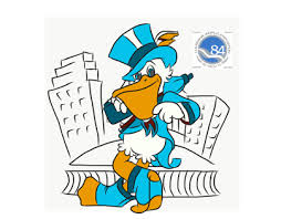
Should have done a Seymour D Fair type cartoon Pelican - a New Orleans aristocrat with spats and tophat spinning a basketball and grinning goofily. Love the Breakers looking "84" logo with the waves, etc. as well as the blue and grey colors that would have been unique to the NBA.
This post was edited on 11/21/19 at 6:00 am
Posted on 11/21/19 at 5:59 am to Large Farva
Solid but very clean look. I like it
Posted on 11/21/19 at 6:33 am to Large Farva
It’s too grey. I liked the old Brooklyn Nets shade of the hardwood

Posted on 11/21/19 at 6:48 am to Large Farva
I like it a lot
Posted on 11/21/19 at 8:41 am to SirWinston
quote:
as well as the blue and grey colors that would have been unique to the NBA
Agree about the cartoon pelican logo, but not about the colors. A few years ago a bunch of nba teams were trying to incorporate some sort of blue or gray color scheme.
Posted on 11/21/19 at 9:05 am to Large Farva
I like it. Makes Unis pop out and all of those flashy / bright shoes.

 Page 1 of 1


Popular
Back to top