- My Forums
- Tiger Rant
- LSU Recruiting
- SEC Rant
- Saints Talk
- Pelicans Talk
- More Sports Board
- Fantasy Sports
- Golf Board
- Soccer Board
- O-T Lounge
- Tech Board
- Home/Garden Board
- Outdoor Board
- Health/Fitness Board
- Movie/TV Board
- Book Board
- Music Board
- Political Talk
- Money Talk
- Fark Board
- Gaming Board
- Travel Board
- Food/Drink Board
- Ticket Exchange
- TD Help Board
Customize My Forums- View All Forums
- Show Left Links
- Topic Sort Options
- Trending Topics
- Recent Topics
- Active Topics
Started By
Message
Utah Jazz color scheme
Posted on 5/4/18 at 9:51 pm

Posted on 5/4/18 at 9:51 pm
What are they trying to be?
Southern Cal-ish jerseys? Mardi Gras colored logo?
They confuse the shite out of me.
ETA: my issue isn’t the jerseys, it’s the meshing of the two
Southern Cal-ish jerseys? Mardi Gras colored logo?
They confuse the shite out of me.
ETA: my issue isn’t the jerseys, it’s the meshing of the two
This post was edited on 5/4/18 at 10:05 pm
 12
12

Posted on 5/4/18 at 9:51 pm to tigerman03
This is going to be their permanent color scheme next year I think.

Posted on 5/4/18 at 9:52 pm to tigerman03
These jerseys suck

Posted on 5/4/18 at 9:53 pm to tigerman03
(no message)
This post was edited on 4/9/23 at 3:44 pm

Posted on 5/4/18 at 9:54 pm to NorthshoreTiger76
quote:
These jerseys suck
I love them. Such a better scheme than Mardi Gras for them

Posted on 5/4/18 at 9:55 pm to tigerman03
I like it. Maroon and orange or maroon and gold make a really good color scheme. They should keep those colors and give New Orleans back the Jazz name and colors
Posted on 5/4/18 at 9:55 pm to tiggerthetooth
I don’t have an issue with the jersey colors on it. My problem is that mixed with the purple, green and gold logo.
It’s like my eyes just drank Coke with Pop Rocks.
It’s like my eyes just drank Coke with Pop Rocks.

Posted on 5/4/18 at 9:56 pm to Dire Wolf
I like them too
Kinda like the utes a little bit
Kinda like the utes a little bit
Posted on 5/4/18 at 9:56 pm to tigerman03
They might as well change their name already
Posted on 5/4/18 at 9:56 pm to tigerman03
quote:Awesome?
What are they trying to be?
Posted on 5/4/18 at 10:03 pm to tigerman03
I like them better than....


Posted on 5/4/18 at 10:05 pm to tigerman03
They need someone to start playing some jazz around salt lake, while they are changing shite around.

Posted on 5/4/18 at 10:24 pm to tigerman03
Thanks for the pics
Posted on 5/4/18 at 10:35 pm to LosLobos111
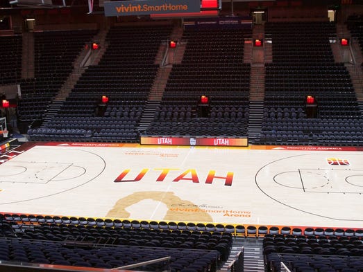
The Spectrum
quote:
The cascading color bands featured on the court and on the jersey represent the red rock formations, arches, canyons and vistas found throughout southern Utah. It’s a homage to the part of the state that, although hours aways, has always claimed the Jazz as its own.
The new court also features an outline of Delicate Arch near midcourt -- the twisting line on the right side of the jersey is the route from Salt Lake to Moab.
It’s a look that doesn’t resemble anything the Jazz have worn before. There’s no J-Note, no blue or green, no mountains and the design doesn’t even feature the word “Jazz.” All of that is by intent.
Posted on 5/4/18 at 10:36 pm to rt3
Posted on 5/4/18 at 10:39 pm to tigerman03
This is just one theme to highlight southern Utah. Next year they will have a combo that has a snow/mountain theme as an alternate.
Posted on 5/5/18 at 12:46 am to 40 Rouge
I'm guessing like the retro 90s?


This post was edited on 5/5/18 at 12:47 am

Posted on 5/5/18 at 12:51 am to tigerman03
They went with the brown and orange, Cleveland football style colors which is quite obviously a winning color combination.
I don't care about the color combinations, but it looked worse when they were down by around 30 at home. I switched to some murder show on discovery ID to improve my mood.
I don't care about the color combinations, but it looked worse when they were down by around 30 at home. I switched to some murder show on discovery ID to improve my mood.
Posted on 5/5/18 at 5:40 am to tigerman03
It’s such a sharp contrast of what their color scheme has always been. But I like bright colors, so I don’t mind it.
Posted on 5/5/18 at 5:43 am to LosLobos111
Those are gorgeous uniforms. Those should be permanent.

 Page 1 of 2

Popular
Back to top