- My Forums
- Tiger Rant
- LSU Recruiting
- SEC Rant
- Saints Talk
- Pelicans Talk
- More Sports Board
- Fantasy Sports
- Golf Board
- Soccer Board
- O-T Lounge
- Tech Board
- Home/Garden Board
- Outdoor Board
- Health/Fitness Board
- Movie/TV Board
- Book Board
- Music Board
- Political Talk
- Money Talk
- Fark Board
- Gaming Board
- Travel Board
- Food/Drink Board
- Ticket Exchange
- TD Help Board
Customize My Forums- View All Forums
- Show Left Links
- Topic Sort Options
- Trending Topics
- Recent Topics
- Active Topics
Started By
Message
re: Updated NFL Offseason Uniform Thread - 4/19/24 - Denver / Houston Leaked
Posted on 4/19/24 at 9:55 am to Gnash
Posted on 4/19/24 at 9:55 am to Gnash
New broncos and Texans uniforms are dookie. New Texans helmet looks like the Seattle Kraken logo got buttfricked by a Houston area hobo.
New Lions uniforms are elite.
New Lions uniforms are elite.
 0
0


Posted on 4/19/24 at 10:00 am to Spelt it rong
What a swing and a miss by the broncos. Woof

Posted on 4/19/24 at 10:05 am to Boodis Man
quote:
Denver uni.

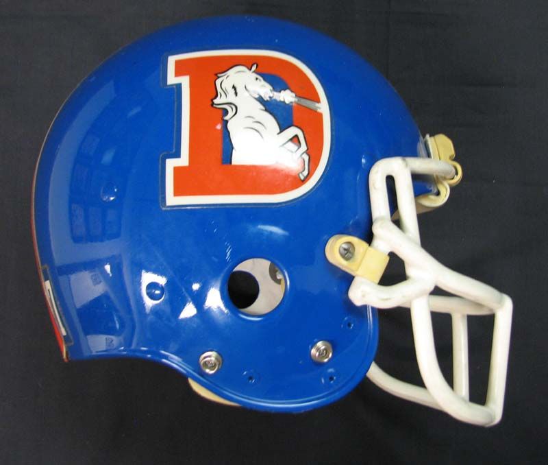
It was this easy, but they blew it.
Texans are straight garbage, but have been since the beginning.
Lions need to put stripes on all of the pants. Don't care for the black uni or the blue helmet, but pretty good. Still like the Barry Sanders uni better.

Posted on 4/19/24 at 10:05 am to David Ricky
Htown Tejano's
the H Town blue as an accent color only is stupid ,
McNair's hatred with the Oilers history is pathetic
the H Town blue as an accent color only is stupid ,
McNair's hatred with the Oilers history is pathetic

Posted on 4/19/24 at 10:07 am to Gnash
I wish the Saints would do something fresh and classic with stripes around the shoulders and down the legs. Feels like they haven’t done anything in a long time and it’s pretty bland and boring. The all whites without leg stripes ain’t it. Black helmet is also shite.

Posted on 4/19/24 at 10:12 am to David Ricky
The new Broncos jerseys are the definition of meh, but a simple change back to the lighter blue would've made a world of difference IMO.
I don't know why they dumped the red numbers on Houston's white jerseys either. They look so drab now. I also liked the old number font better. It was sharp, easy to read, and uniquely theirs. The new font looks like a knockoff of the Seahawks' clunky numbers.
I don't know why they dumped the red numbers on Houston's white jerseys either. They look so drab now. I also liked the old number font better. It was sharp, easy to read, and uniquely theirs. The new font looks like a knockoff of the Seahawks' clunky numbers.
Posted on 4/19/24 at 10:14 am to hg


Posted on 4/19/24 at 10:21 am to 91TIGER
quote:
Lions need to put stripes on all of the pants
Agree with this. The helmet and sleeve stripes with solid color pants make the uniform look cheap and incomplete. Another simple change that would've made their update perfect.

 Page 3 of 3


Popular
Back to top