- My Forums
- Tiger Rant
- LSU Recruiting
- SEC Rant
- Saints Talk
- Pelicans Talk
- More Sports Board
- Fantasy Sports
- Golf Board
- Soccer Board
- O-T Lounge
- Tech Board
- Home/Garden Board
- Outdoor Board
- Health/Fitness Board
- Movie/TV Board
- Book Board
- Music Board
- Political Talk
- Money Talk
- Fark Board
- Gaming Board
- Travel Board
- Food/Drink Board
- Ticket Exchange
- TD Help Board
Customize My Forums- View All Forums
- Show Left Links
- Topic Sort Options
- Trending Topics
- Recent Topics
- Active Topics
Started By
Message
ULM’s jerseys..
Posted on 2/15/19 at 9:57 pm
Posted on 2/15/19 at 9:57 pm

 7
7

Posted on 2/15/19 at 9:59 pm to NFLSU
Does that make LSU
Posted on 2/15/19 at 9:59 pm to NFLSU
Their Uni’s are fricking awesome.
I love the throwback while incorporating the newer Warhawk logo.
I love the throwback while incorporating the newer Warhawk logo.
This post was edited on 2/15/19 at 10:00 pm
Posted on 2/15/19 at 9:59 pm to CottonWasKing
quote:
They’re
Posted on 2/15/19 at 10:00 pm to NFLSU
Congratulations you caught a typo exactly one minute before I corrected it. I hope that makes you feel like a man because god knows your boyfriend doesn’t
Posted on 2/15/19 at 10:03 pm to CottonWasKing

Posted on 2/15/19 at 10:15 pm to CottonWasKing
Typo =/= not knowing the difference between their there and they’re
Posted on 2/15/19 at 10:18 pm to NFLSU
I think the unis are sweet
Posted on 2/15/19 at 11:20 pm to ehidal1
Never said they weren’t
Posted on 2/16/19 at 12:24 am to CottonWasKing
They were awesome & I wore them once.

Posted on 2/16/19 at 6:37 am to NFLSU
Great jerseys. Loved them. Great team. I hope they are the second best team in the nation.
Posted on 2/16/19 at 6:39 am to NFLSU
My wife asked me why they were the WartHogs?
Posted on 2/16/19 at 6:49 am to canyon
I like their new look that gives homage to the old NLU days. Even the L in ulm is retro
Posted on 2/16/19 at 7:15 am to BBJ
Growing up in north La, we always pulled for NLU and Tech, after LSU. Glad they paid homage to the old Indian gear...NLU used to have some sweet t-shirts.
Posted on 2/16/19 at 7:15 am to NFLSU
Look, the uniform design is fine and the logo is terrific. What kills them is there color scheme. There is not a more offensive color combination than red and mustard yellow. They look like a pairing of cheap condiment containers on a picnic table at a rinkeydink school fair. shite is just not very soothing on the eyes. Those colors clash like a motherfuker. And not in a good way like Clemson's blue and orange or LSU's purple and gold(yellow).
Posted on 2/16/19 at 7:34 am to nola000
quote:
Those colors clash like a motherfuker.
I think you're exaggerating the extent, but other than that I tend to agree.
That said, they're a directional school. I guess they probably benefit from having colors that stand out and are unique (at least among major D1 schools) to them.

Posted on 2/16/19 at 8:06 am to Philippines4LSU
Those colors are based on that supposedly offensive savage nickname “Indians” they had to ditch. See Washington Redskins.

Posted on 2/16/19 at 1:01 pm to NFLSU
I think they looked great, this color scheme is not used enough. Outside of LSU many people say the same thing about our unis being ugly.

Posted on 2/16/19 at 1:35 pm to 91TIGER
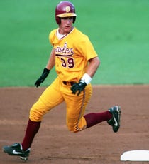
The gold on white that USC, LSU & ULM wear looks great. You would never wear gold on gold like in that second photo. That looks awful.
Posted on 2/16/19 at 5:45 pm to superwolf
quote:
You would never wear gold on gold like in that second photo.
100% agree, just can't find photos w/ yellow jersey and white pants. I love ASU unis, prefer the maroon base w/ yellow letters w/ yellow socks.


 Page 1 of 1


Popular
Back to top