- My Forums
- Tiger Rant
- LSU Recruiting
- SEC Rant
- Saints Talk
- Pelicans Talk
- More Sports Board
- Fantasy Sports
- Golf Board
- Soccer Board
- O-T Lounge
- Tech Board
- Home/Garden Board
- Outdoor Board
- Health/Fitness Board
- Movie/TV Board
- Book Board
- Music Board
- Political Talk
- Money Talk
- Fark Board
- Gaming Board
- Travel Board
- Food/Drink Board
- Ticket Exchange
- TD Help Board
Customize My Forums- View All Forums
- Show Left Links
- Topic Sort Options
- Trending Topics
- Recent Topics
- Active Topics
Started By
Message
re: Anyone else get mad about Calibri and Arial?
Posted on 1/13/17 at 9:28 am to Nado Jenkins83
Posted on 1/13/17 at 9:28 am to Nado Jenkins83
Ariail is good. What most science manuscripts are written in. It's just very universal so when I'm actually typing things I use it. But not good enough for printing. It's just bare bones nothing fancy.
Times New Roman looks too busy to me now that I'm used to Arial. Clumped and busy.
Arial is a sans-serif font
Times New Roman is a serif font so it looks more complicated and can be harder to read
This is the main reason people find switching from TNR to Arial so garish on initial use because it's very linear.
Calibri is awful I hate how that's the new MS default. Apparently it was designed to look better for HD displays where you can see pixelation in Times New Roman.
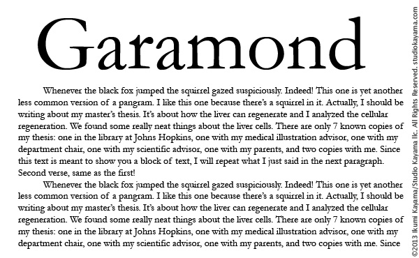
Garamond is the absolutely GOAT.
one of a handful of scientific approved fonts for manuscripts and tables. So under rated.
Garamond
Garamond
Garamond
Use that shite all the time when I need to print things that look professional.
(Helvetica's uncle essentially)

This post was edited on 1/13/17 at 9:33 am
Posted on 1/13/17 at 9:31 am to Delacroix22
I use Georgia almost exclusively. I deal with numbers a lot, and I feel like it makes the numbers easier to read.
Popular
Back to top

 1
1


