- My Forums
- Tiger Rant
- LSU Recruiting
- SEC Rant
- Saints Talk
- Pelicans Talk
- More Sports Board
- Fantasy Sports
- Golf Board
- Soccer Board
- O-T Lounge
- Tech Board
- Home/Garden Board
- Outdoor Board
- Health/Fitness Board
- Movie/TV Board
- Book Board
- Music Board
- Political Talk
- Money Talk
- Fark Board
- Gaming Board
- Travel Board
- Food/Drink Board
- Ticket Exchange
- TD Help Board
Customize My Forums- View All Forums
- Show Left Links
- Topic Sort Options
- Trending Topics
- Recent Topics
- Active Topics
Started By
Message
re: Baton Rouge's newest ice hockey team - the Baton Rouge Zydeco
Posted on 7/13/23 at 10:44 am to Eighteen

Posted on 7/13/23 at 10:44 am to Eighteen
quote:
The only positive about it is the “red stick” hockey stick
I found this to be the only bit of creativity in the logo.
quote:
The bridge in the background? Why?
I get that it's right next to downtown but it just looks so poorly done and as cheesy at the BRProud logo.
quote:
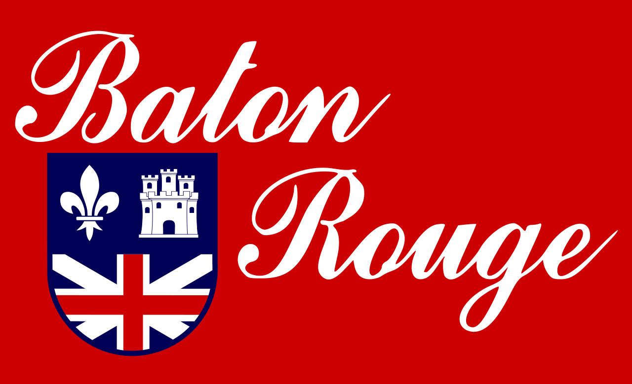
The cheesey fleur de lis in the 0
FWIW, the Baton Rouge flag does carry the fleur de lis:
Again this is extremely similar energy to when the Baby Cakes got redesigned because the organization picked some random group based out of California to try and design this with MINIMAL input from the community.
The logo carries too much of that minor league 2000s energy and the lack of symmetry in the logo is really making me annoyed.
 2
2

Posted on 7/13/23 at 10:47 am to BilbeauTBaggins
quote:
FWIW, the Baton Rouge flag does carry the fleur de lis:
But that’s my point.
There’s a Red Stick
AND a drawing of the bridge
AND a fleur de lis
because it’s Baton Rouge. and we write the word Baton Rouge in the logo , but we also have to represent it/reference 3 times in the logo because it’s Baton Rouge.
cheesy and lame

Posted on 7/13/23 at 2:53 pm to BilbeauTBaggins
quote:
the lack of symmetry in the logo is really making me annoyed.
I'm glad I'm not the only one. Having the red stick just hanging out there instead of flush against the rest of the wordmark is a horrible design element and irks the hell out of me. Like Eighteen posted earlier, it really looks like AI was used to create this.
Is it too late to change it? I'm having trouble believing all the relevant decision-makers looked at that name and logo, and thought it was perfect.

 Page 1 of 1


Popular
Back to top