- My Forums
- Tiger Rant
- LSU Recruiting
- SEC Rant
- Saints Talk
- Pelicans Talk
- More Sports Board
- Fantasy Sports
- Golf Board
- Soccer Board
- O-T Lounge
- Tech Board
- Home/Garden Board
- Outdoor Board
- Health/Fitness Board
- Movie/TV Board
- Book Board
- Music Board
- Political Talk
- Money Talk
- Fark Board
- Gaming Board
- Travel Board
- Food/Drink Board
- Ticket Exchange
- TD Help Board
Customize My Forums- View All Forums
- Show Left Links
- Topic Sort Options
- Trending Topics
- Recent Topics
- Active Topics
Started By
Message
re: Changes to Tiger Stadium Turf
Posted on 8/10/22 at 8:47 am to GetBackToWork
Posted on 8/10/22 at 8:47 am to GetBackToWork
quote:
I know why they introduced the Geaux Font (it's something that can be trademarked and licensed), but I feel like it came off the logo of some software app. There is nothing traditional or strong about it. Looks like lettering for a west coast school that plays at odd times on ESPN
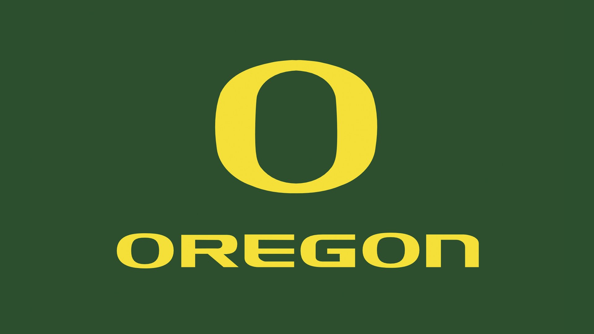
In the early to mid 2000s a handful of schools trademarked a font and acted like it was the most unique thing ever. But they are really very similar and hard to tell apart if the letters aren’t in school colors.


This post was edited on 8/10/22 at 8:53 am
Posted on 8/10/22 at 9:02 am to T
quote:
In the early to mid 2000s a handful of schools trademarked a font and acted like it was the most unique thing ever. But they are really very similar and hard to tell apart if the letters aren’t in school colors.
If you look at logos many have the same "style". Graphic design companies go on a marketing blitz, complete with some BS speech about how unique the logos are and what they "mean", and get the schools to buy in to the BS. The result is many schools end up with the same cartoonish looking crap...that cost $100k to design.
Every school has access to thousands of creative and talented kids on their campus. Just have a student contest to design a logo. I'd bet anything that would produce results 1000x greater than the shite "professional designers" come up with. And it would be a hell of a lot cheaper


Posted on 8/10/22 at 10:51 am to T
quote:
But they are really very similar and hard to tell apart if the letters aren’t in school colors.
You picked some bad examples to showcase this if so.
I'd have to see what other letters for Miami's font looks like since they only have 3 unique letters (4 if you count the U which has been in place for 50 years) and one of them is two counts of an I which is the simplest letter in the alphabet. The font looks "slimmer" than the other two and the "a" has a break in it like the U, which neither Oregon or LSU have.
The "G" "E" and "R" that Oregon and Tigers share all look nothing alike and it's not because of the school colors.
Popular
Back to top
 2
2


