- My Forums
- Tiger Rant
- LSU Recruiting
- SEC Rant
- Saints Talk
- Pelicans Talk
- More Sports Board
- Fantasy Sports
- Golf Board
- Soccer Board
- O-T Lounge
- Tech Board
- Home/Garden Board
- Outdoor Board
- Health/Fitness Board
- Movie/TV Board
- Book Board
- Music Board
- Political Talk
- Money Talk
- Fark Board
- Gaming Board
- Travel Board
- Food/Drink Board
- Ticket Exchange
- TD Help Board
Customize My Forums- View All Forums
- Show Left Links
- Topic Sort Options
- Trending Topics
- Recent Topics
- Active Topics
Started By
Message
re: Pitt Panthers: biggest logo downgrade of all time?
Posted on 9/15/24 at 9:12 pm to pioneerbasketball

Posted on 9/15/24 at 9:12 pm to pioneerbasketball
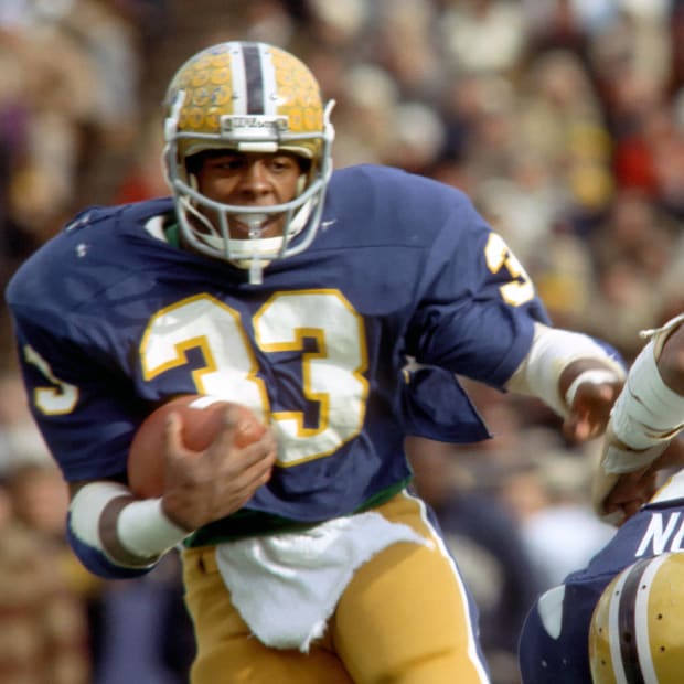
Curtis Martin
 0
0


Posted on 9/15/24 at 9:20 pm to Domeskeller
quote:
Current Pitt helmet script, which was the script in the '70s and '80s, is better than everything the OP posted, and that's all you really need for the logo.
100% this.
quote:
Old logo is awful and very difficult to use on apparel. Shocked it took this long to update.
And this.
Pitt returning to a more traditional look is one of the best recent uniform upgrades I can think of.
Posted on 9/15/24 at 9:22 pm to mizzoubuckeyeiowa
Yep, the Johnny Majors Jakie Sherrill era Pitt script helmets are the best.
The one the OP likes looks like a high school team or a CUSA team.

The one the OP likes looks like a high school team or a CUSA team.
This post was edited on 9/15/24 at 9:26 pm
Posted on 9/15/24 at 9:41 pm to JerryTheKingBawler
Looks too much like FIU
Posted on 9/15/24 at 9:49 pm to JerryTheKingBawler
Personally I'm sick as can be with navy blue color logos and uniforms - including my Astros.

 Page 2 of 2


Popular
Back to top