- My Forums
- Tiger Rant
- LSU Recruiting
- SEC Rant
- Saints Talk
- Pelicans Talk
- More Sports Board
- Coaching Changes
- Fantasy Sports
- Golf Board
- Soccer Board
- O-T Lounge
- Tech Board
- Home/Garden Board
- Outdoor Board
- Health/Fitness Board
- Movie/TV Board
- Book Board
- Music Board
- Political Talk
- Money Talk
- Fark Board
- Gaming Board
- Travel Board
- Food/Drink Board
- Ticket Exchange
- TD Help Board
Customize My Forums- View All Forums
- Show Left Links
- Topic Sort Options
- Trending Topics
- Recent Topics
- Active Topics
Started By
Message
Robinhood app question
Posted on 4/17/18 at 7:37 pm
Posted on 4/17/18 at 7:37 pm
When looking at the price charts/graph, there is a dotted horizontal line going across the chart.I
If the price rose, the graph is green and if it is losing it is red. What I don't understand is why the graph line will start above the dotted line or below the dotted line. My guess is that the dotted line signifies a monthly or quarterly average price??
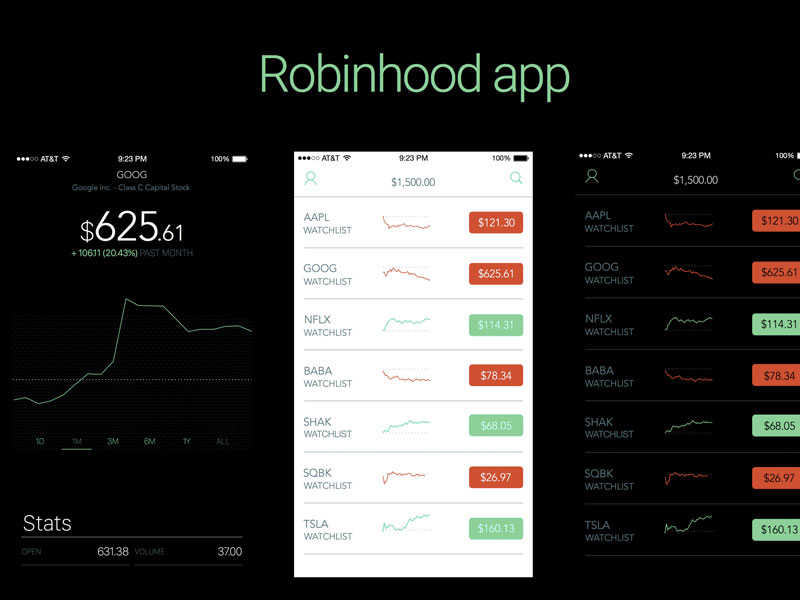
If the price rose, the graph is green and if it is losing it is red. What I don't understand is why the graph line will start above the dotted line or below the dotted line. My guess is that the dotted line signifies a monthly or quarterly average price??
This post was edited on 4/17/18 at 7:44 pm
 2
2


Posted on 4/17/18 at 8:22 pm to BHM
Wasn’t too long ago that stocks were that cheap. Wow.
Posted on 4/18/18 at 8:13 am to bayoubengals88
Netflix at 114?? Sell everything you own and buy it all.. I predict > $300

 Page 1 of 1


Popular
Back to top