- My Forums
- Tiger Rant
- LSU Recruiting
- SEC Rant
- Saints Talk
- Pelicans Talk
- More Sports Board
- Fantasy Sports
- Golf Board
- Soccer Board
- O-T Lounge
- Tech Board
- Home/Garden Board
- Outdoor Board
- Health/Fitness Board
- Movie/TV Board
- Book Board
- Music Board
- Political Talk
- Money Talk
- Fark Board
- Gaming Board
- Travel Board
- Food/Drink Board
- Ticket Exchange
- TD Help Board
Customize My Forums- View All Forums
- Show Left Links
- Topic Sort Options
- Trending Topics
- Recent Topics
- Active Topics
Started By
Message

LSU should add the tiger head logo to its end zones
Posted on 11/17/19 at 11:30 am
Posted on 11/17/19 at 11:30 am
I was struck by how nice Baylor’s endzone decorations looked last night. They have a bear head logo in their end zones next to the word marks to not leave so much dead space.
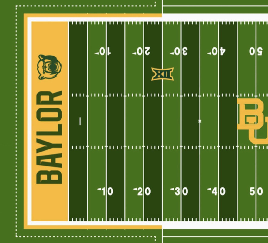
LSU should do this as well as we have beautiful end zones and field decorations, but too much dead space in our end zones
LSU should do this as well as we have beautiful end zones and field decorations, but too much dead space in our end zones
This post was edited on 11/17/19 at 11:33 am
 4
4

Posted on 11/17/19 at 11:31 am to SirWinston
Toonces?
Posted on 11/17/19 at 11:32 am to genuineLSUtiger
Definitely not toonces
Posted on 11/17/19 at 11:32 am to genuineLSUtiger
No this one

It looks hard, but it would really just be a $1500 stencil that you paint over. Would probably take 30 extra mins for each side.
It looks hard, but it would really just be a $1500 stencil that you paint over. Would probably take 30 extra mins for each side.
This post was edited on 11/17/19 at 11:36 am

Posted on 11/17/19 at 11:33 am to SirWinston
I love the current design
quote:Sometimes less is more
too much dead space in our end zones

Posted on 11/17/19 at 11:35 am to Tiger Prawn
I don't think it would look as good as you think. The tiger head logo has too much purple and gold to be placed in both purple and gold endzones. They'd have to take the purple out of the logo in the purple end zone and vice versa in the yellow one
Posted on 11/17/19 at 11:36 am to purplepylon
You could just add a white outline to the letters and the logos
Posted on 11/17/19 at 11:36 am to SirWinston
Anyone with photoshop skills got time on their hands? 
Posted on 11/17/19 at 11:38 am to SirWinston
Posted on 11/17/19 at 11:40 am to SirWinston
quote:
You could just add a white outline to the letters and the logos
Adding a white outline in the gold end zone won't accomplish anything. It will all run together
Posted on 11/17/19 at 11:41 am to Florida225
YES PLEASE. Let's go back to the block LSU. We get it, they spent money on geaux font. They've made that money back by now. Leave geaux font on all the apparel, and make the endzones old school again.

Posted on 11/17/19 at 11:41 am to Florida225
Yes bring back the big LSU block letters
Posted on 11/17/19 at 11:50 am to Florida225
Yah those are GOAT but I figure there’s zero chance as Nike has embedded themselves so deeply in our program and wants the geaux font everywhere. They tried like hell to get LSU to use the geaux font on our helmets instead of the block letters during the revamp a few years ago 
This post was edited on 11/17/19 at 11:51 am

 Page 1 of 1


Popular
Back to top