- My Forums
- Tiger Rant
- LSU Recruiting
- SEC Rant
- Saints Talk
- Pelicans Talk
- More Sports Board
- Winter Olympics
- Fantasy Sports
- Golf Board
- Soccer Board
- O-T Lounge
- Tech Board
- Home/Garden Board
- Outdoor Board
- Health/Fitness Board
- Movie/TV Board
- Book Board
- Music Board
- Political Talk
- Money Talk
- Fark Board
- Gaming Board
- Travel Board
- Food/Drink Board
- Ticket Exchange
- TD Help Board
Customize My Forums- View All Forums
- Show Left Links
- Topic Sort Options
- Trending Topics
- Recent Topics
- Active Topics
Started By
Message
re: Logo help please
Posted on 6/16/16 at 4:27 pm to idlewatcher

Posted on 6/16/16 at 4:27 pm to idlewatcher

 1
1

Posted on 6/16/16 at 6:16 pm to idlewatcher
So my focus group (the women at work which is the demographic I'm selling to) don't know what "that thing at the top" is. They like the general idea. Here's what my wife sent with the suggestion the circle is a saw blade and the X is two nails:
Posted on 6/16/16 at 10:19 pm to Coon
What is the thing at the top? I've done hundreds of framing inspections, and can't figure it out. Is it a lathe?
This post was edited on 6/16/16 at 10:20 pm
Posted on 6/16/16 at 10:46 pm to CCTider
Bench plane. More commonly referred to as "fricking planer."
This post was edited on 6/16/16 at 10:47 pm
Posted on 6/17/16 at 9:04 am to Coon
Who gives a shite what a women's focus group knows or doesn't know. You're not gearing your company towards women, you're gearing it toward woodworking and people who would know what a planer actually is.
Good idea about the two nails, I'll give you that
Good idea about the two nails, I'll give you that
Posted on 6/17/16 at 9:45 am to idlewatcher
No, I AM gearing it towards women. White women. White women with money to spend. If I just throw the words "reclaimed cypress" out there, it's like shooting fish in a barrel. It's like white woman kryptonite.
Posted on 6/17/16 at 10:09 am to Coon
quote:
I AM gearing it towards women. White women
Sound like a racist to me
Try this brah

Those original files you uploaded (saw, etc.) were all .png files which do not translate well for logos. As you can see, there are tailings on the edges. I'll try and find one which will work. Let me know what to add/delete/etc.
Posted on 6/17/16 at 10:49 am to idlewatcher
quote:
idlewatcher
Seems like you really "nailed it" this time
Posted on 6/17/16 at 11:30 am to Coon
quote:
If I just throw the words "reclaimed cypress" out there, it's like shooting fish in a barrel.
I know a guy:

Posted on 6/17/16 at 11:56 am to idlewatcher
Focus group responded. Make saw blade black and a little bolder and make the words larger and possible bolder. Comments were "your eyes go straight to the nails because they're so dark, need to fill in that empty space, too much empty space.
Also, send me your burner email, might have to send you a gift card for this hard work....
Also, send me your burner email, might have to send you a gift card for this hard work....
Posted on 6/17/16 at 1:31 pm to Coon

Maybe you should include a slogan or something as well.
quote:
Also, send me your burner email, might have to send you a gift card for this hard work....
Appreciate it, but not necessary. Happy to help - especially new business owners.
Posted on 6/17/16 at 2:57 pm to Coon

Posted on 6/17/16 at 3:06 pm to soccerfüt

Posted on 6/18/16 at 2:12 pm to idlewatcher
Ha, I approve this message!
Posted on 6/23/16 at 1:48 pm to idlewatcher
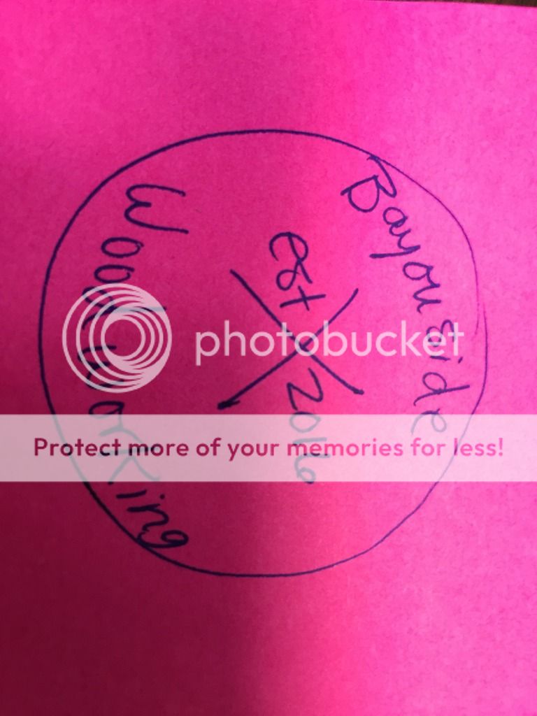
Last changes.....
Make the saw blade less bold (basically between the current and last one)
Make the text "Bayouside" and "Woodworking" a little holder and fit to the boxes I have drawn. Make the text "est." and "2016" the size of the boxes I have drawn. Just seems like a lot of empty space.
Thoughts?
Make the saw blade less bold (basically between the current and last one)
Make the text "Bayouside" and "Woodworking" a little holder and fit to the boxes I have drawn. Make the text "est." and "2016" the size of the boxes I have drawn. Just seems like a lot of empty space.
Thoughts?
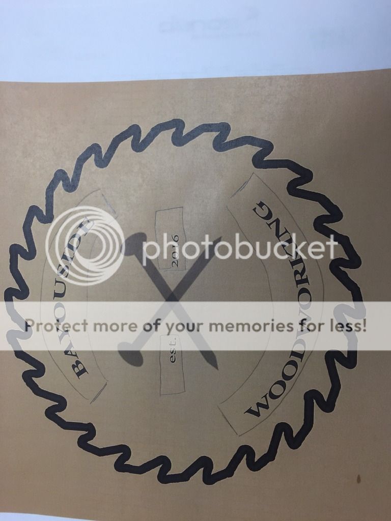
Posted on 6/23/16 at 3:10 pm to Coon

How's this?
What was that which you printed on? A cardboard box?
Notes:
1. BSW font in 80 pt from 72 pt
2. Stroke on saw blade from 6 to 3 pixels
3. "est. 2016" font from 48 pt to 72 pt to help fill the space
Posted on 6/23/16 at 4:09 pm to idlewatcher
Looks good. Forgot to ask if you can make it just the saw blade and inside so I can drop it on letterhead and it just be the circle (not the sepia square).
That's just printed on a regular sheet of paper.
That's just printed on a regular sheet of paper.
Posted on 6/23/16 at 4:51 pm to Coon
Let me do a bit of research on the best way to save it. When I created my company logo, it was a PDF vector and was done in Illustrator (which I no longer have).
I'll look into tonight and get back with you tomorrow.
I'll look into tonight and get back with you tomorrow.
Posted on 6/23/16 at 11:36 pm to Coon
See if this will work:

I think it should. Print it out on a piece of paper and see how it prints. Most of these files typically are in .AI/PDF/.PSD just FYI as they tend to be far clearer and doesn't have the 'haze'.
Notes:
Removed sepia background
Rasterized layer
"Save for web" from .gif to .png24
Bonus - threw together a sample letterhead to see how it would flow. Looks pretty good if you ask me but you can make your own in MS Word or some other program and change the border colors or add shapes, etc..
This post was edited on 6/24/16 at 12:01 am

 Page 2 of 3

Popular
Back to top