- My Forums
- Tiger Rant
- LSU Recruiting
- SEC Rant
- Saints Talk
- Pelicans Talk
- More Sports Board
- Fantasy Sports
- Golf Board
- Soccer Board
- O-T Lounge
- Tech Board
- Home/Garden Board
- Outdoor Board
- Health/Fitness Board
- Movie/TV Board
- Book Board
- Music Board
- Political Talk
- Money Talk
- Fark Board
- Gaming Board
- Travel Board
- Food/Drink Board
- Ticket Exchange
- TD Help Board
Customize My Forums- View All Forums
- Show Left Links
- Topic Sort Options
- Trending Topics
- Recent Topics
- Active Topics
Started By
Message
re: Who here is in a union? Do you feel it helps or hurts?
Posted on 1/9/20 at 2:38 pm to BabyTac
Posted on 1/9/20 at 2:38 pm to BabyTac
unions undoubtedly have many problems, and are ripe for the greedy and corrupt. there's no two ways about that.
however, I'd love to hear one of the many, many very intelligent and thoughtful neocon posters here explain how the graph below is illegitimate
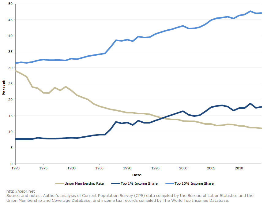
however, I'd love to hear one of the many, many very intelligent and thoughtful neocon posters here explain how the graph below is illegitimate
 4
4

Posted on 1/9/20 at 2:40 pm to HT713
quote:
neocon posters
quote:
not here to argue.


Posted on 1/9/20 at 5:09 pm to HT713
quote:
I'd love to hear one of the many, many very intelligent and thoughtful neocon posters here
Posted on 1/9/20 at 5:42 pm to HT713
quote:I do not meet any of the criteria for the type of person you are hoping to hear from.
however, I'd love to hear one of the many, many very intelligent and thoughtful neocon posters here explain how the graph below is illegitimate
But it does occur to me that the graph you posted is highly misleading. Superimposing separate rates in one chart is a very clever way for the very intelligent people you spoke of to delude not so intelligent people into thinking that superimposed graph lines imply a causal relationship. We could also superimpose graphs that reflect changing trends in the growing share of Americans who obtain college degrees instead of union membership participation rates, and that too might suggest a causal relationship (and may even be more plausible). We could do it with a graph showing the increase in complexity of managing large businesses and corporations over time (as measured by the increases in various regulations and so on), and that too might be a plausible correlation to explain why our top income earners are growing a larger share of the nation’s income.
But suppose we included a trend line reflecting the share of Americans who report to drink milk (it’s been declining over the years). Would you then automatically assume that drinking less milk is a cause or an effect of participating in unions? Or a cause or effect in growing the share of wealth generated by our top value producers? Of course you wouldn’t. That would be ridiculous. So why be intrigued at the range of conclusions that could possibly be drawn by the presence of a graph charting a reduction in labor union participation?
Posted on 1/9/20 at 5:55 pm to HT713
Cool graph posted with no context, bro.
Nevermind, you are not worth engaging. Continue your regularly scheduled sky-scream.
quote:
neocon posters
Nevermind, you are not worth engaging. Continue your regularly scheduled sky-scream.

 Page 1 of 1


Popular
Back to top