- My Forums
- Tiger Rant
- LSU Recruiting
- SEC Rant
- Saints Talk
- Pelicans Talk
- More Sports Board
- Winter Olympics
- Fantasy Sports
- Golf Board
- Soccer Board
- O-T Lounge
- Tech Board
- Home/Garden Board
- Outdoor Board
- Health/Fitness Board
- Movie/TV Board
- Book Board
- Music Board
- Political Talk
- Money Talk
- Fark Board
- Gaming Board
- Travel Board
- Food/Drink Board
- Ticket Exchange
- TD Help Board
Customize My Forums- View All Forums
- Show Left Links
- Topic Sort Options
- Trending Topics
- Recent Topics
- Active Topics
Started By
Message
Logo help please
Posted on 6/15/16 at 10:32 pm
Posted on 6/15/16 at 10:32 pm
I'd appreciate some assistance with a logo I need...
Sepia background
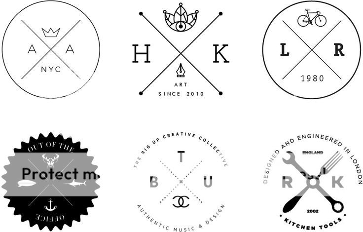
A circular logo similar to the top right in this image:
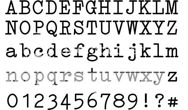
With the lower case letter b on the left and w on the right, in type font similar to this:
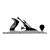
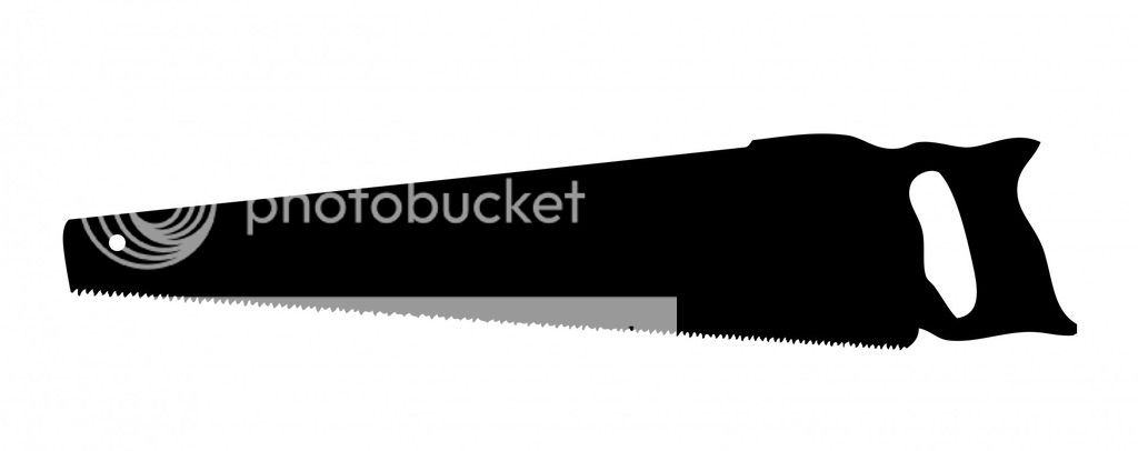
For top image in the X I'd like this silhouette:
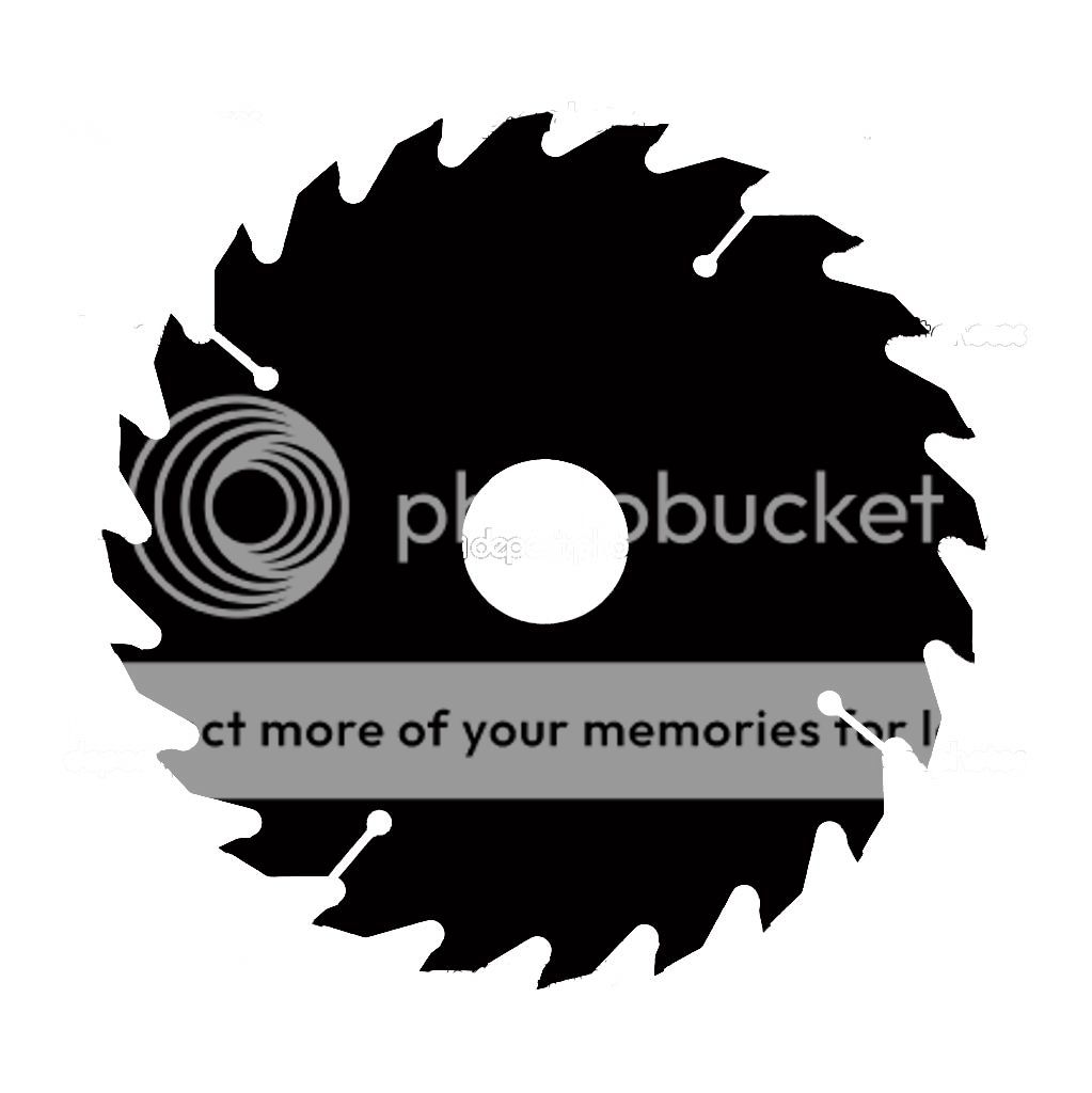
And for the bottom image id like either of these (whichever looks better):
Sepia background
A circular logo similar to the top right in this image:
With the lower case letter b on the left and w on the right, in type font similar to this:
For top image in the X I'd like this silhouette:
And for the bottom image id like either of these (whichever looks better):
 5
5

Posted on 6/16/16 at 8:55 am to Coon
Is this for an organization looking to hunt and saw apart the Loch Ness monster?
Posted on 6/16/16 at 9:04 am to PowerTool
Hahahah. That's what t looks like.
This post was edited on 6/16/16 at 9:05 am

Posted on 6/16/16 at 11:15 am to Coon
Do you know the name of that font?
Posted on 6/16/16 at 11:20 am to idlewatcher
No, I just searched type font. Doesn't need to be that exact one, something similar will do.
For added bonus, the name of my company is Bayouside Woodworking if someone wants to make something with that as well. And by company I mean selling stuff I make in my shed to enable me to buy more stuff for my shed and make more stuff to sell.
For added bonus, the name of my company is Bayouside Woodworking if someone wants to make something with that as well. And by company I mean selling stuff I make in my shed to enable me to buy more stuff for my shed and make more stuff to sell.
Posted on 6/16/16 at 12:18 pm to poochie
I love pictograms.
Posted on 6/16/16 at 1:01 pm to Coon
quote:
No, I just searched type font. Doesn't need to be that exact one, something similar will do.
I can probably figure it out.
ETA:
IntellectaTypewriter Regular
This post was edited on 6/16/16 at 1:15 pm
Posted on 6/16/16 at 2:01 pm to Coon

Posted on 6/16/16 at 2:22 pm to Coon
Something along this line I'm assuming?

I think it would look good with the text around the circle. Better yet, making the text part of the circle and the lines would continue before and after the text.
I think it would look good with the text around the circle. Better yet, making the text part of the circle and the lines would continue before and after the text.
Posted on 6/16/16 at 2:32 pm to idlewatcher
That looks good. A few thoughts for consideration:
•Background a little lighter
•Center the b and w in their respected quadrants
•Do you think lower case is good there or should we go upper case?
I really like the graphics in general. I also like the idea of having the wording as part of the circle but don't know about having the words and the b w would be redundant. If the words are part of the circle, maybe could put another graphic in the right and left quadrants. Or a graphic on the two sides and top and "est. 2016" in the bottom. The third graphic could be a hammer silhouette.
Thoughts?
Posted on 6/16/16 at 2:38 pm to Coon
Maybe instead of the circle use the saw blade edges. Also I prefer uppercase letters and just 2 graphics not 4
Posted on 6/16/16 at 2:57 pm to jp90
I like that if it's just the edge. Not sure on the full black saw blade with white images.

Posted on 6/16/16 at 3:02 pm to Coon
Here's my charity for the year.

Posted on 6/16/16 at 3:11 pm to DesignTiger
That's a cool background - the old photograph look.
Coon - I like the blade at the bottom. Don't mind the text for now.

Coon - I like the blade at the bottom. Don't mind the text for now.
Posted on 6/16/16 at 3:20 pm to idlewatcher
what about the hammer in the top middle in the left quadrant, remove the saw at the bottom and add "est. 2016"

Posted on 6/16/16 at 3:30 pm to Coon

The clarity on the image of the hammer you posted is junk FYI.
Posted on 6/16/16 at 3:34 pm to idlewatcher
i think if you tilt the hammer 45 deg clockwise and make the words part of the circle we might be onto something...
Posted on 6/16/16 at 3:41 pm to Coon
:elevator music:
Posted on 6/16/16 at 3:44 pm to idlewatcher


 Page 1 of 3

Popular
Back to top