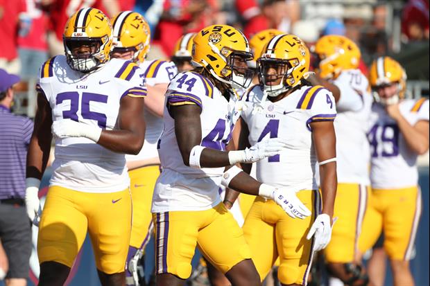
Here is the new LSU Tiger head logo:
quote:

Michael Bonnette @LSUBonnette
The new #LSU Tiger head logo makes its debut on the @lsufball helmet for today's spring game.
Image Link
Thoughts?
Filed Under: LSU Football

Comments

15 Comments
user avatar
I thought the fleur de lis was going to be in his mouth!
Reply111 months
user avatar
Booooooooooooooo!
Reply111 months
user avatar
Personally, I didn't see anything wrong with the old one. The ears on this one look like they are laid down on the head-awkward. Also the white accents are also too symmetrical. I wish they'd just leave well enough alone. Having said that, nobody is going to really notice it on the actual helmets on the field, pretty much like no one noticed the old one on the helmets either.
Reply112 months
user avatar
Awesome.... No Super Awesome!!!
Reply112 months
user avatar
No wonky/lazy eye? I like it. I am not scared of change
Reply112 months
user avatar
I consider myself a traditionalist when it comes to this stuff and I think the Tiger uniform is sacred.

That all said, this change is an improvement and I hope they keep it for the next hundred years.
Reply112 months
user avatar
You people are insane?!? Are you forgetting what this replacing? Toonces anyone? This is designed after the helmet emblem to be the new logo that replaces toonces on merchandise, etc . It is not going on the helmet folks.
Reply116 months
user avatar
I was scared just looking at it , jk it's terrible . They would be better off with Bengal tiger stripes
Reply116 months
user avatar
Looks great. Every single negative comment is simply wrong. sorry
Reply116 months
user avatar
19
upvote4downvote1
LSU football unis and logos are sacred ground. Will they never fricking learn???!!!

Toonces II...The nightmare continues.
Reply116 months
user avatar
LSU, quit trying to fit things that are not broken. DISLIKE!!!!!!!
Reply116 months
user avatar
Not good. Looks like the ears are down. Who comes up with this stuff? Looks as bad as the center of the PMAC.
Reply116 months
user avatar
Old logo came from an actual pic of Mike growling, and looked better. Why do they need to change it?
Reply116 months
user avatar
looks like a toy
Reply116 months
Popular Stories