- My Forums
- Tiger Rant
- LSU Recruiting
- SEC Rant
- Saints Talk
- Pelicans Talk
- More Sports Board
- Fantasy Sports
- Golf Board
- Soccer Board
- O-T Lounge
- Tech Board
- Home/Garden Board
- Outdoor Board
- Health/Fitness Board
- Movie/TV Board
- Book Board
- Music Board
- Political Talk
- Money Talk
- Fark Board
- Gaming Board
- Travel Board
- Food/Drink Board
- Ticket Exchange
- TD Help Board
Customize My Forums- View All Forums
- Show Left Links
- Topic Sort Options
- Trending Topics
- Recent Topics
- Active Topics
Started By
Message
re: Baton Rouge's newest ice hockey team - the Baton Rouge Zydeco
Posted on 7/13/23 at 10:34 am to SuperSaint
Posted on 7/13/23 at 10:34 am to SuperSaint
Good god, wtf is wrong with this city. Kingfish had sentimental appeal, a cool logo and a unique name.
Zydeco…in Baton Rouge?
Not easy to have a mascot or represent
This logo

The only positive about it is the “red stick” hockey stick
The bridge in the background? Why?
The cheesey fleur de lis in the 0
It feels like they used AI to name and create this to be honest.
Beyond horrible. Do they not even run this by people to get feedback? What were the other options that didn’t get chosen?
Zydeco…in Baton Rouge?
Not easy to have a mascot or represent
This logo
The only positive about it is the “red stick” hockey stick
The bridge in the background? Why?
The cheesey fleur de lis in the 0
It feels like they used AI to name and create this to be honest.
Beyond horrible. Do they not even run this by people to get feedback? What were the other options that didn’t get chosen?
This post was edited on 7/13/23 at 10:37 am
 3
3

Posted on 7/13/23 at 10:40 am to Eighteen
If they wanted a music related name how about the Baton Rouge Blues? At least we have a connection to the blues.
I’m guessing there might be trademark issues with Kingfish. Even after all these years it might be considered IP of whatever entity the ECHL was passed on to/turned into.
I’m guessing there might be trademark issues with Kingfish. Even after all these years it might be considered IP of whatever entity the ECHL was passed on to/turned into.
Posted on 7/13/23 at 10:43 am to Eighteen
quote:
It feels like they used AI to name and create this to be honest.
well I mean frick, I hope they didn't pay anyone for this shite

Posted on 7/13/23 at 10:44 am to Eighteen
quote:
The only positive about it is the “red stick” hockey stick
I found this to be the only bit of creativity in the logo.
quote:
The bridge in the background? Why?
I get that it's right next to downtown but it just looks so poorly done and as cheesy at the BRProud logo.
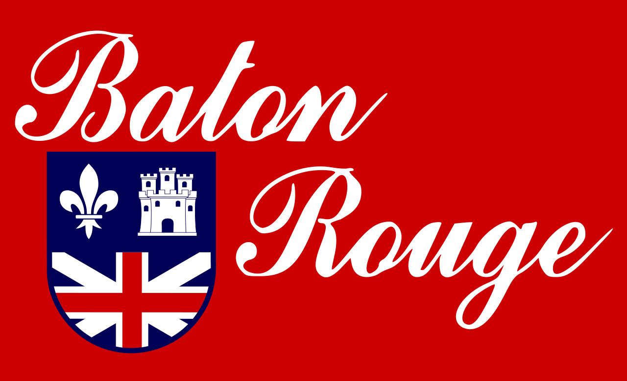
quote:
The cheesey fleur de lis in the 0
FWIW, the Baton Rouge flag does carry the fleur de lis:
Again this is extremely similar energy to when the Baby Cakes got redesigned because the organization picked some random group based out of California to try and design this with MINIMAL input from the community.
The logo carries too much of that minor league 2000s energy and the lack of symmetry in the logo is really making me annoyed.

 Page 1 of 1


Popular
Back to top