- My Forums
- Tiger Rant
- LSU Recruiting
- SEC Rant
- Saints Talk
- Pelicans Talk
- More Sports Board
- Fantasy Sports
- Golf Board
- Soccer Board
- O-T Lounge
- Tech Board
- Home/Garden Board
- Outdoor Board
- Health/Fitness Board
- Movie/TV Board
- Book Board
- Music Board
- Political Talk
- Money Talk
- Fark Board
- Gaming Board
- Travel Board
- Food/Drink Board
- Ticket Exchange
- TD Help Board
Customize My Forums- View All Forums
- Show Left Links
- Topic Sort Options
- Trending Topics
- Recent Topics
- Active Topics
Started By
Message
re: Worst Logo Changes in Sports History
Posted on 11/30/22 at 1:48 pm to SirWinston

Posted on 11/30/22 at 1:48 pm to SirWinston
quote:
If they had kept the same colours and classic uniforms the logo wouldn't be that bad
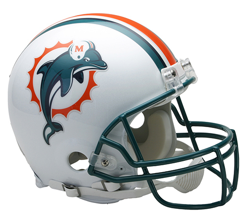
I'm going to be honest, I will never understand why Miami is always mentioned as having such a bad rebrand. Of all the NFL franchises who have rebranded the past 15-20 years, Miami had probably the most minor of changes. So they use a brighter shade of green, changed the font of the numbers, and took the helmet off the dolphin in their logo. What else am I missing?
To me, it's just a modernized version of what they've always worn. They didn't reinvent the wheel with their rebrand


/cdn.vox-cdn.com/uploads/chorus_asset/file/23886244/1240878555.jpg)
This post was edited on 11/30/22 at 1:50 pm
 2
2

Posted on 11/30/22 at 3:14 pm to lsufball19
quote:
So they use a brighter shade of green, changed the font of the numbers, and took the helmet off the dolphin in their logo.
Individually, those changes may not be much. Altogether, I think they were all downgrades. No need to fix something that isn’t broken.

Posted on 11/30/22 at 4:22 pm to lsufball19
The current “dolphin” on the helmet looks like a whale

 Page 1 of 1


Popular
Back to top