- My Forums
- Tiger Rant
- LSU Recruiting
- SEC Rant
- Saints Talk
- Pelicans Talk
- More Sports Board
- Fantasy Sports
- Golf Board
- Soccer Board
- O-T Lounge
- Tech Board
- Home/Garden Board
- Outdoor Board
- Health/Fitness Board
- Movie/TV Board
- Book Board
- Music Board
- Political Talk
- Money Talk
- Fark Board
- Gaming Board
- Travel Board
- Food/Drink Board
- Ticket Exchange
- TD Help Board
Customize My Forums- View All Forums
- Show Left Links
- Topic Sort Options
- Trending Topics
- Recent Topics
- Active Topics
Started By
Message
re: Worst Logo Changes in Sports History
Posted on 11/29/22 at 4:03 pm to Mufassa
Posted on 11/29/22 at 4:03 pm to Mufassa
quote:
YouTube vid
Great video explaining the trend
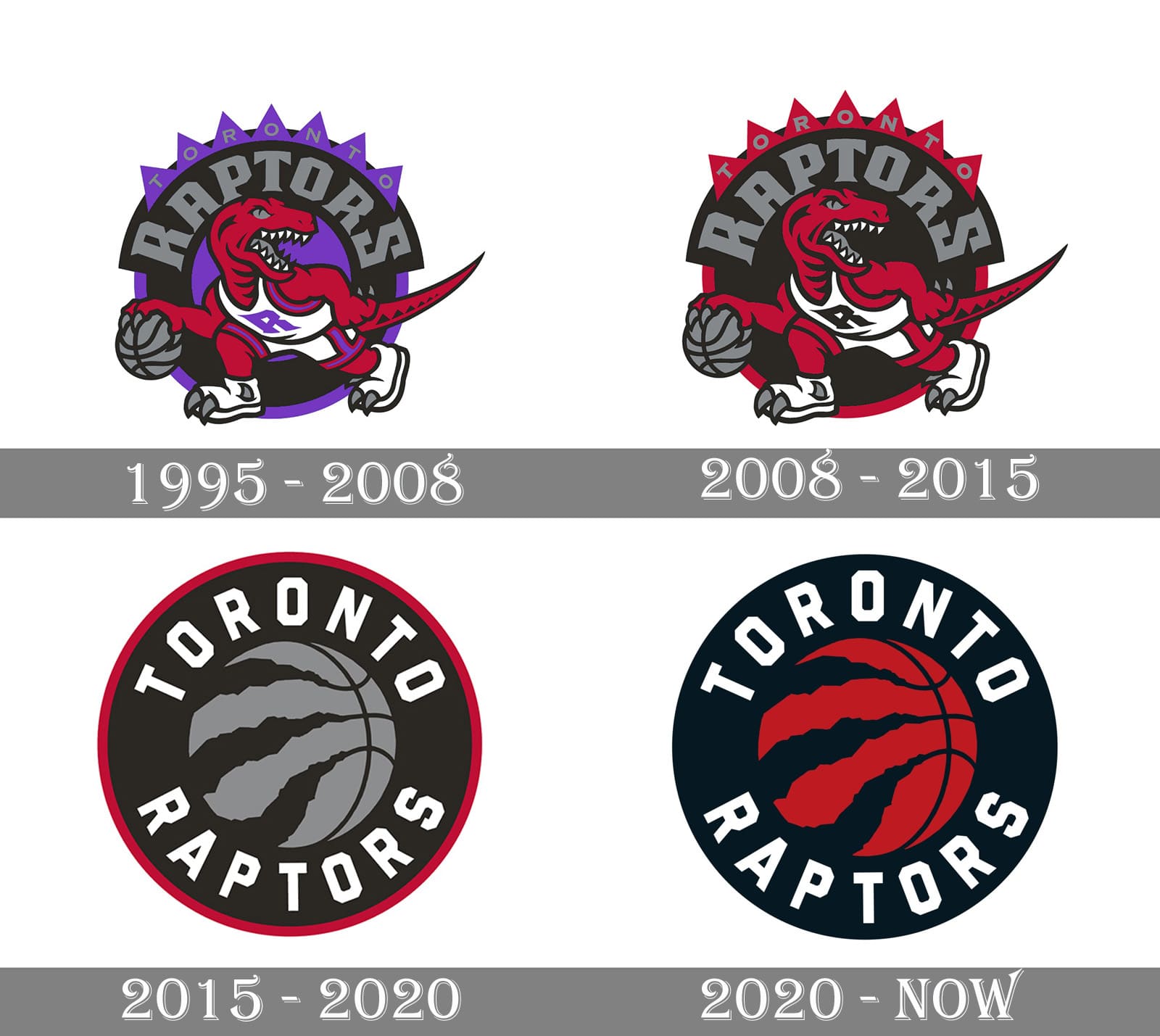
I spent a lot of time in the field of "brand design" and have watched trends come and go. The push to "flat" design has been driven directly by two things. First like they state in the video, mobile first, better yet, mobile native design. You need a brand mark to be clearly legible on what are truly small spaces. Also, additional color and design can be detrimental to page download times, especially when you're considering mobile data trasfer.
Second is flexibility and reuse. How current CMSs (content management systems) work is that you upload one SVG file and the backend of the CMS deploys the logo for mobile, desktop, tablet and everything in between. So that one cached image populates across your site in various sizes and places. So that means the more simple and flexible your logo is, the better it will be for wide use across digital properties. That's where 90+% of the places where your brand is viewed.
I personally like the more refined look of the corporate logos today. Sports logos on the hand should be reserved to have character and unique styles.
That said, the trend shifts every five years or so. Since things have turned so sterile, I imagine that some handcrafted type elements will start making their way back into brand design.
Popular
Back to top
 1
1


