- My Forums
- Tiger Rant
- LSU Recruiting
- SEC Rant
- Saints Talk
- Pelicans Talk
- More Sports Board
- Fantasy Sports
- Golf Board
- Soccer Board
- O-T Lounge
- Tech Board
- Home/Garden Board
- Outdoor Board
- Health/Fitness Board
- Movie/TV Board
- Book Board
- Music Board
- Political Talk
- Money Talk
- Fark Board
- Gaming Board
- Travel Board
- Food/Drink Board
- Ticket Exchange
- TD Help Board
Customize My Forums- View All Forums
- Show Left Links
- Topic Sort Options
- Trending Topics
- Recent Topics
- Active Topics
Started By
Message
Can Someone Please Help With This Logo? Simple Fix
Posted on 3/4/16 at 9:02 am

Posted on 3/4/16 at 9:02 am
Please help with this!! My Photoshop is not working. Its a change of name in a business

Above is the type of logo that I'm wanting.
Below is the name of the business and type of font I want incorporated in the above logo.
So where it says "SAWMILL", replace with "MILL". Replace "WOODSTORE" with "PROPERTIES" and "SERVICE" with "CREEK".
Mill Creek Properties name of the new business
Need Lucida Handwriting font used for the wording please.
Here's one missing the words
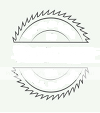
Thanks in the advance!!!

Above is the type of logo that I'm wanting.
Below is the name of the business and type of font I want incorporated in the above logo.
So where it says "SAWMILL", replace with "MILL". Replace "WOODSTORE" with "PROPERTIES" and "SERVICE" with "CREEK".
Mill Creek Properties name of the new business
Need Lucida Handwriting font used for the wording please.
Here's one missing the words
Thanks in the advance!!!
This post was edited on 3/4/16 at 9:06 am
 2
2


Posted on 3/4/16 at 9:56 am to Meateye
quote:
Need Lucida Handwriting font used for the wording please.
I have that installed already but it's in italics only. You sure that's the proper font?
Posted on 3/4/16 at 10:00 am to idlewatcher

Posted on 3/4/16 at 2:53 pm to Meateye
A quick pass.


IMO, I think you should change "PROPERTIES" to either a different font altogether or have "MILL CREEK" on the top line and "PROPERTIES" on the bottom line. In the middle, in a bolded font, you can use the date of whenever your company was incorporated.
FYI - that font isn't the best. It has a 250 kerning spacing and still looks like garbage. Are you sold on that font?
Posted on 3/4/16 at 4:06 pm to Meateye
SMH... This is why people who care about the image of their business hire professionals to design their logo.
This post was edited on 3/4/16 at 4:07 pm
Posted on 3/4/16 at 5:14 pm to idlewatcher

Here is what I think you're looking for with a few little extra modifications.
I do have to agree with Idlewatcher here though on the font. Lucida Handwriting is just not really suited for something like this. Part of what makes the original logo that you are trying to build from so nice looking is that there is a lot of inferred symmetry and the words within the blade are long enough to work properly in the allotted space.
We can try some other things with the PS file I have built for this, but it will likely not be until after the weekend if you need something else.
Posted on 3/5/16 at 8:30 am to LuckyInKentucky
Looks great Lucky. For a logo like that, certainly a different font would look better; particularly in the middle space.
Posted on 3/5/16 at 3:22 pm to idlewatcher
I agree with yall about the font. They all look great but a different font would look better. If yall could just make one how you think it would look better that would be awesome. Thanks!!

 Page 1 of 1


Popular
Back to top