- My Forums
- Tiger Rant
- LSU Recruiting
- SEC Rant
- Saints Talk
- Pelicans Talk
- More Sports Board
- Fantasy Sports
- Golf Board
- Soccer Board
- O-T Lounge
- Tech Board
- Home/Garden Board
- Outdoor Board
- Health/Fitness Board
- Movie/TV Board
- Book Board
- Music Board
- Political Talk
- Money Talk
- Fark Board
- Gaming Board
- Travel Board
- Food/Drink Board
- Ticket Exchange
- TD Help Board
Customize My Forums- View All Forums
- Show Left Links
- Topic Sort Options
- Trending Topics
- Recent Topics
- Active Topics
Started By
Message
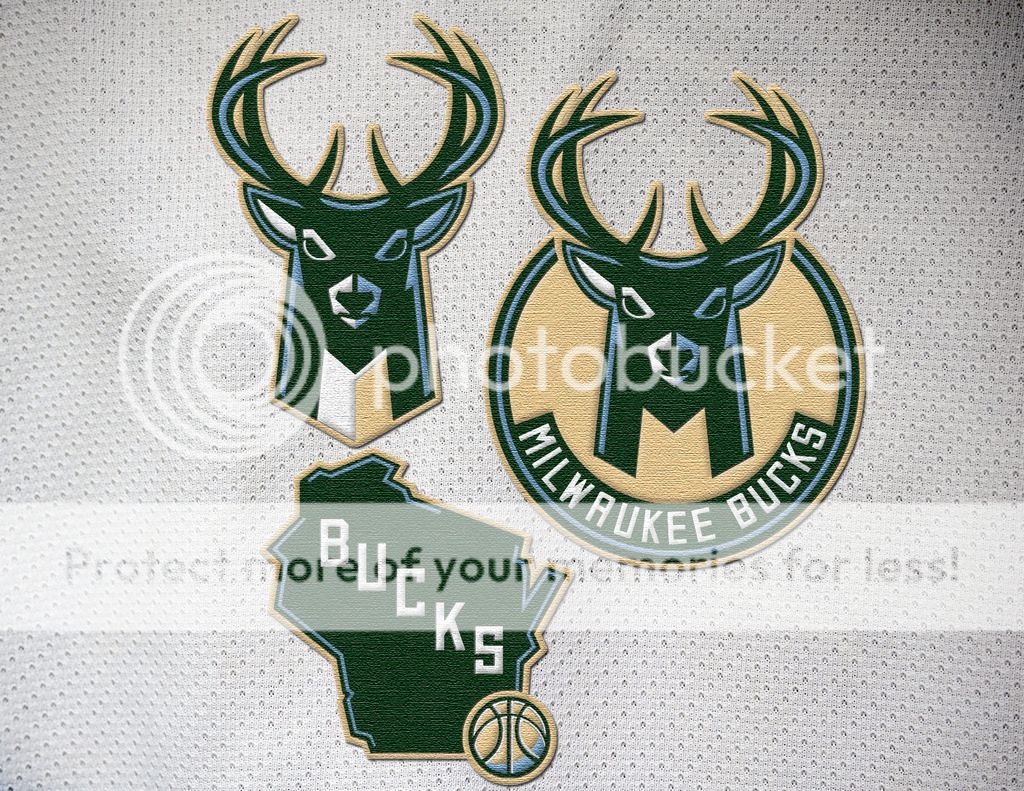
re: Milwaukee Bucks New Logos and Colors
Posted on 4/15/15 at 1:15 pm to GeauxColonels

Posted on 4/15/15 at 1:15 pm to GeauxColonels
And I just got my Bucks shirt for making over $800 of purchases from Uline 
 0
0

Posted on 4/15/15 at 1:19 pm to GeauxColonels
Cream City Cream

Posted on 4/15/15 at 3:07 pm to goldenbadger08
quote:
Because it doesn't belong? It represents Wisconsin's lakes and rivers.
Where would you put it in the other two logos?
Basically, someone else has already answered that question with some logo tweaks:
Posted on 4/15/15 at 3:10 pm to GeauxColonels
Big improvement over the old logo. The shape is better and it was good to get rid of the red which really did give a Christmas vibe when combined w/ the green. If I were a fan of the team I would be very happy w/ this change.
Posted on 4/15/15 at 3:13 pm to GeauxColonels
That looks a lot better
Posted on 4/15/15 at 3:13 pm to GeauxColonels
I really like these. The bucks antlers forming the basketball in the middle is cool.
Posted on 4/15/15 at 3:24 pm to GeauxColonels
Lol, ew. Definitely does not enhance the logo in any way.

 Page 3 of 3


Popular
Back to top