- My Forums
- Tiger Rant
- LSU Recruiting
- SEC Rant
- Saints Talk
- Pelicans Talk
- More Sports Board
- Fantasy Sports
- Golf Board
- Soccer Board
- O-T Lounge
- Tech Board
- Home/Garden Board
- Outdoor Board
- Health/Fitness Board
- Movie/TV Board
- Book Board
- Music Board
- Political Talk
- Money Talk
- Fark Board
- Gaming Board
- Travel Board
- Food/Drink Board
- Ticket Exchange
- TD Help Board
Customize My Forums- View All Forums
- Show Left Links
- Topic Sort Options
- Trending Topics
- Recent Topics
- Active Topics
Started By
Message
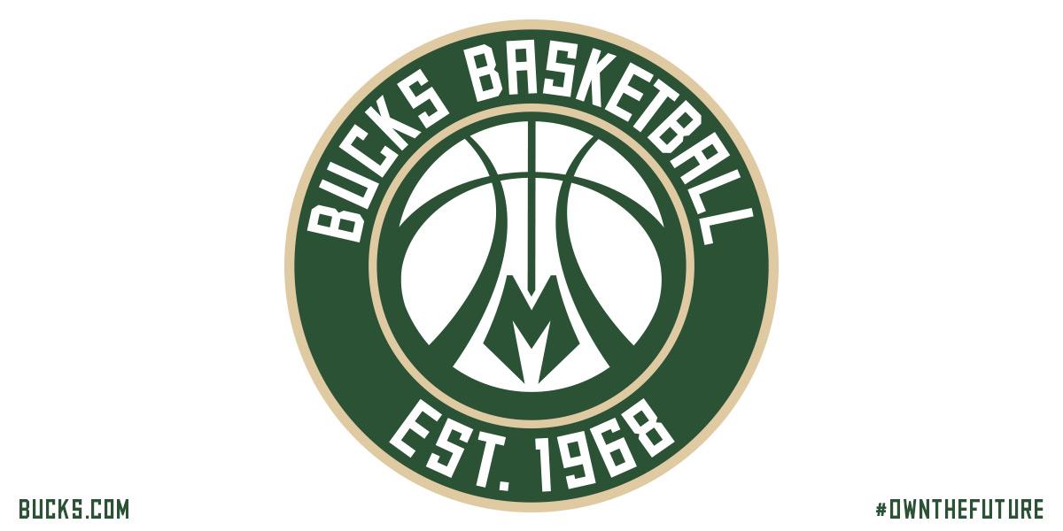
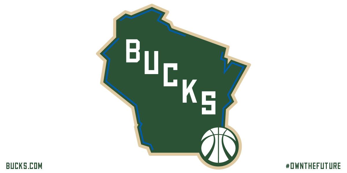
Milwaukee Bucks New Logos and Colors
Posted on 4/15/15 at 9:19 am

Posted on 4/15/15 at 9:19 am


 19
19

Posted on 4/15/15 at 9:19 am to GeauxColonels
Meh
Posted on 4/15/15 at 9:22 am to GeauxColonels
quote:
Cream City Cream
More like "Frank Brickowski's arse sweat white"
Posted on 4/15/15 at 9:23 am to GeauxColonels
Not bad

Posted on 4/15/15 at 9:24 am to GeauxColonels
The third logo is weak sauce
Like the other two though
Interested to see a uni with this color scheme
Like the other two though
Interested to see a uni with this color scheme
This post was edited on 4/15/15 at 9:24 am
Posted on 4/15/15 at 9:24 am to GeauxColonels
that green just kills all the fun.
Posted on 4/15/15 at 9:33 am to GCTiger11
quote:
The third logo is weak sauce
Like the other two though
Interested to see a uni with this color scheme
I think the fourth logo is worse. It doesn't even make sense
Posted on 4/15/15 at 9:35 am to GeauxColonels
I especially like the state logo with the blue outlining the two Great Lakes and Mississippi River. I have a feeling that will be use prominently on their court.
I'm sure the uni will be pretty simple. A green and off white home-away with the blue used as trim. I just hope there isn't a black alternate jersey.
I think the most underrated part of all of this is the font. It's simple and old-schoolish. Very Milwaukee.
It's been a trend the past two decades when teams rebrand themselves they tend to perform better so I'm excited as a Bucks fan

Posted on 4/15/15 at 9:36 am to GeauxColonels
The uniforms have serious potential to be awesome. A cream uniform with green cursive Milwaukee or Bucks across the chest - beautiful

Posted on 4/15/15 at 9:37 am to oVo
quote:
Meh
Posted on 4/15/15 at 9:38 am to GeauxColonels
Needed to go back to this. Still like 'em, though. I'm not a Bucks fan, but a lot of my friends are liking the logos.

This post was edited on 4/15/15 at 9:39 am
Posted on 4/15/15 at 9:38 am to GeauxColonels
Good logos, good colors. Dat Great Lakes blue 
Posted on 4/15/15 at 9:38 am to hendersonshands
I think those look great.

Posted on 4/15/15 at 9:38 am to goldenbadger08
The state logo is ugly because Wisconsin doesn't have an iconic shape. That particular logo just doesn't look that good.
Posted on 4/15/15 at 9:41 am to PrimeTime Money
You think the logo is ugly because the shape of the state of Wisconsin isn't ideal. Got it.
Posted on 4/15/15 at 9:45 am to goldenbadger08
I like it better than the Christmas decorations they've looked like the past few years.
Posted on 4/15/15 at 9:45 am to goldenbadger08
That's right. It doesn't make for a good logo.

Posted on 4/15/15 at 9:46 am to GeauxColonels
Don't care for the font
Posted on 4/15/15 at 9:50 am to Rickety Cricket
quote:I bet most people, after seeing the state logo, are surprised to see how much of Wisconsin's border is water. 86% of it.
Dat Great Lakes blue

 Page 1 of 3

Popular
Back to top