- My Forums
- Tiger Rant
- LSU Recruiting
- SEC Rant
- Saints Talk
- Pelicans Talk
- More Sports Board
- Fantasy Sports
- Golf Board
- Soccer Board
- O-T Lounge
- Tech Board
- Home/Garden Board
- Outdoor Board
- Health/Fitness Board
- Movie/TV Board
- Book Board
- Music Board
- Political Talk
- Money Talk
- Fark Board
- Gaming Board
- Travel Board
- Food/Drink Board
- Ticket Exchange
- TD Help Board
Customize My Forums- View All Forums
- Show Left Links
- Topic Sort Options
- Trending Topics
- Recent Topics
- Active Topics
Started By
Message
re: Milwaukee Bucks New Logos and Colors
Posted on 4/15/15 at 9:51 am to goldenbadger08
Posted on 4/15/15 at 9:51 am to goldenbadger08
They should have just made Andrew Wiggins their logo.
 2
2

Posted on 4/15/15 at 9:52 am to GeauxColonels
this


Posted on 4/15/15 at 9:52 am to GeauxColonels
Font is a little too much when used for anything more than BUCKS I think.
Otherwise, pretty solid.
Otherwise, pretty solid.
Posted on 4/15/15 at 9:55 am to Pettifogger
quote:Like Hendersonhands said,
Font is a little too much when used for anything more than BUCKS I think.
quote:I hope they go to something like that.
A cream uniform with green cursive Milwaukee or Bucks across the chest - beautiful
Posted on 4/15/15 at 9:56 am to Chad504boy
quote:
They should have just made Andrew Wiggins their logo.
hmmm

Posted on 4/15/15 at 10:28 am to GCTiger11
quote:
The third logo is weak sauce
The third logo was designed specifically to have a collegiate feel in an attempt to build a better fanbase across the state (according to the designers). Hence, they went with the diagonal "BUCKS" text to achieve that feel.
Posted on 4/15/15 at 10:34 am to GeauxColonels
Also, they did the unveiling a bit different than most teams would. They had "speed painters" on the court at halftime the other night and they painted the 3 new logos while fans watched (and some shitty "performers" tried to sing): LINK
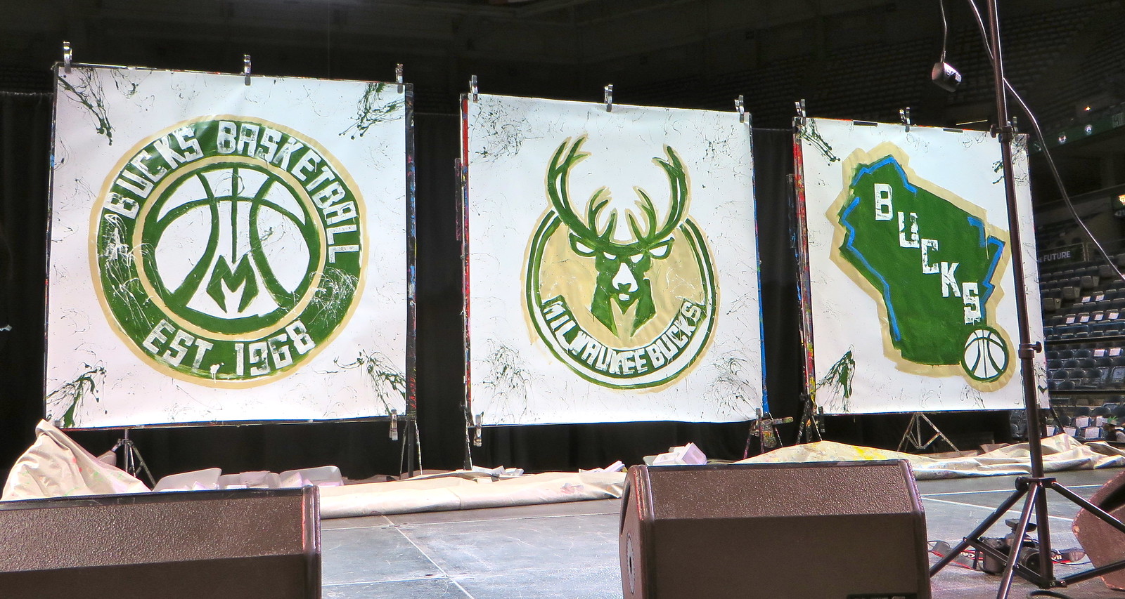
Also, here are some sheets of the many designs they toyed around with before settling on the final logos:
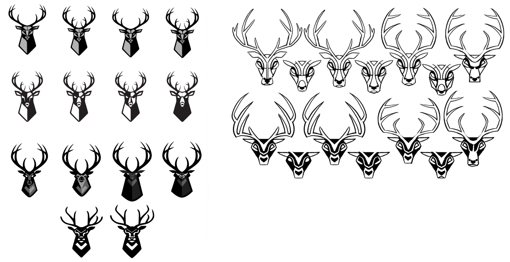
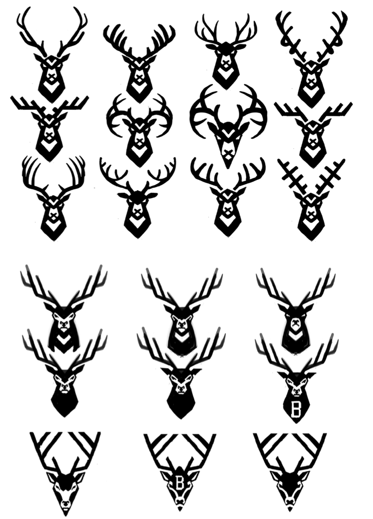
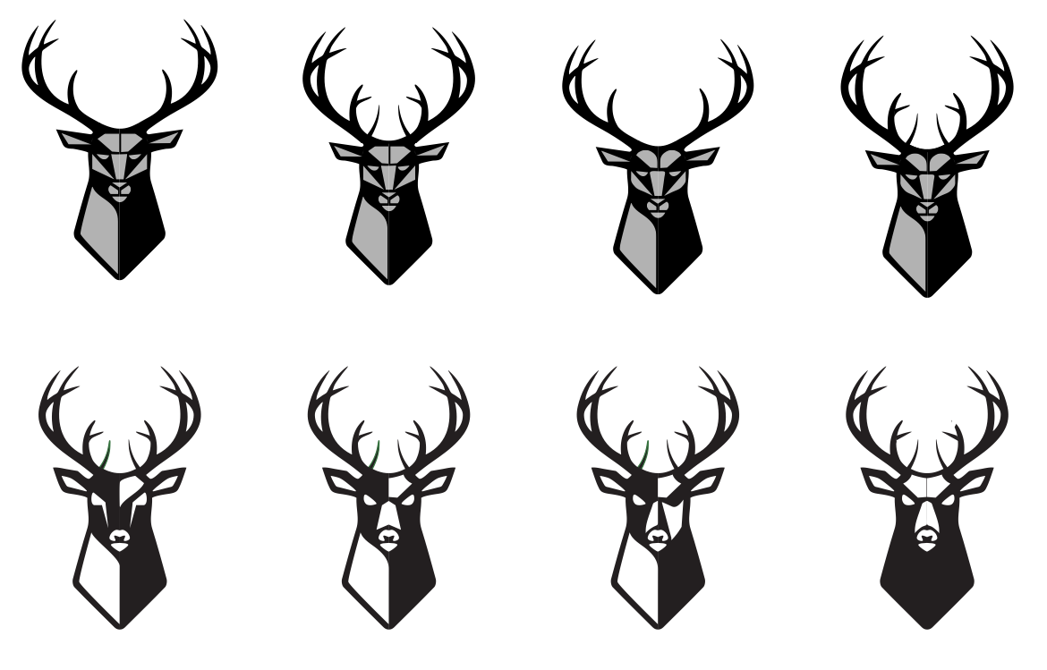
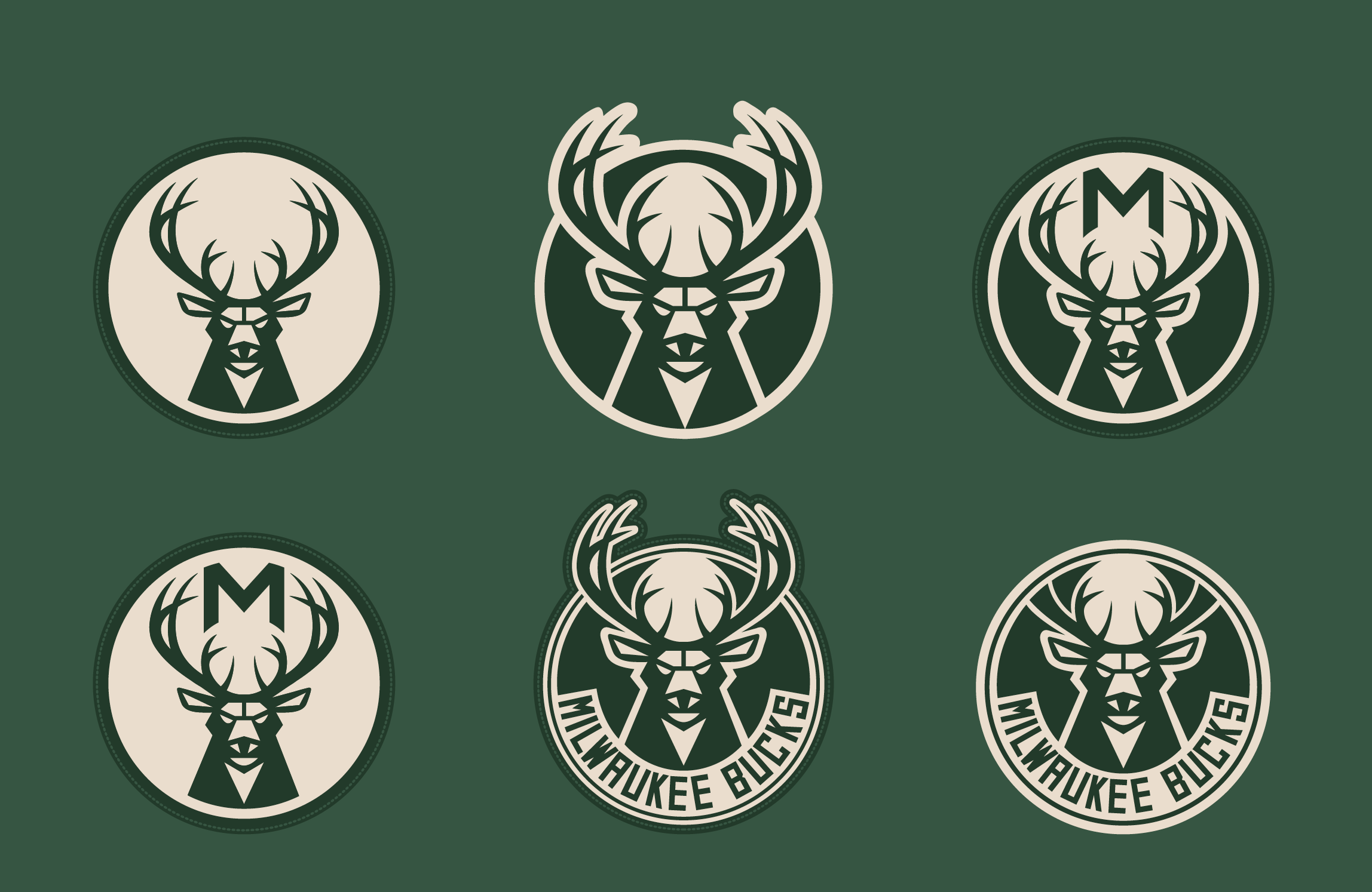
Also, here are some sheets of the many designs they toyed around with before settling on the final logos:
Posted on 4/15/15 at 10:38 am to Chad504boy
That's Minnesota, dumbass

Posted on 4/15/15 at 10:39 am to GeauxColonels
I like the new look.

Posted on 4/15/15 at 10:54 am to The Sad Banana
I wish there was some blue in the first two logos.
Posted on 4/15/15 at 11:03 am to PrimeTime Money
quote:
I wish there was some blue in the first two logos.
Agreed. If you're going to include it in your color scheme, why leave it out of the other 2?
Posted on 4/15/15 at 11:07 am to GeauxColonels
I feel like I've seen this same exact color scheme before but I can't figure out where.
Green and tan with a hint of blue.
Green and tan with a hint of blue.
Posted on 4/15/15 at 11:09 am to PrimeTime Money
quote:
Green and tan
Cream bruh!
Posted on 4/15/15 at 11:13 am to GeauxColonels
quote:Because it doesn't belong? It represents Wisconsin's lakes and rivers.
why leave it out of the other 2?
Where would you put it in the other two logos?
Posted on 4/15/15 at 11:16 am to goldenbadger08
quote:Why in the ever-loving hell does that matter?
Because it doesn't belong? It represents Wisconsin's lakes and rivers.
Where would you put it in the other two logos?
The green represents Wisconsin's grass and trees and shite. Why is that in the first logo?
Posted on 4/15/15 at 11:42 am to PrimeTime Money
big fan of these
Posted on 4/15/15 at 11:47 am to GeauxColonels
I like them

Posted on 4/15/15 at 11:49 am to hendersonshands
quote:
The uniforms have serious potential to be awesome. A cream uniform with green cursive Milwaukee or Bucks across the chest - beautiful
from Paul Lukas
quote:
And for what it's worth, the feeling here at Uni Watch HQ is that the new uniforms are very good -- better than the logos -- and will be a big hit when they're unveiled in June.

Posted on 4/15/15 at 11:52 am to PrimeTime Money
quote:
I wish there was some blue in the first two logos.
Agreed, but that bball logo is tight. Love the antlers themed into the lines on the ball.
Posted on 4/15/15 at 12:28 pm to CocomoLSU
I really like that the M looks like a deer hoof. It's a nice touch.

 Page 2 of 3

Popular
Back to top