- My Forums
- Tiger Rant
- LSU Recruiting
- SEC Rant
- Saints Talk
- Pelicans Talk
- More Sports Board
- Fantasy Sports
- Golf Board
- Soccer Board
- O-T Lounge
- Tech Board
- Home/Garden Board
- Outdoor Board
- Health/Fitness Board
- Movie/TV Board
- Book Board
- Music Board
- Political Talk
- Money Talk
- Fark Board
- Gaming Board
- Travel Board
- Food/Drink Board
- Ticket Exchange
- TD Help Board
Customize My Forums- View All Forums
- Show Left Links
- Topic Sort Options
- Trending Topics
- Recent Topics
- Active Topics
Started By
Message
re: Anyone else get mad about Calibri and Arial?
Posted on 1/13/17 at 9:10 am to hendersonshands

Posted on 1/13/17 at 9:10 am to hendersonshands
On AIM I set my font to Cooper Black with blue color.
 2
2


Posted on 1/13/17 at 9:11 am to Bmath
I used to set my font size really small (8 pt or so) in AIM because I thought big fonts were gay/girly.

Posted on 1/13/17 at 9:12 am to Bmath
Windings is the devil shite

Posted on 1/13/17 at 9:18 am to Nado Jenkins83
I don't get it
Posted on 1/13/17 at 9:18 am to hendersonshands
I ride or die with Arial.

Posted on 1/13/17 at 9:19 am to Nado Jenkins83
I knew it was the god damn Jews.
Posted on 1/13/17 at 9:20 am to hendersonshands
quote:
I don't get it
its a 9/11 conspiracy

Posted on 1/13/17 at 9:26 am to hendersonshands
Arial exclusively at my company. For some reason, Word will randomly turn copied font, taken from an Arial doc and going into an Arial doc, and turn the pasted font into TNR or Calibri.
That and my teams not realizing we are Arial enrage me.
That and my teams not realizing we are Arial enrage me.

Posted on 1/13/17 at 9:28 am to Nado Jenkins83
Ariail is good. What most science manuscripts are written in. It's just very universal so when I'm actually typing things I use it. But not good enough for printing. It's just bare bones nothing fancy.
Times New Roman looks too busy to me now that I'm used to Arial. Clumped and busy.
Arial is a sans-serif font
Times New Roman is a serif font so it looks more complicated and can be harder to read
This is the main reason people find switching from TNR to Arial so garish on initial use because it's very linear.
Calibri is awful I hate how that's the new MS default. Apparently it was designed to look better for HD displays where you can see pixelation in Times New Roman.
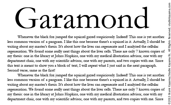
Garamond is the absolutely GOAT.
one of a handful of scientific approved fonts for manuscripts and tables. So under rated.
Garamond
Garamond
Garamond
Use that shite all the time when I need to print things that look professional.
(Helvetica's uncle essentially)
Times New Roman looks too busy to me now that I'm used to Arial. Clumped and busy.
Arial is a sans-serif font
Times New Roman is a serif font so it looks more complicated and can be harder to read
This is the main reason people find switching from TNR to Arial so garish on initial use because it's very linear.
Calibri is awful I hate how that's the new MS default. Apparently it was designed to look better for HD displays where you can see pixelation in Times New Roman.
Garamond is the absolutely GOAT.
one of a handful of scientific approved fonts for manuscripts and tables. So under rated.
Garamond
Garamond
Garamond
Use that shite all the time when I need to print things that look professional.
(Helvetica's uncle essentially)
This post was edited on 1/13/17 at 9:33 am
Posted on 1/13/17 at 9:31 am to Delacroix22
I use Georgia almost exclusively. I deal with numbers a lot, and I feel like it makes the numbers easier to read.
Posted on 1/13/17 at 9:32 am to VermilionTiger
You can easily fix that.
And I use calibri in emails and TNR on letters, memos, and TPS reports.
And I use calibri in emails and TNR on letters, memos, and TPS reports.

Posted on 1/13/17 at 9:37 am to hendersonshands
Arial 12 is usually my go-to for cereal writings. Otherwise i like to get silly with that Helvetica.

Posted on 1/13/17 at 9:39 am to hendersonshands
quote:
Calibri
The best... FTW
Posted on 1/13/17 at 9:40 am to VermilionTiger
quote:
My OUTLOOK forces me to type in blue font every time I start a new damn email. EVERYTIME
Dont forget you're in charge and you can tell OUTLOOK what to do.
The answers you seek are behind the "Settings" menu.
Show that computer who's the BOSS!!!
Posted on 1/13/17 at 10:04 am to hendersonshands
I broke a baby's nose once because someone used Baskerville Old Face. You just don't bring that shite, not in my house.
EDIT: Don't worry, the baby was ugly to start with. I asked the mother why she didn't just keep the placenta instead.
EDIT: Don't worry, the baby was ugly to start with. I asked the mother why she didn't just keep the placenta instead.
This post was edited on 1/13/17 at 10:05 am

Posted on 1/13/17 at 10:06 am to hendersonshands
Times New Roman can get bent.
TEAM CALIBRI
TEAM CALIBRI
Posted on 1/13/17 at 10:08 am to GoIrish02
Tahoma for Word & Georgia for Outlook. 
Posted on 1/13/17 at 10:19 am to hendersonshands
If someone types a document in comic sans I can't take it seriously.
Times new roman (12) for everything and perpetua for fancy documents that get duplicated and handed out. Just because they have a great all caps version that helps everything look uniform with headers and body paragraphs.
Times new roman (12) for everything and perpetua for fancy documents that get duplicated and handed out. Just because they have a great all caps version that helps everything look uniform with headers and body paragraphs.
This post was edited on 1/13/17 at 10:20 am
Posted on 1/13/17 at 11:04 am to Sir Drinksalot
I'm just going to say this:
If you're using Calibri, you aren't serious about communication. With the exception of large font size, headings, or use as an insert, same applies if you're using Arial.
If I see Calibri or Arial from someone, I pretty much know that person is a retard, doesn't care about communication, and doesn't give a damn about making a document user-friendly for me or any other reader. Guess how I evaluate that document? Not kindly.
Sans-serif fonts like the above are extremely poor choices for communication. The serifs are very important for letter recognition and greatly affect readability.
Garamond is pretty good.
Best choices are Century Schoolbook or Palatino.


I can't believe no attorneys or especially judges haven't gotten all up in the bid'neth of this topic.
If you're using Calibri, you aren't serious about communication. With the exception of large font size, headings, or use as an insert, same applies if you're using Arial.
If I see Calibri or Arial from someone, I pretty much know that person is a retard, doesn't care about communication, and doesn't give a damn about making a document user-friendly for me or any other reader. Guess how I evaluate that document? Not kindly.
Sans-serif fonts like the above are extremely poor choices for communication. The serifs are very important for letter recognition and greatly affect readability.
Garamond is pretty good.
Best choices are Century Schoolbook or Palatino.
I can't believe no attorneys or especially judges haven't gotten all up in the bid'neth of this topic.

Posted on 1/13/17 at 11:06 am to hendersonshands
Times new roman is for phaggits. U need comic sans.

 Page 2 of 3

Popular
Back to top