- My Forums
- Tiger Rant
- LSU Recruiting
- SEC Rant
- Saints Talk
- Pelicans Talk
- More Sports Board
- Fantasy Sports
- Golf Board
- Soccer Board
- O-T Lounge
- Tech Board
- Home/Garden Board
- Outdoor Board
- Health/Fitness Board
- Movie/TV Board
- Book Board
- Music Board
- Political Talk
- Money Talk
- Fark Board
- Gaming Board
- Travel Board
- Food/Drink Board
- Ticket Exchange
- TD Help Board
Customize My Forums- View All Forums
- Show Left Links
- Topic Sort Options
- Trending Topics
- Recent Topics
- Active Topics
Started By
Message
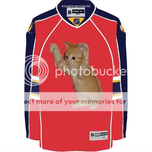
Hockey board- Florida Panthers new uniforms
Posted on 6/3/16 at 2:43 pm
Posted on 6/3/16 at 2:43 pm

 13
13

Posted on 6/3/16 at 3:05 pm to LSUMJ
I have way too much nostalgia wrapped up in the old logo but even I think the new unis are better. Very clean looking.
Posted on 6/3/16 at 3:07 pm to LSUMJ
Nice. Looks like they got rid of the stupid palm trees too.
Posted on 6/3/16 at 3:11 pm to LSUMJ
Pretty sweet
Posted on 6/3/16 at 3:12 pm to BCMCubs
cool,
i still love the old uni's
i still love the old uni's
Posted on 6/3/16 at 3:14 pm to Jack Bauer7
State flag on the shoulder is a nice touch. Wish more pro sports teams did that.
But wait until some PC bro associates the Florida flag with the confederate flag. They are asking for trouble.
But wait until some PC bro associates the Florida flag with the confederate flag. They are asking for trouble.

Posted on 6/3/16 at 3:19 pm to LSUMJ
I honestly think the old unis were some of the worst in pro sports.
Posted on 6/3/16 at 3:43 pm to LSUMJ
Miami has a huge Latino population. Let's make some jerseys that look like soccer jerseys!
Posted on 6/3/16 at 3:53 pm to LSUMJ
Yeah, those look pretty good.
Posted on 6/3/16 at 4:36 pm to BunkieWrench
Not bad

Posted on 6/3/16 at 4:42 pm to LSUMJ
The logo looks bad but I like the color scheme.
Posted on 6/3/16 at 4:44 pm to LSUMJ
I like the design of the jersey better but I don't like the logo as much
Posted on 6/3/16 at 4:46 pm to AlabamaAlum07
quote:
stupid palm trees

Posted on 6/3/16 at 6:17 pm to AlabamaAlum07
quote:
Nice.
I agree.
quote:
Looks like they got rid of the stupid palm trees too.
KYS


Posted on 6/3/16 at 6:24 pm to LSUMJ
my initial reaction is that i like em.
i am still bitter about what happened to the marlins unis/color scheme. just shameful.
i am still bitter about what happened to the marlins unis/color scheme. just shameful.
Posted on 6/3/16 at 6:37 pm to LSUMJ
Long sleeved soccer jerseys and a copy/paste of the Jags shield.
Very unimpressed.
Very unimpressed.
Posted on 6/3/16 at 6:47 pm to LSUMJ
Posted on 6/3/16 at 7:31 pm to LSUMJ
I still have my John Vanbeisbrouck jersey from 1995.
Posted on 6/3/16 at 8:09 pm to LSUMJ
Don't like them. Go back to the uniforms from their inaugural season, and leave them alone. Yes, I liked the palm trees and hockey stick on the shoulders. Yes, I realize I am in the minority. At least they are nowhere nearly as atrocious as the Blue Jackets.
Posted on 6/3/16 at 8:16 pm to 1LoudTideFan
I hate the Marlins uniforms as well. The teal and the awesome "marlin flying over the baseball" logo worked perfectly together.

 Page 1 of 1


Popular
Back to top