- My Forums
- Tiger Rant
- LSU Recruiting
- SEC Rant
- Saints Talk
- Pelicans Talk
- More Sports Board
- Fantasy Sports
- Golf Board
- Soccer Board
- O-T Lounge
- Tech Board
- Home/Garden Board
- Outdoor Board
- Health/Fitness Board
- Movie/TV Board
- Book Board
- Music Board
- Political Talk
- Money Talk
- Fark Board
- Gaming Board
- Travel Board
- Food/Drink Board
- Ticket Exchange
- TD Help Board
Customize My Forums- View All Forums
- Show Left Links
- Topic Sort Options
- Trending Topics
- Recent Topics
- Active Topics
Started By
Message
Does anyone else wish we'd go back to the old unis?
Posted on 10/28/15 at 8:49 pm

Posted on 10/28/15 at 8:49 pm

The old font and stripes for 2012 and prior were much better than they are now in my opinion.

VS

I think the old ones even look tougher tbh. I heard they changed to a lighter color yellow for some reason. I didn't know if it was true but there is a clear difference here. If we are purple and gold, what's the logic of switching to lighter yellow?
 35
35

Posted on 10/28/15 at 8:50 pm to reauxl tigers7
Me too. But these are good too.
Posted on 10/28/15 at 8:50 pm to reauxl tigers7
Yes
Posted on 10/28/15 at 8:53 pm to reauxl tigers7
I'm failing to see the problem
Posted on 10/28/15 at 8:53 pm to reauxl tigers7
Not something one should consider when getting one's grove on...and its a good grove. Really really good.
Posted on 10/28/15 at 8:55 pm to reauxl tigers7
(no message)
This post was edited on 1/10/21 at 11:59 pm
Posted on 10/28/15 at 8:55 pm to reauxl tigers7
We need the old ones back asap. The thin font looks good on ole miss because we have the same design but with our colors the old o es are way better.
Posted on 10/28/15 at 8:57 pm to reauxl tigers7
Are you crying about the colors on the jersey stripes? Or is it the material? The jersey templet is a higher technology than in 2012, I rather have up to date lighter materials for the players. But by all means lets worry about colors on a stripe or half shoulder stripe. 

Posted on 10/28/15 at 8:58 pm to reauxl tigers7
I prefer the shorter stripes but I still think the new ones look fly as hell.

Posted on 10/28/15 at 8:58 pm to Byrdybyrd05
I can't tell a difference. Maybe I'm retarded
Posted on 10/28/15 at 9:03 pm to reauxl tigers7
Stripes are 100% better now. And the numbers looked awful when they first changed the font because they were way too small. Personally I think the jerseys right now are close to perfect.
As for the color yellow, I don't think it's any different now then it's been for the last 10 years or so. You can look at pictures from the same game and colors will look a little different. The yellow looks a little different than it did from circa 2005 and prior because the material of the pants are different. It is a little lighter gold and no longer has a shine to it.
As for the color yellow, I don't think it's any different now then it's been for the last 10 years or so. You can look at pictures from the same game and colors will look a little different. The yellow looks a little different than it did from circa 2005 and prior because the material of the pants are different. It is a little lighter gold and no longer has a shine to it.

Posted on 10/28/15 at 9:03 pm to reauxl tigers7
quote:
heard they changed to a lighter color yellow for some reason. I didn't know if it was true but there is a clear difference here
The white balance amongst other camera and post processing methods can cause the differences shown in the shade of gold.
Posted on 10/28/15 at 9:04 pm to reauxl tigers7
Don't make me none.

Posted on 10/28/15 at 9:05 pm to lsudat10
these new ones are more of a modern attempt on the classic unis we wore when when the shoulder stripes actually went under the shoulders. except for the number font.

Eddie Fuller circa The Earthquake Game 1988
OR further back...
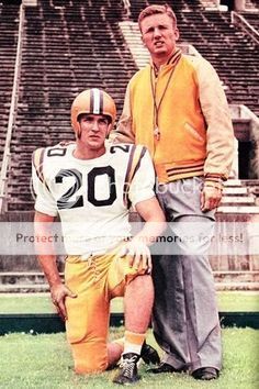
Billy Cannon and Paul Dietzel circa 1958
I like the new unis...fwiw.
Eddie Fuller circa The Earthquake Game 1988
OR further back...
Billy Cannon and Paul Dietzel circa 1958
I like the new unis...fwiw.
Posted on 10/28/15 at 9:06 pm to reauxl tigers7
I do like the old ones better, I was thinking this today when looking at old pics. Atleast we still keep a pretty classic look.
Posted on 10/28/15 at 9:42 pm to Byrdybyrd05
The font was better? WTF, bunch of pansies.

Posted on 10/28/15 at 9:55 pm to reauxl tigers7
2012's look better. The new font on the numbers looks trendy, and even though they're a throwback to the old unis, I just like the look of the shorter stripes better.
Posted on 10/28/15 at 9:59 pm to reauxl tigers7
I don't see enough of a difference
Posted on 10/28/15 at 10:03 pm to reauxl tigers7
i like the old ones more too.
if they want to use longer stripes as we do now, i think it would help if they slightly tapered as the stripes rounded towards the underarm side. not a full out taper like the USC shoulder stripes, but just a bit
if they want to use longer stripes as we do now, i think it would help if they slightly tapered as the stripes rounded towards the underarm side. not a full out taper like the USC shoulder stripes, but just a bit
Posted on 10/28/15 at 10:12 pm to gerkin
The older ones were better no doubt, but these arent that bad.

 Page 1 of 4

Popular
Back to top