- My Forums
- Tiger Rant
- LSU Recruiting
- SEC Rant
- Saints Talk
- Pelicans Talk
- More Sports Board
- Fantasy Sports
- Golf Board
- Soccer Board
- O-T Lounge
- Tech Board
- Home/Garden Board
- Outdoor Board
- Health/Fitness Board
- Movie/TV Board
- Book Board
- Music Board
- Political Talk
- Money Talk
- Fark Board
- Gaming Board
- Travel Board
- Food/Drink Board
- Ticket Exchange
- TD Help Board
Customize My Forums- View All Forums
- Show Left Links
- Topic Sort Options
- Trending Topics
- Recent Topics
- Active Topics
Started By
Message
re: The real new USA kit
Posted on 4/23/15 at 9:14 am to GeauxColonels

Posted on 4/23/15 at 9:14 am to GeauxColonels
The only think that I can think is that the women's team wanted their own look and "identity" going into the World Cup. That's only true if it holds up as being a women's jersey only. If that's the case, I'll move on with my life. If I have to watch the USMNT play in the Gold Cup with those blue and white monstrosities AND this, I'm going to be upset.
 1
1

Posted on 4/23/15 at 9:28 am to Dijkstra
Then don't watch. Simple. 
Posted on 4/23/15 at 9:38 am to EastNastySwag
Not an option. As the owner of a limited edition Centennial jersey, I should be consulted on all future kits, and my opinion should be taken into account when choosing a design. It's part of a larger economic freedom thing for me that I feel pretty strongly about, and I'm not going to apologize for that.
Posted on 4/23/15 at 9:41 am to Dijkstra
Holy shite, that was brilliant 
 DS gonna DS pretty shortly.
This post was edited on 4/23/15 at 9:42 am

Posted on 4/23/15 at 10:36 am to EastNastySwag
quote:
EastNastySwag
But seriously... how old are you? And do you rock neon colored socks on the reg?
Posted on 4/23/15 at 11:01 am to Broski
Old enough. Of course I got a pair of neon green socks that my daughters bought me for Xmas a few years back because it fits my personality.
Posted on 4/23/15 at 12:19 pm to EastNastySwag
I don't have an issue with the jersey - it's in the same vein as the anthracite kit from 2008/09. I didn't like that one at launch and eventually it grew on me.
I eventually stopped caring about the bomb pop, and the new shitty Microsoft WordArt gradient isn't THAT awful.
But, I don't know what in the blue.... errrrr..... neon green frick Nike is doing with the socks.
I eventually stopped caring about the bomb pop, and the new shitty Microsoft WordArt gradient isn't THAT awful.
But, I don't know what in the blue.... errrrr..... neon green frick Nike is doing with the socks.
Posted on 4/23/15 at 12:28 pm to Sheep
quote:
it's in the same vein as the anthracite kit from 2008/09
At least those had a red, white & blue crest.
Posted on 4/23/15 at 12:32 pm to Sheep
Don't ever dis the Bomb Pop. 
Posted on 4/23/15 at 12:43 pm to EastNastySwag
Horrible, just horrible.
Change the black to blue and add a little red and it would be good.
Not a fan of uniforms that represent nothing about the county/team wearing them.
Change the black to blue and add a little red and it would be good.
Not a fan of uniforms that represent nothing about the county/team wearing them.
Posted on 4/23/15 at 1:00 pm to Dijkstra
quote:
Not an option. As the owner of a limited edition Centennial jersey, I should be consulted on all future kits, and my opinion should be taken into account when choosing a design. It's part of a larger economic freedom thing for me that I feel pretty strongly about, and I'm not going to apologize for that.
Posted on 4/23/15 at 1:39 pm to EastNastySwag
quote:
neon green is a pussy getting color
Yea, maybe if you're Abby Wambach...
Those jerseys are so incredibly awful.
Of course you would defend them though.
Posted on 4/23/15 at 2:24 pm to STLhog
So sayeth a Pool fan with those hideous Warrior kits.
Posted on 4/23/15 at 3:07 pm to Broski
quote:
At least those had a red, white & blue crest.
More like red, muted blue and grey.
It's not the "standard" crest. But still, the red highlights helped.


Posted on 4/23/15 at 3:08 pm to EastNastySwag
The home strips were legit.
But yea the away and third kits were an abomination. But everyone knows that.
I'm not sitting here saying this jersey gets me pussy.

But yea the away and third kits were an abomination. But everyone knows that.
I'm not sitting here saying this jersey gets me pussy.
This post was edited on 4/23/15 at 3:17 pm
Posted on 4/23/15 at 3:24 pm to STLhog

Still the GOAT. It's traditional and clean. Sure, it's plain, but I'd rather a more throwback approach to a simple shirt than tacky black trim and blacked out badges. I usually love and cherish good, clean black and white designs due to PTSD from early web designs and Web 2.0 "shine" phases. I didn't think I could hate something with a clean black and white approach so much until now. Add in those socks, and I feel like this was designed by a 14 year old girl creating and customizing a team on FIFA.
This isn't a 19 year old drug dealer's Dodge Charger you're designing, Nike. Cut that shite out.
Posted on 4/23/15 at 3:38 pm to Dijkstra
I just got the short sleeve version of this, and it makes my pants parts tingly every time I wear it.


I'm hoping I can find some lettering do to a Rimando name set on it.
I'm hoping I can find some lettering do to a Rimando name set on it.
Posted on 4/23/15 at 3:40 pm to Sheep
quote:
More like red, muted blue and grey.
Last I checked, muted blue is still blue.
Posted on 4/23/15 at 3:46 pm to Dijkstra
quote:
Still the GOAT.
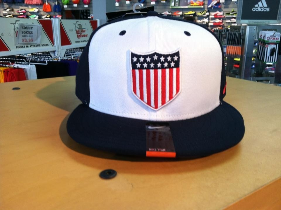
Related: If anyone ever finds one of these, I'll pay TOP DOLLAR for it.
This post was edited on 4/23/15 at 3:47 pm
Posted on 4/23/15 at 3:52 pm to Broski
quote:
Last I checked, muted blue is still blue.
Thanks for the input, Semantics Champion.
The point I was trying to make is that they didn't use the standard (for that time) crest on the anthracite jerseys.

 Page 3 of 4

Popular
Back to top