- My Forums
- Tiger Rant
- LSU Recruiting
- SEC Rant
- Saints Talk
- Pelicans Talk
- More Sports Board
- Fantasy Sports
- Golf Board
- Soccer Board
- O-T Lounge
- Tech Board
- Home/Garden Board
- Outdoor Board
- Health/Fitness Board
- Movie/TV Board
- Book Board
- Music Board
- Political Talk
- Money Talk
- Fark Board
- Gaming Board
- Travel Board
- Food/Drink Board
- Ticket Exchange
- TD Help Board
Customize My Forums- View All Forums
- Show Left Links
- Topic Sort Options
- Trending Topics
- Recent Topics
- Active Topics
Started By
Message
re: Opinions, critiques on logo I'm working on
Posted on 8/4/12 at 10:45 am to DLauw

Posted on 8/4/12 at 10:45 am to DLauw
I'd take LSU out of the mouth. It just looks cheesy. You took too much white off. Add some back around the edge. Also, smooth out a lot of those lines. The stripes need to be much smoother.
 0
0

Posted on 8/4/12 at 10:47 am to DLauw
I think the base idea is good. Keep tweakin, Rome wasn't built in a day.
Posted on 8/4/12 at 10:53 am to TurDuken
Posted on 8/4/12 at 11:10 am to DLauw
Pretty cool
Posted on 8/4/12 at 11:49 am to DLauw
The actual picture blows away anything that anyone has come up with. Cartoony characters don't do much for me. Do a shirt with the real picture and I'll buy it. Cabelas and a thousand others have beautiful merchandise with actual replicas of animals, fish etc.
Posted on 8/4/12 at 11:51 am to DLauw
i like it
Posted on 8/4/12 at 11:57 am to 228Tiger
I like the concept you got going on.
clean up the lines.
Outline the head ( if you are going for an 80'2 type feel) fine line.
If you take the "LSU" out of the mouth you are left with a gaping maw and just teeth. maybe adjust jaw line/position.
my .02
Looks good BTW keep up the good work.
clean up the lines.
Outline the head ( if you are going for an 80'2 type feel) fine line.
If you take the "LSU" out of the mouth you are left with a gaping maw and just teeth. maybe adjust jaw line/position.
my .02
Looks good BTW keep up the good work.

Posted on 8/4/12 at 11:59 am to DLauw
I like the bottom one.
Posted on 8/4/12 at 12:32 pm to DLauw
LINK
LINK
I like both of these images better as starting points. The one you chose has too wide a mouth opening.
The first above could be a much better toonces, the second as possibly an improvement to the circle tiger we have now.
Kudos for attempting.
Eta: mispelling
LINK
I like both of these images better as starting points. The one you chose has too wide a mouth opening.
The first above could be a much better toonces, the second as possibly an improvement to the circle tiger we have now.
Kudos for attempting.
Eta: mispelling
This post was edited on 8/4/12 at 2:06 pm
Posted on 8/4/12 at 2:21 pm to DLauw
What if you took LSU out of his mouth and arched the letters out just above his head, between his ears?

Posted on 8/4/12 at 2:25 pm to DLauw
Yeesh.

Something about the eyes bugs me. It looks too much like something for Missouri.
Something about the eyes bugs me. It looks too much like something for Missouri.
This post was edited on 8/4/12 at 4:39 pm

Posted on 8/4/12 at 2:26 pm to DLauw
I wouldn't mind a wider face. The LSU overtakes his entire face IMO.
Posted on 8/4/12 at 2:27 pm to AtlantaLSUfan
quote:
You may want to cut-out more of the white outter rim (fur)
I agree, the amount of white makes him look...fluffy?
quote:
and try to increase the barely visible lower teeth.
Bared Tiger teeth is always good
Posted on 8/4/12 at 2:28 pm to dbt_Geaux_Tigers_196
Black makes it too much like Mizzou. IMO
Posted on 8/4/12 at 4:36 pm to DLauw
Love it
Posted on 8/4/12 at 4:39 pm to DLauw
looks like cobra from GI joe
This post was edited on 8/4/12 at 4:40 pm
Posted on 8/4/12 at 4:41 pm to St Augustine
Bring in the margins of the face a bit (make it skinnier). Right now it sort of looks like it has a mane. But the face looks menacing!
Edit: I didn't read where this had already been suggested. Carry on!
Edit: I didn't read where this had already been suggested. Carry on!
This post was edited on 8/4/12 at 4:43 pm
Posted on 8/4/12 at 4:46 pm to DLauw
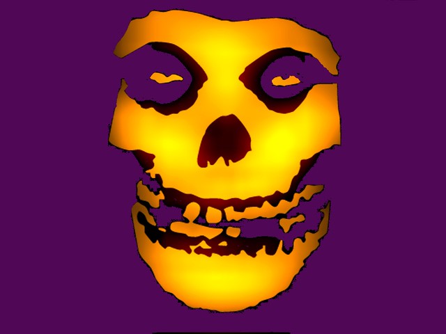
Looks too much like this.
Posted on 8/4/12 at 5:27 pm to DLauw
I quit posting revisions here but if you're interested you can see the entire album here.
Thanks for the suggestions!
Thanks for the suggestions!
This post was edited on 8/4/12 at 5:57 pm
Posted on 8/4/12 at 5:46 pm to Brinner
This. It's fricking BLUE

 Page 3 of 4

Popular
Back to top