- My Forums
- Tiger Rant
- LSU Recruiting
- SEC Rant
- Saints Talk
- Pelicans Talk
- More Sports Board
- Fantasy Sports
- Golf Board
- Soccer Board
- O-T Lounge
- Tech Board
- Home/Garden Board
- Outdoor Board
- Health/Fitness Board
- Movie/TV Board
- Book Board
- Music Board
- Political Talk
- Money Talk
- Fark Board
- Gaming Board
- Travel Board
- Food/Drink Board
- Ticket Exchange
- TD Help Board
Customize My Forums- View All Forums
- Show Left Links
- Topic Sort Options
- Trending Topics
- Recent Topics
- Active Topics
Started By
Message
Need Some Help Designing a Letterhead Logo/Flier for Youth Event
Posted on 4/18/15 at 7:56 pm
Posted on 4/18/15 at 7:56 pm
First, I want to say thank you for the time you will spend going through this post.
I normally dont do this kind of thing. However, I am currently planning a free, large scale, youth event for my Church district. Every other event we do as a district costs the teens a minimum of $45. Most are closer to $150, even for a weekend. The district and churches themselves can't afford many costs either, every penny above standard operating costs is sent to the mission field. It is the way the denomination is set up financially. To keep it free, I am trying to find a way to cut all the costs I can. Hence, I am asking for help. To say I would be appreciative is a massive understatement.
The event is called Recur 2015 and will be the night of July 31st. It is an overnight event where no one will be sleeping. Movies, games, music, and a Bible study will all be going at different times.
Being an overnight event, I was thinking a darker background with directional lighting over reclaimed industrial style lettering would be the best motif possible. Large and Centered have Recur 2015. Then say July 31st in the bottom right hand corner. Basic lettering would be best for that. Maybe also find a way to add a simple two word phrase. Go Back wherever you might think is best. One word in each top corner maybe? Whole phrase in bottom left, or centered? I dunno. I want one image for both the logo and flier. No need to do two things.
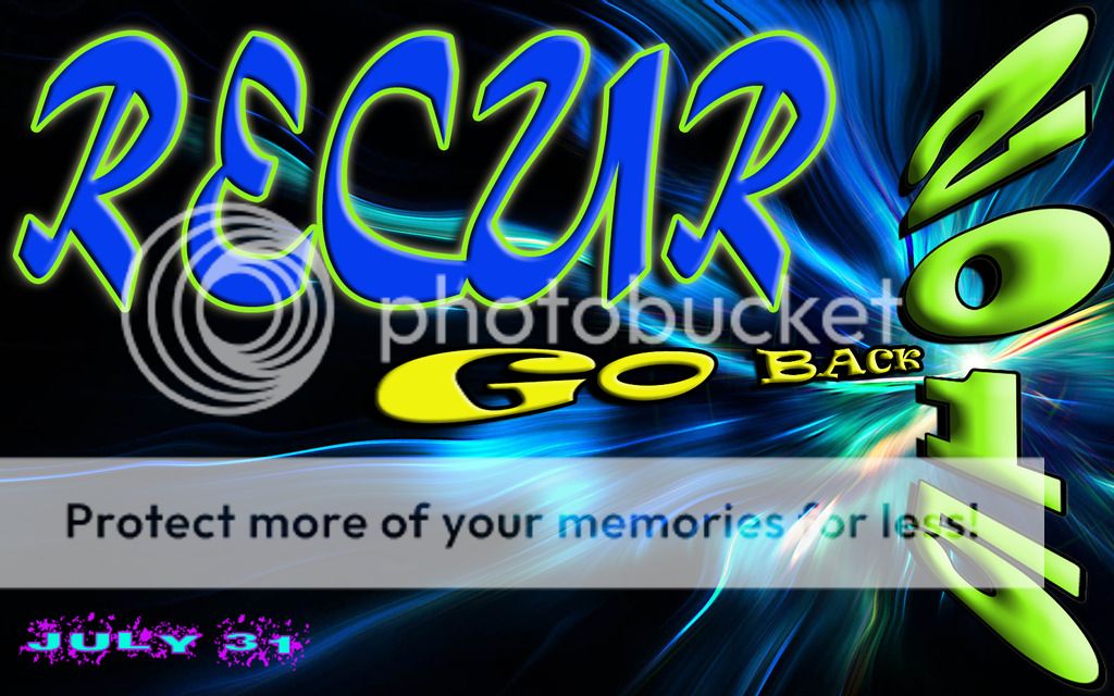
Background idea is something similar to one of these.


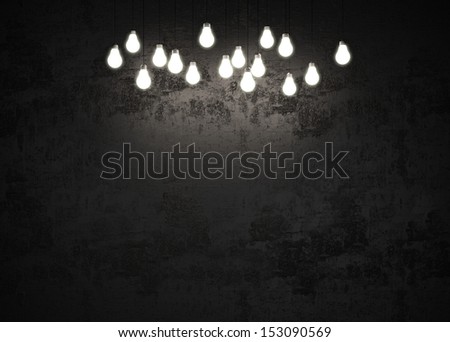

Those last 2 are probably my favorite.
The lettering is probably going to be more difficult. I was hoping for something industrial-ish, maybe slightly 3 dimensional, and at a angle to the background . Obviously someone better at seeing and understanding modern visual cues would probably have a superior idea.
Here is my idea for lettering itself, and again, I dont really know how this would work. This is the closest I can find to the image in my head. At least, that is graphics based.
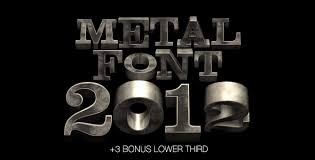
From a non graphics based perspective.


I realize what I am asking someone to do for free is insane. Please do not bend over backwards if it seems too much. If you think you have a better idea, that would be easier to make and still be visually appealing, which you are willing to do. Then by all means do that. I am not stuck on everything I said. I am simply grateful for anything someone is willing to do.
Email me if you need to, whether with questions, thoughts or to send me the design. I'll also check this thread regularly if you ask anything in here. VaBamaManTD @ yahoo.com
I would also like to apologize for the jumbled, frenzied, and haphazard way this post was thrown together. Sorry guys.

I normally dont do this kind of thing. However, I am currently planning a free, large scale, youth event for my Church district. Every other event we do as a district costs the teens a minimum of $45. Most are closer to $150, even for a weekend. The district and churches themselves can't afford many costs either, every penny above standard operating costs is sent to the mission field. It is the way the denomination is set up financially. To keep it free, I am trying to find a way to cut all the costs I can. Hence, I am asking for help. To say I would be appreciative is a massive understatement.
The event is called Recur 2015 and will be the night of July 31st. It is an overnight event where no one will be sleeping. Movies, games, music, and a Bible study will all be going at different times.
Being an overnight event, I was thinking a darker background with directional lighting over reclaimed industrial style lettering would be the best motif possible. Large and Centered have Recur 2015. Then say July 31st in the bottom right hand corner. Basic lettering would be best for that. Maybe also find a way to add a simple two word phrase. Go Back wherever you might think is best. One word in each top corner maybe? Whole phrase in bottom left, or centered? I dunno. I want one image for both the logo and flier. No need to do two things.
Background idea is something similar to one of these.
Those last 2 are probably my favorite.
The lettering is probably going to be more difficult. I was hoping for something industrial-ish, maybe slightly 3 dimensional, and at a angle to the background
Here is my idea for lettering itself, and again, I dont really know how this would work. This is the closest I can find to the image in my head. At least, that is graphics based.
From a non graphics based perspective.
I realize what I am asking someone to do for free is insane. Please do not bend over backwards if it seems too much. If you think you have a better idea, that would be easier to make and still be visually appealing, which you are willing to do. Then by all means do that. I am not stuck on everything I said. I am simply grateful for anything someone is willing to do.
Email me if you need to, whether with questions, thoughts or to send me the design. I'll also check this thread regularly if you ask anything in here. VaBamaManTD @ yahoo.com
I would also like to apologize for the jumbled, frenzied, and haphazard way this post was thrown together. Sorry guys.
This post was edited on 4/18/15 at 8:16 pm
 2
2


Posted on 4/19/15 at 1:58 pm to VaBamaMan


Posted on 4/19/15 at 7:12 pm to VaBamaMan
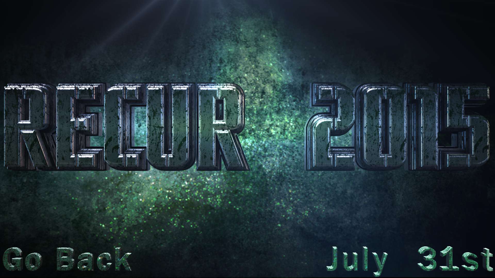
Not sure if this is what you wanting.
With a flare
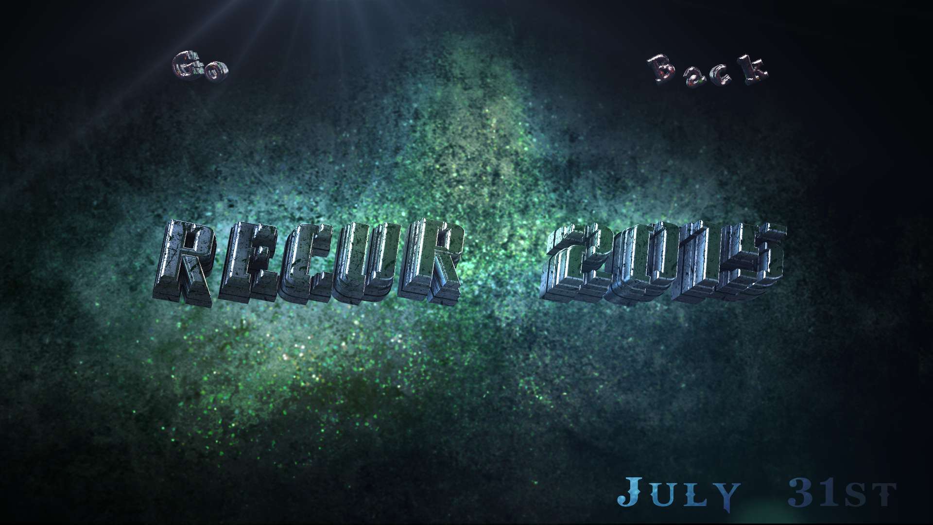
Without
With a flare
Without
Posted on 4/19/15 at 9:48 pm to JCinBAMA
Thanks man! Looks good! I like that font a lot! Think I was wrong on the angled idea though.
What i am thinking is, with that background. It might look better to make the Recur 2015 a bit larger, just have it on a straight line with no angles, and make it kind of look like it is jumping off the page(only if easily possible). Put the Go Back right under Recur or in the bottom left. Keep that same font but straighten it up like the date is done.
I don't know how hard that would be to change. I don't think the changes are that drastic from what you did though. Hopefully it isn't a big deal. If it is, I might just run with it. I wish I was better at this kind of stuff. I haz no skillz.
Thanks again dude! I owe you a thousand upvotes.
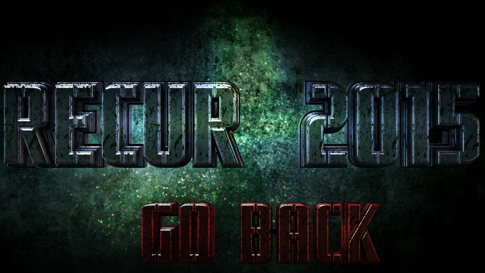
Posted on 4/19/15 at 11:46 pm to VaBamaMan
Maybe this?
I change the date also, it looked out of place.
If you right click on the pic, click view image
it opens to full size. 1,920px × 1,080px
I change the date also, it looked out of place.
If you right click on the pic, click view image
it opens to full size. 1,920px × 1,080px
This post was edited on 4/19/15 at 11:54 pm
Posted on 4/20/15 at 12:42 am to JCinBAMA
Dude!!! Looks awesome!!!
Do you think it would look better without the date on it? Something just looks off with it for some reason. I think it clutters it up, makes the image too busy. All of my original idea sucked haha. I didn't realize that on the backside of the flyer I'm going to be printing all of the pertinent info anyway. Date isn't needed on the front.
What if we just take that off, enlarge "Go Back" a bit, and center it under Recur 2015? If we were to do that, is getting it in the same font as Recur, but in something like a dark red color, possible? If green is all you can do it in then it would still look good.
If you do it, just make a judgement call on centering and heighth and width for "go back". Too big would fill in too much, too small would get lost.
It is your call if you want to, that looks really good as it is. I can just be a perfectionist a-hole.
It is my first time planning something on a district wide scale so I am hoping to make this as well done as possible. If it goes really well, then next year I would be able to actually hire and pay you to do the graphics. If you want to after dealing with me this year.
You can tell me to shut up and go away if you want to. If you do it, it will be the last one I ask from you. You've been tremendous with this man. 
Do you think it would look better without the date on it? Something just looks off with it for some reason. I think it clutters it up, makes the image too busy. All of my original idea sucked haha. I didn't realize that on the backside of the flyer I'm going to be printing all of the pertinent info anyway. Date isn't needed on the front.
What if we just take that off, enlarge "Go Back" a bit, and center it under Recur 2015? If we were to do that, is getting it in the same font as Recur, but in something like a dark red color, possible? If green is all you can do it in then it would still look good.
If you do it, just make a judgement call on centering and heighth and width for "go back". Too big would fill in too much, too small would get lost.
It is your call if you want to, that looks really good as it is. I can just be a perfectionist a-hole.
It is my first time planning something on a district wide scale so I am hoping to make this as well done as possible. If it goes really well, then next year I would be able to actually hire and pay you to do the graphics. If you want to after dealing with me this year.
You can tell me to shut up and go away if you want to. If you do it, it will be the last one I ask from you. You've been tremendous with this man.
This post was edited on 4/20/15 at 12:45 am
Posted on 4/20/15 at 2:03 am to VaBamaMan
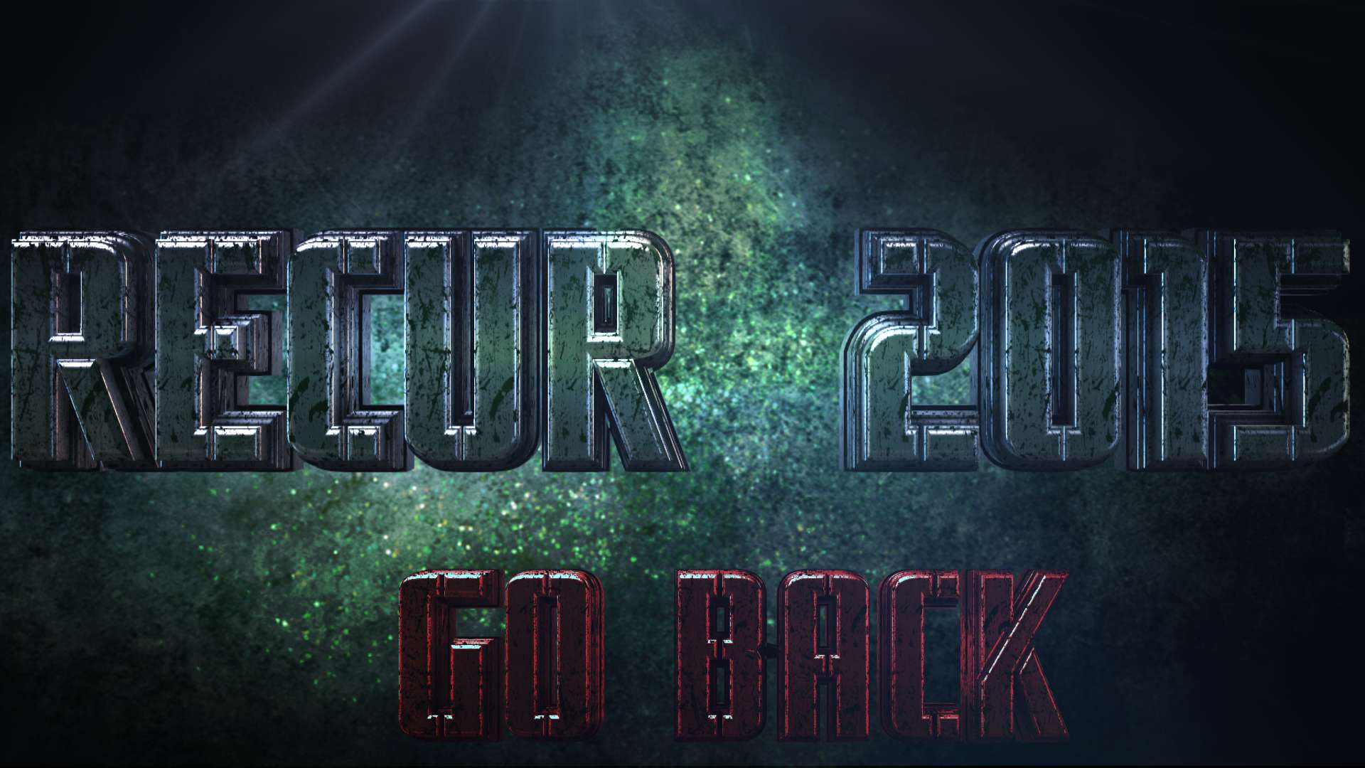
Posted on 4/20/15 at 10:22 am to JCinBAMA
There it is!
Thanks man. Looks freaking amazing. You nailed it.


Thanks man. Looks freaking amazing. You nailed it.
Posted on 4/20/15 at 11:28 am to VaBamaMan
Posted on 4/28/15 at 11:53 am to JCinBAMA

Posted on 4/28/15 at 11:54 am to YACKER

 Page 1 of 1


Popular
Back to top