- My Forums
- Tiger Rant
- LSU Recruiting
- SEC Rant
- Saints Talk
- Pelicans Talk
- More Sports Board
- Fantasy Sports
- Golf Board
- Soccer Board
- O-T Lounge
- Tech Board
- Home/Garden Board
- Outdoor Board
- Health/Fitness Board
- Movie/TV Board
- Book Board
- Music Board
- Political Talk
- Money Talk
- Fark Board
- Gaming Board
- Travel Board
- Food/Drink Board
- Ticket Exchange
- TD Help Board
Customize My Forums- View All Forums
- Show Left Links
- Topic Sort Options
- Trending Topics
- Recent Topics
- Active Topics
Started By
Message
re: Need Some Help Designing a Letterhead Logo/Flier for Youth Event
Posted on 4/20/15 at 12:42 am to JCinBAMA
Posted on 4/20/15 at 12:42 am to JCinBAMA
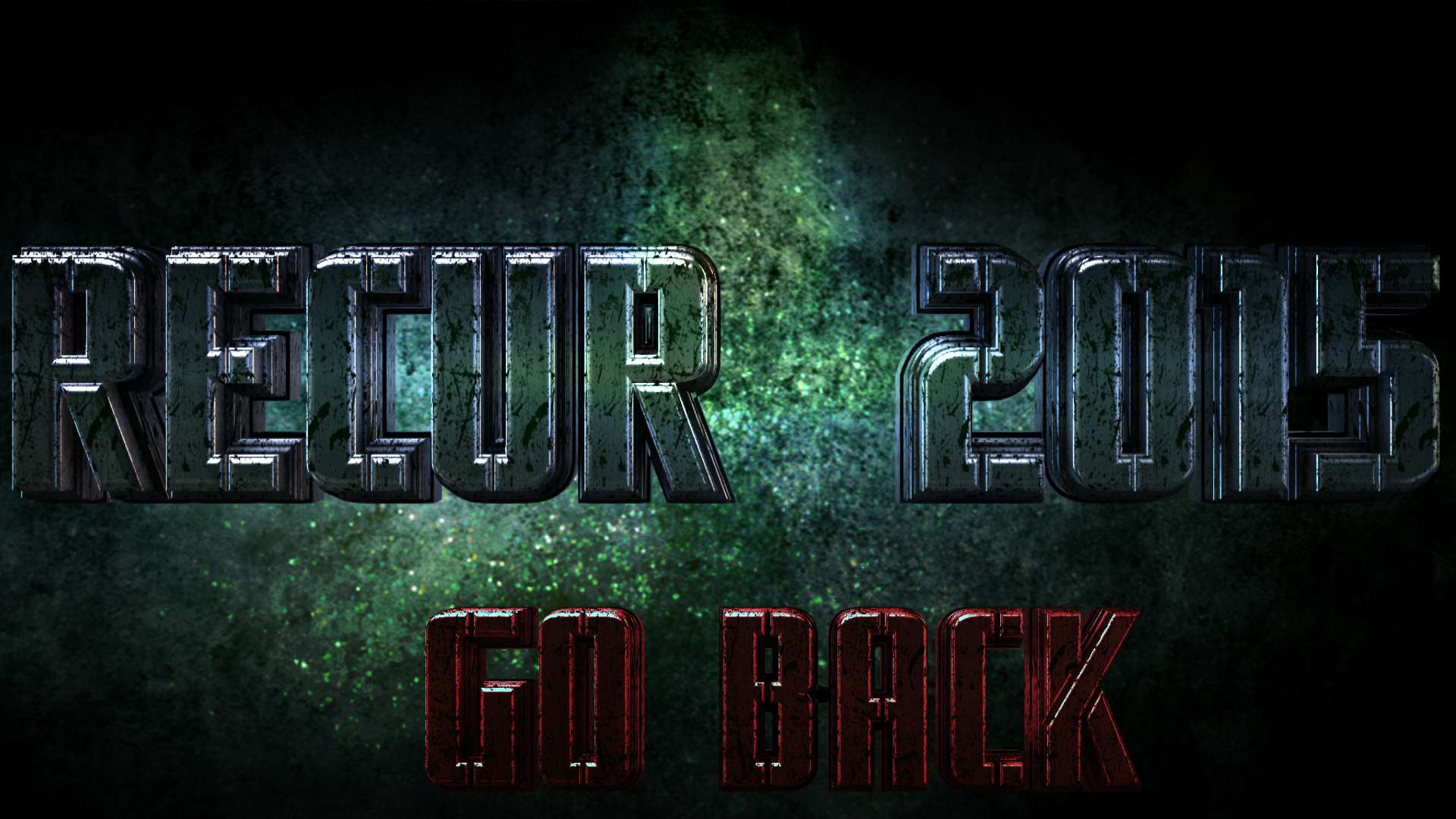
Dude!!! Looks awesome!!!
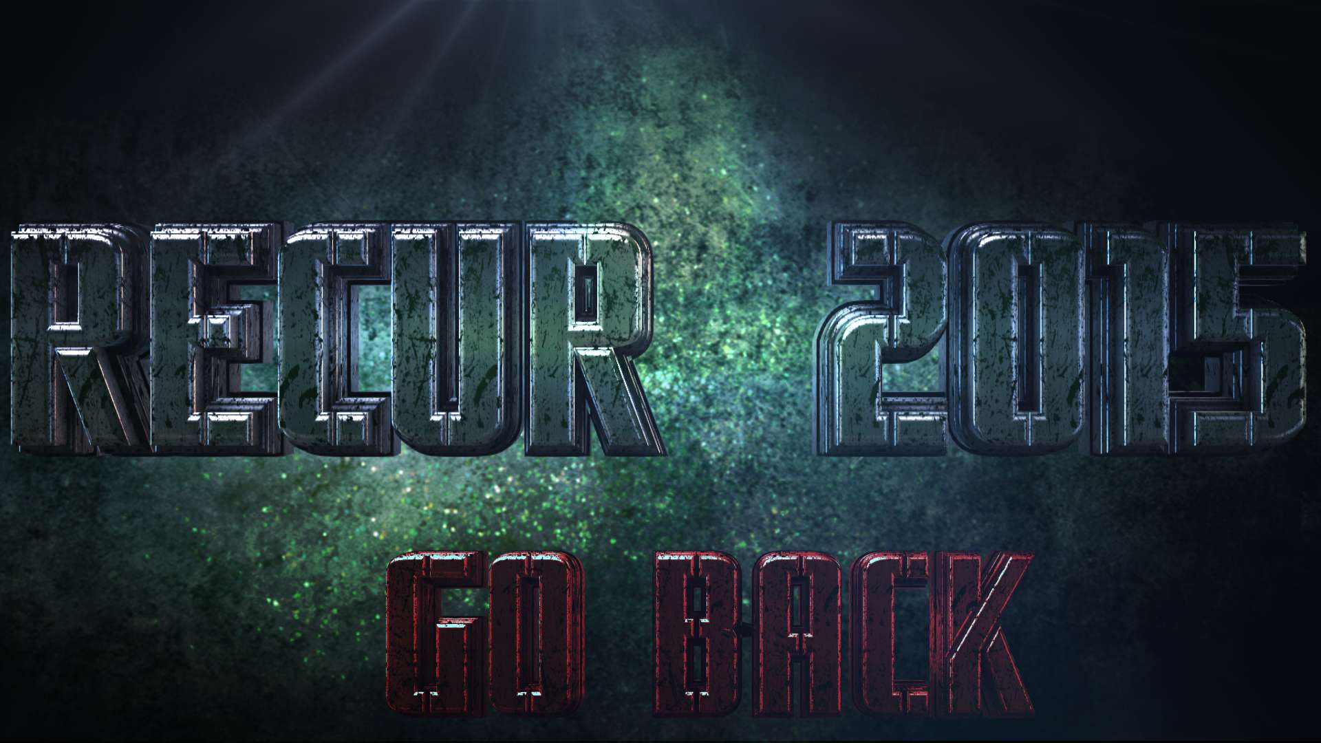
Do you think it would look better without the date on it? Something just looks off with it for some reason. I think it clutters it up, makes the image too busy. All of my original idea sucked haha. I didn't realize that on the backside of the flyer I'm going to be printing all of the pertinent info anyway. Date isn't needed on the front.
What if we just take that off, enlarge "Go Back" a bit, and center it under Recur 2015? If we were to do that, is getting it in the same font as Recur, but in something like a dark red color, possible? If green is all you can do it in then it would still look good.
If you do it, just make a judgement call on centering and heighth and width for "go back". Too big would fill in too much, too small would get lost.
It is your call if you want to, that looks really good as it is. I can just be a perfectionist a-hole.
It is my first time planning something on a district wide scale so I am hoping to make this as well done as possible. If it goes really well, then next year I would be able to actually hire and pay you to do the graphics. If you want to after dealing with me this year.
You can tell me to shut up and go away if you want to. If you do it, it will be the last one I ask from you. You've been tremendous with this man.
This post was edited on 4/20/15 at 12:45 am
 1
1


Posted on 4/20/15 at 2:03 am to VaBamaMan

 Page 1 of 1


Popular
Back to top