- My Forums
- Tiger Rant
- LSU Recruiting
- SEC Rant
- Saints Talk
- Pelicans Talk
- More Sports Board
- Fantasy Sports
- Golf Board
- Soccer Board
- O-T Lounge
- Tech Board
- Home/Garden Board
- Outdoor Board
- Health/Fitness Board
- Movie/TV Board
- Book Board
- Music Board
- Political Talk
- Money Talk
- Fark Board
- Gaming Board
- Travel Board
- Food/Drink Board
- Ticket Exchange
- TD Help Board
Customize My Forums- View All Forums
- Show Left Links
- Topic Sort Options
- Trending Topics
- Recent Topics
- Active Topics
Started By
Message
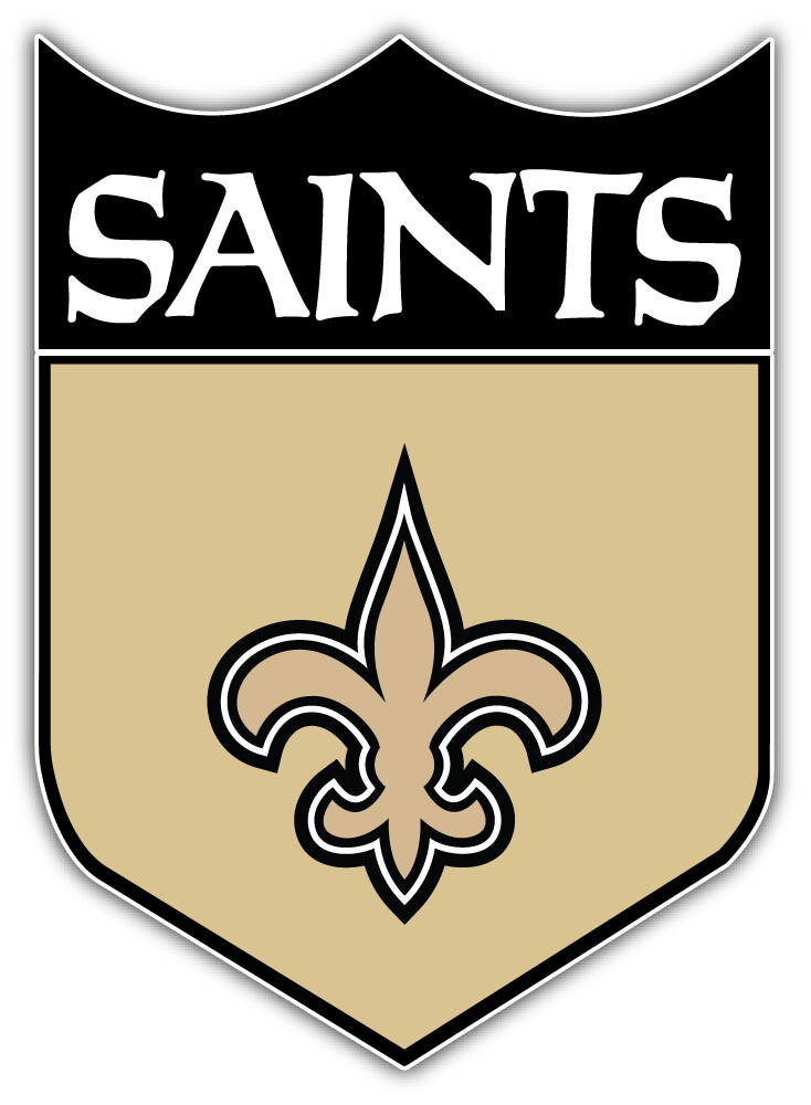
Is It Time For a Saints Logo Refresh.
Posted on 5/15/24 at 6:40 am
Posted on 5/15/24 at 6:40 am
On my way to the office, a Saints fan pulled in front of me and I noticed the rear window Saints decal. The fleur de lis symbol is rather unique and a great representation of the region, it just looks boring and dated.
 16
16

Posted on 5/15/24 at 7:10 am to Scientific73
They don’t need a refresh, but the uniforms and colors need tweaks.
This post was edited on 5/15/24 at 7:10 am
Posted on 5/15/24 at 7:20 am to Scientific73

Posted on 5/15/24 at 7:23 am to Scientific73
Best logo in the league and it’s not even close. It’s the best thing we’ve had going all these years.
Posted on 5/15/24 at 7:39 am to PGAOLDBawNeVaBroke
Logos and uniforms might be the only things that don’t require a refresh in this organization.
Posted on 5/15/24 at 7:40 am to PGAOLDBawNeVaBroke
I’ve seen the Pats new logo and you don’t want a rebrand. Fans would be so mad.
Posted on 5/15/24 at 7:50 am to Scientific73
Just fix the uniforms into, well, a uniform design… and that’s all the Saints need looks-wise.
I would also like to see a return to darker gold. I don’t like metallic beige. But that’s secondary to just adopting a consistent look.
I would also like to see a return to darker gold. I don’t like metallic beige. But that’s secondary to just adopting a consistent look.
Posted on 5/15/24 at 7:50 am to PNW_TigerSaint
Uniforms need to be tweaked. The mono look is just bad. They need to get rid of the black helmet that looks like it was designed to be sold at a gas station.
Color Rush all whites with a pearl helmet.
Throwbacks
Wear the gold pants more often/drop white pants.
Color Rush all whites with a pearl helmet.
Throwbacks
Wear the gold pants more often/drop white pants.
Posted on 5/15/24 at 8:27 am to The Hurricane
at least they didn't move to San Antonio and take the Fleur De Lis with them like what happened when the Jazz moved

Posted on 5/15/24 at 8:27 am to Scientific73
quote:
Saints Logo Refresh
No.
That being said, I wouldn't mind seeing the shield logo make a one-time appearance as an alternate helmet.
Posted on 5/15/24 at 8:33 am to Scientific73
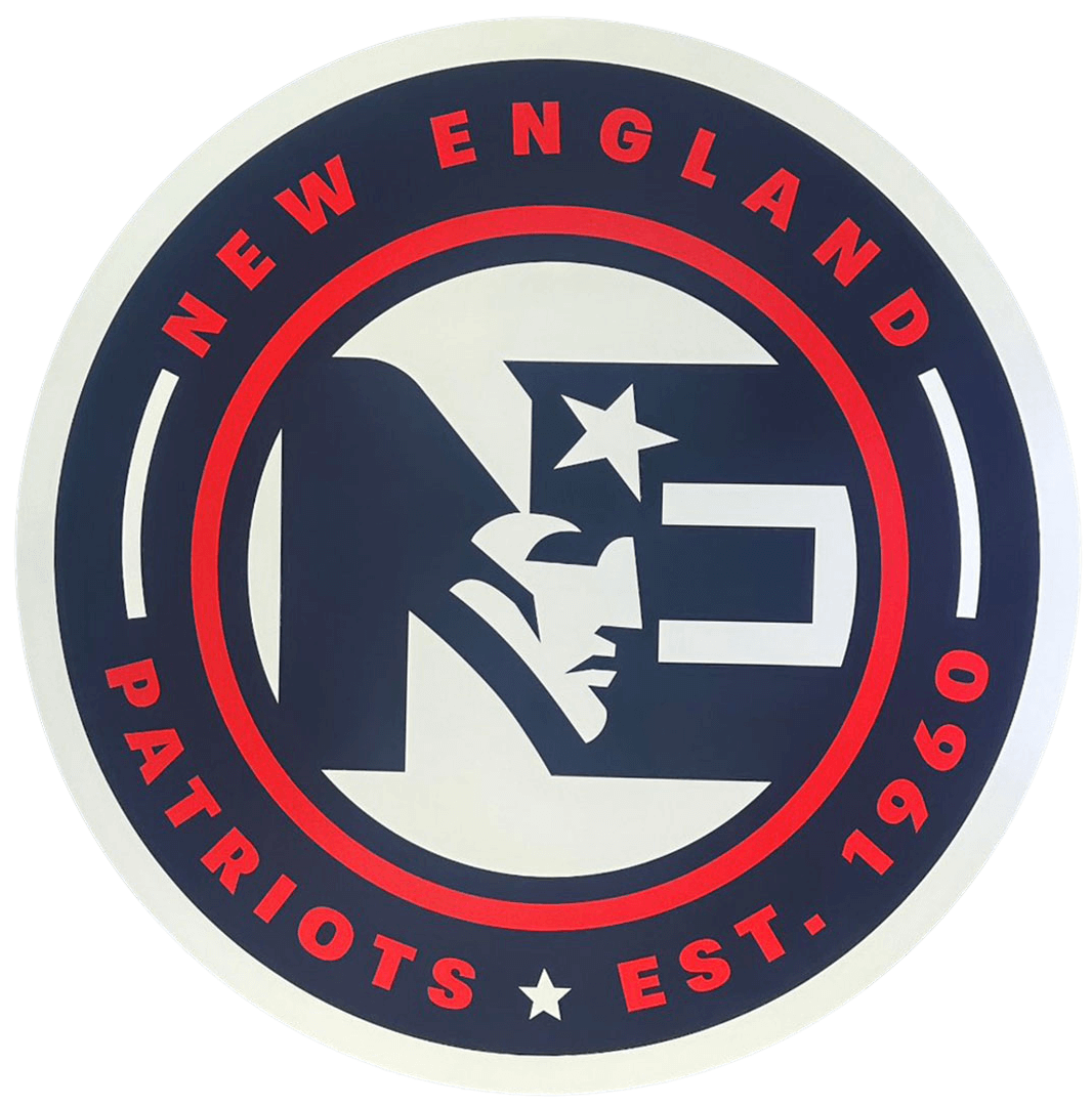
No. You do not want a modern logo update. Look what they did to New England:
Posted on 5/15/24 at 8:39 am to Scientific73
quote:
On my way to the office, a Saints fan pulled in front of me and I noticed the rear window Saints decal.

Posted on 5/15/24 at 8:47 am to Stealth Matrix
I do like that they began to sell more merch with this throwback.


Posted on 5/15/24 at 9:30 am to Scientific73
The fleur de lis is too iconic to eliminate completely.. Maybe a good designer could tweak it.

Posted on 5/15/24 at 10:06 am to VOR
there is no reason EVER to touch the fleur de lis. There is literally no way that they wouldn't frick it up.
Posted on 5/15/24 at 11:49 am to PNW_TigerSaint
quote:
Logos and uniforms might be the only things that don’t require a refresh in this organization.
They need to go back to the Dome Patrol era uniforms and burn the black and white leotards
Posted on 5/15/24 at 1:19 pm to Scientific73
Saints could have the best uniforms in the league if they just went with throwbacks
Color Rush
Dome Patrol Combo.
Color Rush
Dome Patrol Combo.
Posted on 5/15/24 at 1:24 pm to Scientific73
I love the logo, but if they made everything gold instead of beige, it'd be much cooler.

Posted on 5/15/24 at 1:26 pm to Scientific73
They need to get rid of the unnecessary outlines on the fleur de lis.

They need to go back to this logo on the helmet:

They need to go back to this logo on the helmet:
This post was edited on 5/15/24 at 1:29 pm
Posted on 5/15/24 at 1:40 pm to Scientific73
The buzzard wing was already taken...

 Page 1 of 2

Popular
Back to top