- My Forums
- Tiger Rant
- LSU Recruiting
- SEC Rant
- Saints Talk
- Pelicans Talk
- More Sports Board
- Fantasy Sports
- Golf Board
- Soccer Board
- O-T Lounge
- Tech Board
- Home/Garden Board
- Outdoor Board
- Health/Fitness Board
- Movie/TV Board
- Book Board
- Music Board
- Political Talk
- Money Talk
- Fark Board
- Gaming Board
- Travel Board
- Food/Drink Board
- Ticket Exchange
- TD Help Board
Customize My Forums- View All Forums
- Show Left Links
- Topic Sort Options
- Trending Topics
- Recent Topics
- Active Topics
Started By
Message
re: Daily COVID Updated as of 11/2/20 8:00 PM
Posted on 3/26/20 at 3:32 pm to Chromdome35

Posted on 3/26/20 at 3:32 pm to Chromdome35
quote:
All that being said, we could be flattening and it just hasn't shown up in the numbers at this point (let's pray this is the case).
Certainly we look to be at the end of the acceleration phase - the testing backlog is pretty much burned through - so, while not real time, it is a lot more reliable "known" data with fewer "unknowns" as we sit, Thursday, March 26th.
We may not be out of the woods yet, but with as few deaths we've experienced per case and per million of population, I can only say it appears as though our containment and mitigation strategies (Thank YOU, Mr. President, VP Pence, Drs. Birx and Fauci, the entire Task Force and most importantly, most Americans who are not Democrat members of the House and Senate - we (almost) all deserve a round of applause) should get high marks for this level of control, at this point in our curve.
 1
1

Posted on 3/26/20 at 4:06 pm to Ace Midnight
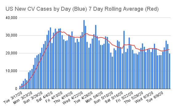
Ace, One of the things I've been keeping an eye on is the lag in new deaths vs new cases.
This graphic shows that 15 days ago the number of cases per million population was 1.3. 15 Days later the number of deaths per million was 1.3.
If you look at the growth per million of cases and compare it to the growth per million of deaths since they were both at 1.3 the pattern looks very similar. They aren't exact, but they are pretty darn close.
Posted on 3/26/20 at 4:07 pm to GumboPot
Chromedome35 gets a free TD-premium account for life as far as I'm concerned for his contribution here. 


Posted on 3/26/20 at 4:10 pm to Chromdome35
Come on....keep dropping
Posted on 3/26/20 at 4:25 pm to Chromdome35
quote:
This graphic shows that 15 days ago the number of cases per million population was 1.3. 15 Days later the number of deaths per million was 1.3.
If you look at the growth per million of cases and compare it to the growth per million of deaths since they were both at 1.3 the pattern looks very similar. They aren't exact, but they are pretty darn close.
That is definitely something to watch. No real reason why they should track so closely, other than as we talked about early on - should this thing settle into a fairly predictable 1% CFR, then every 100 cases will yield 1 death, every 10k will yield 100 deaths, etc.
Posted on 3/26/20 at 4:26 pm to nvcowboyfan
Thanks NVC, I like the way you think!!!
Posted on 3/26/20 at 4:36 pm to Ace Midnight
Have you paid any attention to the predictive model tab of the google sheet? I know it's a simple model, but it's doing a pretty decent job of tracking to the actual numbers.
It predicts 85.9K cases for today, we're 3,950 away from that number right now. It also predicts 1,229 deaths as of the end of the day. We are 52 away from that.
BIG IF we don't see the curves start to flatten soon, the model says we'll be at 1M cases in 11 days and 100K deaths in 19 days.
I suppose we will just have to wait and see if that's correct.
Posted on 3/26/20 at 4:40 pm to Chromdome35
quote:
Have you paid any attention to the predictive model tab of the google sheet?
No.
quote:
BIG IF we don't see the curves start to flatten soon, the model says we'll be at 1M cases in 11 days and 100K deaths in 19 days.
I suppose we will just have to wait and see if that's correct.
We will definitely see.
Posted on 3/26/20 at 4:51 pm to Chromdome35
One thing to look at is how quickly the active cases double. Currently, it’s somewhere between 2 and 5 days. We need that to get longer
Posted on 3/26/20 at 4:59 pm to MorgusTheMagnificent
I agree Morgus. I have read that a normal infectious disease outbreak doubles every 6 days. We are doubling that rate up
right now at right at 3 days doubling time.
right now at right at 3 days doubling time.
Posted on 3/26/20 at 5:05 pm to MorgusTheMagnificent
quote:
. Currently, it’s somewhere between 2 and 5 days. We need that to get longer
While some of these surges are attributable to testing/reporting lags, over time those numbers should settle down. Doubling every 5 days (or even 4 one more cycle) isn't a huge concern (particularly if we're ending the acceleration phase).
Doubling every 2 or 3 days would remain a significant concern.
Posted on 3/26/20 at 5:14 pm to Chromdome35
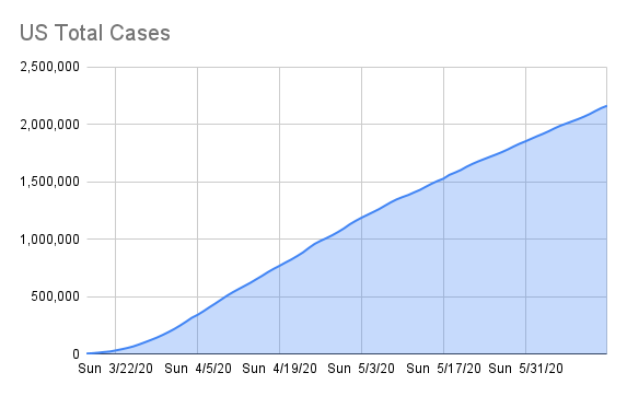
This is the link to the COVID-19 tracker that I have shared on Google Drive. Chromdome's COVID-19 Daily Tracker
The source for the data is https://www.worldometers.info/coronavirus/
The source for the testing data is from https://covidtracking.com/data/
On the tracker sheet you will see tabs for the following data:
1) US Summary
2) Country Comparables: This shows you how the US stacks up vs. select other countries dealing with COVID-19
3) Italy Summary
4) UK Summary
5) France Summary
6) Germany Summary
7) US Weighted Averages - Explores 7 day vs 3 day weight average trends
8) Predictive Model - A simple predictive model that shows where the numbers will be in the future if growth rates don't change
New Tabs Added in the last day
9) Logarithmic Comparisons - Shows the US vs the other countries on the tracker.
10) Sweden Summary
If you would like a graph created that I don't have, just ask and if it's possible I will create it for you.
Due to space constraints on the PT board, I'm only posting a few graphs in the thread, if a consensus emerges of what graphs the PT wants to see in thread without having to go to the tracker, I will gladly change them up.
I am working to create a sheet that compares the US metrics to the other countries metrics. I'll let you all know when that's done and available.
NOTE: The daily growth rate data will not be accurate until the end of the day's postings. It will change throughout the day.
NOTE: I am not tracking individual states, I don't have a reliable consistent source for that data.
NOTE: I am not a mathematician, statistics guru, scientist, sharpest tack in the box, I'm just a guy who likes to understand for myself what is happening and to share it with others. This thread was not created to debate if you should or shouldn't take this seriously, it is simply to present the numbers and foster conversation.

Posted on 3/26/20 at 5:21 pm to Chromdome35
quote:
Spain said it found that rapid coronavirus tests bought from China did not consistently identify positive cases and would return them to the manufacturer. ~ The Spanish newspaper El País reported that microbiologists found that tests it bought from a Chinese company called Bioeasy could correctly identify virus cases only 30% of the time.
Are these the same type of tests we didn't accept from the WHO?

Posted on 3/26/20 at 5:23 pm to imjustafatkid
Probably. They’re in bed with the chicoms
This post was edited on 3/26/20 at 5:24 pm
Posted on 3/26/20 at 5:55 pm to Tiguar
Why has the media not called out chinas numbers?
They’ve completely given up on journalism.
They’ve completely given up on journalism.

Posted on 3/26/20 at 6:05 pm to Chromdome35
quote:
BIG IF we don't see the curves start to flatten soon, the model says we'll be at 1M cases in 11 days and 100K deaths in 19 days.
I suppose we will just have to wait and see if that's correct.
I think one problem with your predictive model is that it doesn't take in to account a trend towards zero new cases.
Usually what you do it take the natural log of the dataset, then find the difference from each day, then trend that curve towards zero at some point in the future.
Which is why curve fitting in these sigmoidal models is so tricky.
Posted on 3/26/20 at 6:11 pm to TeLeFaWx
Uh-huh, you obviously know way more about this kind of modeling than I do. If you give me the formula's to use, I can try to build the model.
This post was edited on 3/26/20 at 6:13 pm
Posted on 3/26/20 at 6:47 pm to Chromdome35
I think you and TeLeFa are on the right track now with projection. Good job with this!
Posted on 3/26/20 at 8:09 pm to Chromdome35
quote:
Uh-huh, you obviously know way more about this kind of modeling than I do. If you give me the formula's to use, I can try to build the model.
I wouldn't really know the trendline functions in google sheets vs Excel.
Maybe I would just make a column with ln(x) of the data, then plot it on a non-log scale graph. You essentially end up with the exact same plot of the data you have on a logarithmic scale.
Then you just take the difference in day to day and graph that. Then you can model that data forward in a variety of ways, as long as it trends to zero. Which is the tricky part. Since it can never be less than zero, you can't have negative total cases for the day.
If you just fit a trendline to that in Excel for example, it's not really going to give you any trendline fit that doesn't cross the x axis. So you basically have to average it with zero in some way, then just reverse the difference going forward with e^(x)
In Excel, you can easily use the LINEST function to get the coefficients for any trendline you would get in their regression analysis.
To get a 4th order polynomial trendline fit for example, which would give you a pretty high r^2 value, but a horrible equation to predict forward with. A logarithmic trend is probably better since it could naturally trend to zero easier, but even then it's a crap shoot.
You could sort of manually fit a trendline that would trend below zero then manually fit an inflection date where it flattens out to mimic the Italy trend?
TL;DR... Don't worry about it, your model will make sense once we hit that inflection point.
Posted on 3/26/20 at 8:35 pm to Chromdome35
This is the link to the COVID-19 tracker that I have shared on Google Drive. Chromdome's COVID-19 Daily Tracker
The source for the data is https://www.worldometers.info/coronavirus/
The source for the testing data is from https://covidtracking.com/data/
On the tracker sheet you will see tabs for the following data:
1) US Summary
2) Country Comparables: This shows you how the US stacks up vs. select other countries dealing with COVID-19
3) Italy Summary
4) UK Summary
5) France Summary
6) Germany Summary
7) US Weighted Averages - Explores 7 day vs 3 day weight average trends
8) Predictive Model - A simple predictive model that shows where the numbers will be in the future if growth rates don't change
New Tabs Added in the last day
9) Logarithmic Comparisons - Shows the US vs the other countries on the tracker.
10) Sweden Summary
If you would like a graph created that I don't have, just ask and if it's possible I will create it for you.
Due to space constraints on the PT board, I'm only posting a few graphs in the thread, if a consensus emerges of what graphs the PT wants to see in thread without having to go to the tracker, I will gladly change them up.
I am working to create a sheet that compares the US metrics to the other country's metrics. I'll let you all know when that's done and available.
NOTE: The daily growth rate data will not be accurate until the end of the day's postings. It will change throughout the day.
NOTE: I am not tracking individual states, I don't have a reliable consistent source for that data.
NOTE: I am not a mathematician, statistics guru, scientist, sharpest tack in the box, I'm just a guy who likes to understand for myself what is happening and to share it with others. This thread was not created to debate if you should or shouldn't take this seriously, it is simply to present the numbers and foster conversation.

 Page 79 of 331

Back to top