- My Forums
- Tiger Rant
- LSU Recruiting
- SEC Rant
- Saints Talk
- Pelicans Talk
- More Sports Board
- Fantasy Sports
- Golf Board
- Soccer Board
- O-T Lounge
- Tech Board
- Home/Garden Board
- Outdoor Board
- Health/Fitness Board
- Movie/TV Board
- Book Board
- Music Board
- Political Talk
- Money Talk
- Fark Board
- Gaming Board
- Travel Board
- Food/Drink Board
- Ticket Exchange
- TD Help Board
Customize My Forums- View All Forums
- Show Left Links
- Topic Sort Options
- Trending Topics
- Recent Topics
- Active Topics
Started By
Message
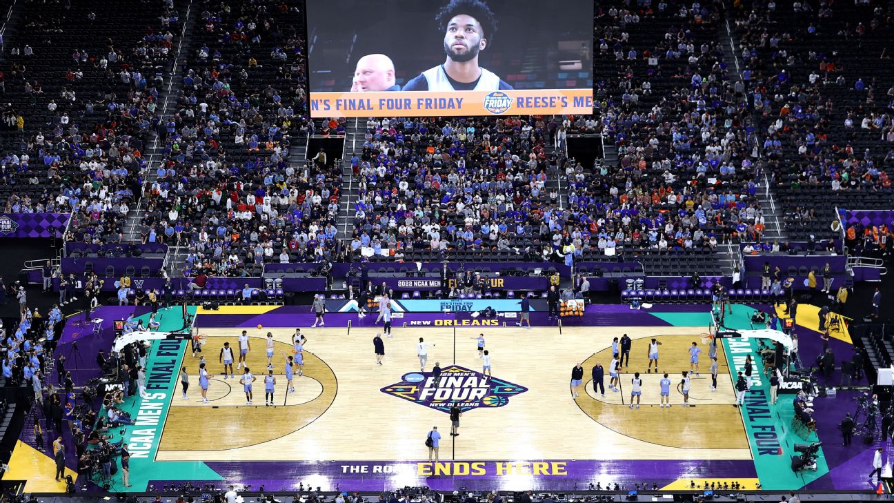
Something not right about this Final Four
Posted on 4/4/22 at 11:15 pm
Posted on 4/4/22 at 11:15 pm
This court/colors on display for the Final Four is embarrassing the Pels in our home city.

Please look Gayle
Please look Gayle
This post was edited on 4/4/22 at 11:17 pm
 7
7

Posted on 4/4/22 at 11:21 pm to rondonumbanine
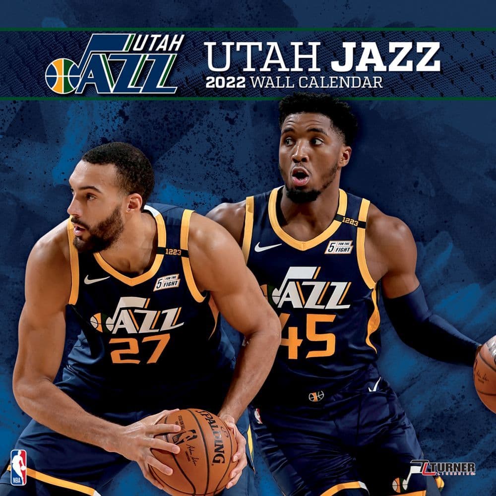
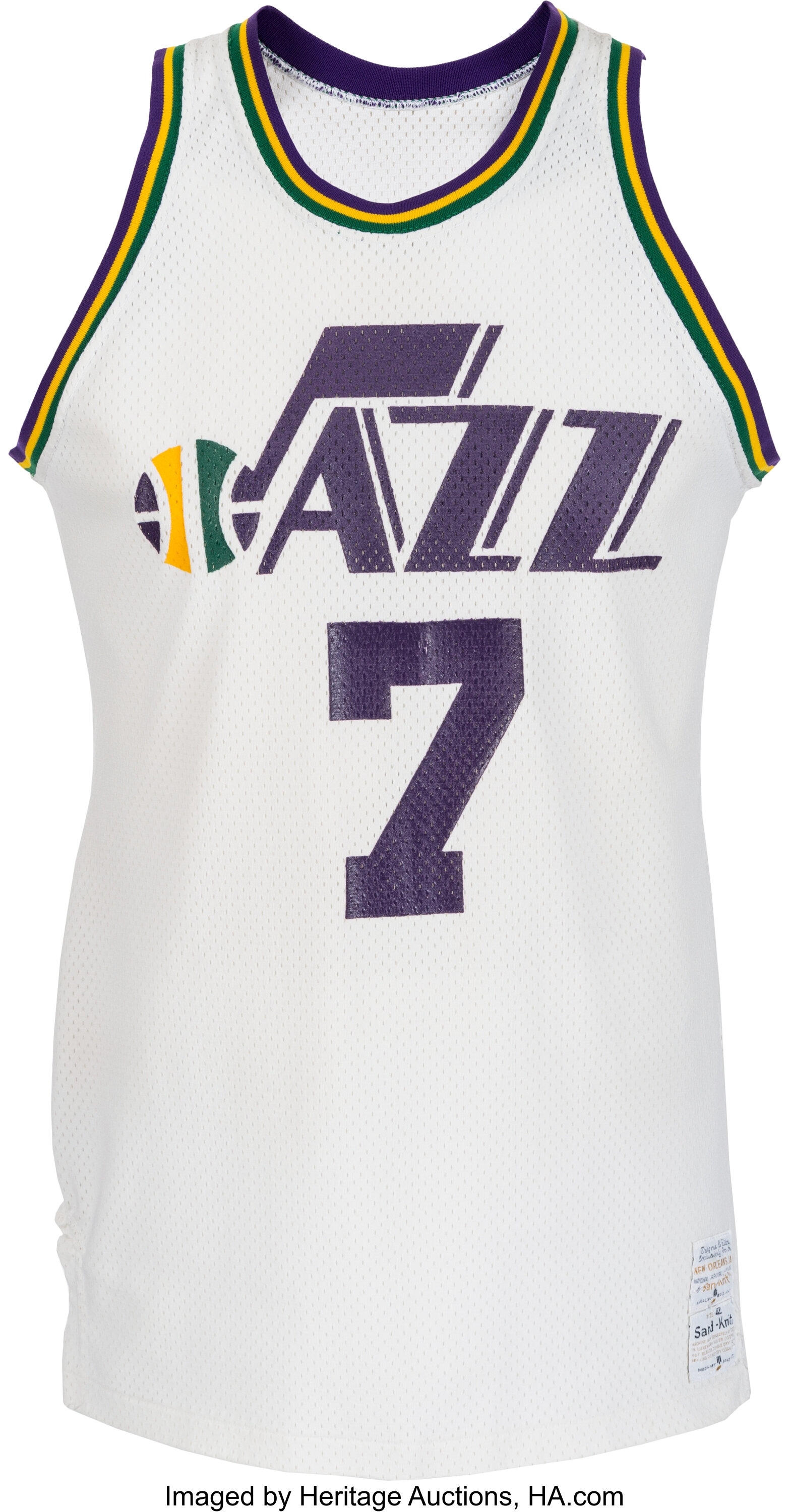
Why our colors aren’t purple, green and gold is crazy. They didn’t even do Mardi Gras unis this year. Massive disconnect between the folks running the Pels and the fans.
Posted on 4/4/22 at 11:26 pm to Ancient Astronaut
quote:
Why our colors aren’t purple, green and gold is crazy.
Because they did that once and it went to Utah
Posted on 4/4/22 at 11:33 pm to saintsfan22
Jazz have been a very successful franchise.

Posted on 4/4/22 at 11:41 pm to Ancient Astronaut
“First the Lakers moved from Minnesota to Los Angeles, where they don’t have lakes.
Then the Oilers moved from Houston to Tennessee, where they don’t have oil.
Then the Jazz moved from New Orleans to Utah, where they don’t allow music.”
Then the Oilers moved from Houston to Tennessee, where they don’t have oil.
Then the Jazz moved from New Orleans to Utah, where they don’t allow music.”
Posted on 4/4/22 at 11:47 pm to rondonumbanine
There needs to be an alternate Mardi Gras colors and MG uniforms. Make the Crescent City basketball secondary logo the center court logo.

Posted on 4/4/22 at 11:58 pm to Ancient Astronaut
Jazz have a completely different color scheme now and have for a while
Posted on 4/5/22 at 12:05 am to Macintosh504
They use a bunch of different colors: the traditional ones, the Pacers like blue and gold, those ugly arse Red Rocks jerseys.

Posted on 4/5/22 at 8:40 am to rondonumbanine
What is embarrassing about the court?
Posted on 4/5/22 at 10:00 am to NOSHAU
The fact that the branding represents the city way better than the Pels, on top of just looking way better than ours
Posted on 4/5/22 at 10:04 am to rondonumbanine
Hate our color scheme(literally the most used/generic color scheme you can pick in sports: red/dark blue), but I also don't exactly love that final four court either.
Way too busy and harsh contrasts.
Actually prefer our normal court to that.
Just wish we did the obvious and just kept the black and gold theme of the Saints the way NY and Pittsburgh have unified color schemes.
Way too busy and harsh contrasts.
Actually prefer our normal court to that.
Just wish we did the obvious and just kept the black and gold theme of the Saints the way NY and Pittsburgh have unified color schemes.
This post was edited on 4/5/22 at 10:06 am

Posted on 4/5/22 at 10:14 am to rondonumbanine
Our court has been atrocious since the rebrand. We really need to revamp that and the uniforms.
Posted on 4/5/22 at 10:36 am to Macintosh504
Posted on 4/5/22 at 10:39 am to rondonumbanine
pour one out for the best home whites in NBA history
Posted on 4/5/22 at 10:42 am to Ancient Astronaut
when did the Jazz go back to the musical note? Was it before or after Benson bought the Pels?
I could see them doing that since it was rumored that Benson tried to buy the Jazz name when he bought the team. Would be kind of fricked if that is the reason they went back to mardi gras colors and the musical note instead of the purple and gray mountains.
I could see them doing that since it was rumored that Benson tried to buy the Jazz name when he bought the team. Would be kind of fricked if that is the reason they went back to mardi gras colors and the musical note instead of the purple and gray mountains.
Posted on 4/5/22 at 10:42 am to Ancient Astronaut
Pisses me off that Utah even found a way to ruin the color scheme by replacing the purple with navy blue and darkening the yellow.
Posted on 4/5/22 at 11:55 am to Bronc
quote:
Hate our color scheme(literally the most used/generic color scheme you can pick in sports: red/dark blue), but I also don't exactly love that final four court either.
I agree it is used a lot but it is bc it looks good on things. I think our logos are top notch as well. I love the Pels color scheme but agree we should have MG uniforms during MG season

Posted on 4/5/22 at 1:48 pm to rondonumbanine
I like the logo and fact that it's not purple and gold. I already have enough of those colors in my wardrobe and nice to have a more subdued color scheme to add to mix. Owners probably considered those colors would be more marketable to fan base in surrounding states. Mardi Gras alternates should be a given though.

Posted on 4/5/22 at 3:10 pm to Macintosh504
quote:
Jazz have a completely different color scheme now and have for a while
They don’t do a single thing related to Jazz. It’s bizarre. I don’t even want the name. But it’s such bad branding to have a name that is a very distinct and known thing and not reference it any way. It’d be like if our name was the Aztecs but we just had generic/Louisiana branding

Posted on 4/5/22 at 3:12 pm to Hester Carries
What pisses me off is Tom offered to pay for the rebrand and give 1M for the name. Charlotte rightfully gets their name. NOLA rightfully gets their name. Utah gets something that fits.
My idea was the name the team the Latter Day Saints and make the logo something to do with bewbz and beer and use it as a negotiation tool.
My idea was the name the team the Latter Day Saints and make the logo something to do with bewbz and beer and use it as a negotiation tool.

 Page 1 of 2

Popular
Back to top