- My Forums
- Tiger Rant
- LSU Recruiting
- SEC Rant
- Saints Talk
- Pelicans Talk
- More Sports Board
- Fantasy Sports
- Golf Board
- Soccer Board
- O-T Lounge
- Tech Board
- Home/Garden Board
- Outdoor Board
- Health/Fitness Board
- Movie/TV Board
- Book Board
- Music Board
- Political Talk
- Money Talk
- Fark Board
- Gaming Board
- Travel Board
- Food/Drink Board
- Ticket Exchange
- TD Help Board
Customize My Forums- View All Forums
- Show Left Links
- Topic Sort Options
- Trending Topics
- Recent Topics
- Active Topics
Started By
Message
Daily New Logo Thread: Wizards Edition
Posted on 4/15/15 at 11:33 am
Posted on 4/15/15 at 11:33 am
New primary logo

This one is no more:

So the only remnant left from the Bullets->Wizards rebrand is the name
This one is no more:
quote:
The Washington Wizards unveiled a new primary logo today. The new primary logo incorporates the "monument ball" design that has been in place since 2011 in combination with the iconic striping from the team's uniforms, the three stars that represent D.C., Maryland and Virginia (which are also featured on the apron of center court at Verizon Center) and the team's wordmarks.
The Wizards will continue to prominently use both the monument ball and "DC hands" logos in all collateral materials and will discontinue the use of the "wizard/partial moon" logo that was introduced in 1997 and revamped in 2011.
So the only remnant left from the Bullets->Wizards rebrand is the name
 12
12


Posted on 4/15/15 at 11:35 am to craigbiggio
I think I like it.

Posted on 4/15/15 at 11:35 am to craigbiggio
I like it
Posted on 4/15/15 at 11:35 am to hendersonshands
quote:
I think I like it.
Agree. They have good colors so it seems like it would be hard to make a shitty logo.
Posted on 4/15/15 at 11:36 am to craigbiggio
quote:
So the only remnant left from the Bullets->Wizards rebrand is the name
I know that they used to be the Bullets, but can you explain what you mean by this? I'm not much of a basketball fan.
Posted on 4/15/15 at 11:37 am to craigbiggio

Noticing a trend with these new logos...
Posted on 4/15/15 at 11:39 am to craigbiggio
Hmmmm....

Posted on 4/15/15 at 11:40 am to LST
quote:
I know that they used to be the Bullets, but can you explain what you mean by this? I'm not much of a basketball fan.
They overhauled their logo and color scheme when they switched from Bullets to Wizards. They went from red white and blue to this:
Now they are back to wearing red white and blue, only now it says Wizards instead of Bullets
Posted on 4/15/15 at 11:43 am to craigbiggio
they just need to go back to beingthe bullets
This post was edited on 4/15/15 at 11:46 am
Posted on 4/15/15 at 11:44 am to 12Pence
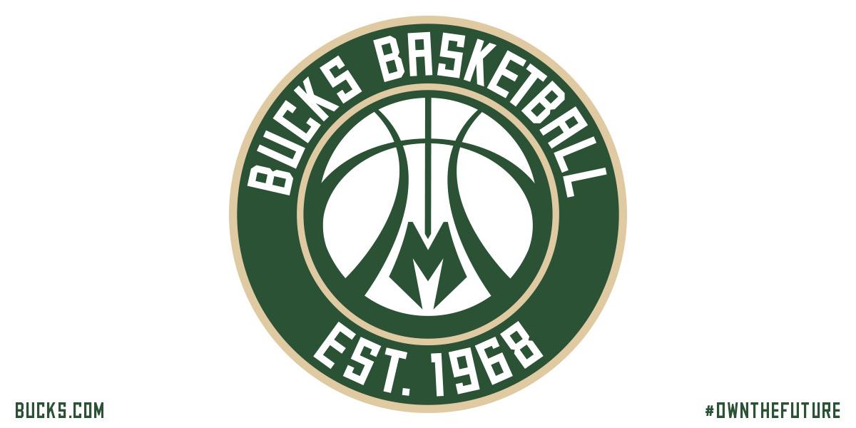
I'm sure there is some marketing data that would explain why they all need to have a circular logo with a basketball in the middle

This post was edited on 4/15/15 at 11:46 am

Posted on 4/15/15 at 11:49 am to craigbiggio
That's a pretty sweet Bucks logo with the lines of the ball looking like antlers.
I dig the Wizards one as well. It's certainly better than the old guy logo; that one was always awful.
I dig the Wizards one as well. It's certainly better than the old guy logo; that one was always awful.
Posted on 4/15/15 at 12:04 pm to craigbiggio
Is better than
Posted on 4/15/15 at 12:06 pm to craigbiggio
quote:
I'm sure there is some marketing data that would explain why they all need to have a circular logo with a basketball in the middle
They paid some consultant half a million dollars to have a focus group tell him that circular logos are less threatening than square logos.
Posted on 4/15/15 at 12:22 pm to craigbiggio
I dig it, probably going to scoop some polos up with that logo on it.
Posted on 4/15/15 at 12:24 pm to craigbiggio
I can appreciate the Wizard logo. It's a pretty tall order to make a wizard and basketball go together. The W and the beard is clever. Having said that, this new logo is just way better. It will make a great center court logo.
Also, seeing the Crescent City basketball logo makes me wonder why it's not more readily available. I'd love to have a hat with it.
Also, seeing the Crescent City basketball logo makes me wonder why it's not more readily available. I'd love to have a hat with it.

Posted on 4/15/15 at 1:27 pm to craigbiggio
quote:
George Washington prepares to penetrate the anus of the sky god
From Deadspin

Posted on 4/15/15 at 1:31 pm to craigbiggio
Why aren't they the Bullets again?
Posted on 4/15/15 at 1:31 pm to craigbiggio
Oh yeah, I forgot they had been blue and gold for a while. Thanks.

Posted on 4/15/15 at 1:33 pm to craigbiggio
quote:
Noticing a trend with these new logos...
Yes, they're called "roundels" in the logo world and they're all the rage right now. Instead of a ton of purple and teal, teams in all sports are going for the roundels.
This post was edited on 4/15/15 at 1:36 pm

 Page 1 of 2

Back to top