- My Forums
- Tiger Rant
- LSU Recruiting
- SEC Rant
- Saints Talk
- Pelicans Talk
- More Sports Board
- Fantasy Sports
- Golf Board
- Soccer Board
- O-T Lounge
- Tech Board
- Home/Garden Board
- Outdoor Board
- Health/Fitness Board
- Movie/TV Board
- Book Board
- Music Board
- Political Talk
- Money Talk
- Fark Board
- Gaming Board
- Travel Board
- Food/Drink Board
- Ticket Exchange
- TD Help Board
Customize My Forums- View All Forums
- Show Left Links
- Topic Sort Options
- Trending Topics
- Recent Topics
- Active Topics
Started By
Message
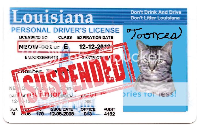
Is Toonces the most short lived logo ever?
Posted on 10/28/15 at 12:26 pm
Posted on 10/28/15 at 12:26 pm
Let's be honest here
Any input?
I love the new one definitely stays truer to helmet tiger/chrysanthemum. But I feel like it was rolled out with little notice.
We had Toonces and then in recent years ESPN started to veer towards just using "LSU" in font as our logo.
What other SEC schools have changed? They've all been the same as long as I can remember honestly.
I know FSU had a little redesign to make it easier to print, which I feel like played in to the new logo as well.
This post was edited on 10/28/15 at 12:28 pm
 22
22

Posted on 10/28/15 at 12:29 pm to Delacroix22
Called it a soft launch...
LINK
edit: That logo lasted over 10 years which was 10 years too many. I still see it everywhere... stores, tv, print ads.
LINK
edit: That logo lasted over 10 years which was 10 years too many. I still see it everywhere... stores, tv, print ads.
This post was edited on 10/28/15 at 12:32 pm
Posted on 10/28/15 at 12:33 pm to whoisnickdoobs
It still lives in some places. My Yahoo Sports app still uses it.

Posted on 10/28/15 at 12:33 pm to Delacroix22
Toonces just so happened to be released with the resurgence of LSU Football. The 2003 BCS Title led to more merchandise sales, and by happenstance a large amount of merchandise with Toonces was sold. I think it falsely portrayed the symbol's popularity, and kept it around for far too long.
Moving forward, I like the refreshed helmet logo as it is more symmetrical. I'm also partial to the eye logo, but that seems to be polarizing among older fans.
Moving forward, I like the refreshed helmet logo as it is more symmetrical. I'm also partial to the eye logo, but that seems to be polarizing among older fans.
This post was edited on 10/30/15 at 2:55 pm
Posted on 10/28/15 at 12:34 pm to whoisnickdoobs
Poor Toonces.
This post was edited on 10/28/15 at 9:12 pm
Posted on 10/28/15 at 12:36 pm to Delacroix22
quote:
Is Toonces the most short lived logo ever?(
At LSU? Probably
Off the top of my head this is the shortest lived logo

Posted on 10/28/15 at 12:45 pm to Delacroix22
...for good reason.

Posted on 10/28/15 at 12:46 pm to Delacroix22
The one good thing to come from Toonces was the "Geaux" font.
Because it's awesome.
Because it's awesome.
Posted on 10/28/15 at 12:49 pm to DonChowder
In terms of college teams I mean.... Especially major college teams.
ND?
OSU?
UF?
UGA?
Alabama?
Auburn?
ND?
OSU?
UF?
UGA?
Alabama?
Auburn?
Posted on 10/28/15 at 1:00 pm to Delacroix22
They had all sorts of fanfare when they introduced toonces and while people didn't hate it right away, the general consensus was that the cartoony look wasn't fitting for LSU and eventually people grew to despise it. They didn't make a big announcement about rolling out the new tiger head logo in fear of a huge backlash from the fickle fans of LSU so they slowly started trying it out in a few places and people loved it. I think with the tiger eye, geaux font LSU, and revised form of the old tiger head we're set for a while
Posted on 10/28/15 at 1:07 pm to Grim
What was the logo before toonces?

Posted on 10/28/15 at 1:09 pm to cheesesteak501

Pretty boring. The geaux font is awesome and the new logo is good.
This post was edited on 10/28/15 at 1:10 pm
Posted on 10/28/15 at 1:15 pm to Delacroix22
If you google LSU Logo it's still toonces all the way down.
Posted on 10/28/15 at 1:18 pm to Delacroix22
This was one of many poor branding decisions made by the university and athletic depts at the time. Remember Welcome to the Now (Evo Devo)?
Posted on 10/28/15 at 1:24 pm to Delacroix22
Idk about longest lived but it is definitely the most widely distributed, it's still all over everything and it's disgusting.
Posted on 10/28/15 at 1:41 pm to Delacroix22
Big waste of money to the firm hired to come up with that logo. But then again, athletics has money to burn.

Posted on 10/28/15 at 4:35 pm to Delacroix22
LINK
Here is a cool website that has cataloged most historic and current college logos. They have not added the new LSU logo yet, except for on the helmet if you scroll down.
Here is a cool website that has cataloged most historic and current college logos. They have not added the new LSU logo yet, except for on the helmet if you scroll down.

Posted on 10/28/15 at 4:38 pm to Bmath
Led not lead
Posted on 10/28/15 at 5:11 pm to Paul Allen
i give apparel with toonces on it to LSU fans that i hate
Posted on 10/28/15 at 5:34 pm to elprez00
quote:
This was one of many poor branding decisions made by the university and athletic depts at the time. Remember Welcome to the Now (Evo Devo)?
Blame this all on Eric Monday. Glad he's at Kentucky now.

 Page 1 of 4

Popular
Back to top